Page 1 :
CSS, CSS, Notes for Professionals, , Notes for Professionals, , 200+ pages, , of professional hints and tricks, , GoalKicker.com, , Free Programming Books, , Disclaimer, This is an unocial free book created for educational purposes and is, not aliated with ocial CSS group(s) or company(s)., All trademarks and registered trademarks are, the property of their respective owners
Page 2 :
Contents, About ................................................................................................................................................................................... 1, Chapter 1: Getting started with CSS .................................................................................................................... 2, Section 1.1: External Stylesheet ..................................................................................................................................... 2, Section 1.2: Internal Styles ............................................................................................................................................ 3, Section 1.3: CSS @import rule (one of CSS at-rule) ................................................................................................... 4, Section 1.4: Inline Styles ................................................................................................................................................. 4, Section 1.5: Changing CSS with JavaScript ................................................................................................................. 4, Section 1.6: Styling Lists with CSS ................................................................................................................................. 5, , Chapter 2: Structure and Formatting of a CSS Rule .................................................................................. 7, Section 2.1: Property Lists ............................................................................................................................................. 7, Section 2.2: Multiple Selectors ...................................................................................................................................... 7, Section 2.3: Rules, Selectors, and Declaration Blocks ............................................................................................... 7, , Chapter 3: Comments ................................................................................................................................................. 8, Section 3.1: Single Line ................................................................................................................................................... 8, Section 3.2: Multiple Line ............................................................................................................................................... 8, , Chapter 4: Selectors ................................................................................................................................................... 9, Section 4.1: Basic selectors ........................................................................................................................................... 9, Section 4.2: Attribute Selectors .................................................................................................................................... 9, Section 4.3: Combinators ............................................................................................................................................ 12, Section 4.4: Pseudo-classes ....................................................................................................................................... 13, Section 4.5: Child Pseudo Class ................................................................................................................................. 15, Section 4.6: Class Name Selectors ............................................................................................................................ 16, Section 4.7: Select element using its ID without the high specificity of the ID selector ....................................... 17, Section 4.8: The :last-of-type selector ...................................................................................................................... 17, Section 4.9: CSS3 :in-range selector example .......................................................................................................... 17, Section 4.10: A. The :not pseudo-class example & B. :focus-within CSS pseudo-class ......................................... 18, Section 4.11: Global boolean with checkbox:checked and ~ (general sibling combinator) .................................. 19, Section 4.12: ID selectors ............................................................................................................................................ 20, Section 4.13: How to style a Range input .................................................................................................................. 21, Section 4.14: The :only-child pseudo-class selector example ................................................................................. 21, , Chapter 5: Backgrounds ......................................................................................................................................... 22, Section 5.1: Background Color ................................................................................................................................... 22, Section 5.2: Background Gradients ........................................................................................................................... 24, Section 5.3: Background Image ................................................................................................................................. 25, Section 5.4: Background Shorthand .......................................................................................................................... 26, Section 5.5: Background Size ..................................................................................................................................... 27, Section 5.6: Background Position .............................................................................................................................. 31, Section 5.7: The background-origin property .......................................................................................................... 32, Section 5.8: Multiple Background Image .................................................................................................................. 34, Section 5.9: Background Attachment ....................................................................................................................... 35, Section 5.10: Background Clip .................................................................................................................................... 36, Section 5.11: Background Repeat ............................................................................................................................... 37, Section 5.12: background-blend-mode Property ..................................................................................................... 37, Section 5.13: Background Color with Opacity ........................................................................................................... 38, , Chapter 6: Centering ................................................................................................................................................. 39, Section 6.1: Using Flexbox ........................................................................................................................................... 39, Section 6.2: Using CSS transform .............................................................................................................................. 40
Page 3 :
Section 6.3: Using margin: 0 auto; ............................................................................................................................. 41, Section 6.4: Using text-align ....................................................................................................................................... 42, Section 6.5: Using position: absolute ......................................................................................................................... 42, Section 6.6: Using calc() ............................................................................................................................................. 43, Section 6.7: Using line-height ..................................................................................................................................... 43, Section 6.8: Vertical align anything with 3 lines of code ......................................................................................... 44, Section 6.9: Centering in relation to another item ................................................................................................... 44, Section 6.10: Ghost element technique (Michał Czernow's hack) ........................................................................... 45, Section 6.11: Centering vertically and horizontally without worrying about height or width ............................... 46, Section 6.12: Vertically align an image inside div ..................................................................................................... 47, Section 6.13: Centering with fixed size ....................................................................................................................... 47, Section 6.14: Vertically align dynamic height elements .......................................................................................... 49, Section 6.15: Horizontal and Vertical centering using table layout ........................................................................ 49, , Chapter 7: The Box Model ...................................................................................................................................... 51, Section 7.1: What is the Box Model? .......................................................................................................................... 51, Section 7.2: box-sizing ................................................................................................................................................. 52, , Chapter 8: Margins .................................................................................................................................................... 55, Section 8.1: Margin Collapsing .................................................................................................................................... 55, Section 8.2: Apply Margin on a Given Side ............................................................................................................... 57, Section 8.3: Margin property simplification .............................................................................................................. 58, Section 8.4: Horizontally center elements on a page using margin ...................................................................... 58, Section 8.5: Example 1: ................................................................................................................................................ 59, Section 8.6: Negative margins ................................................................................................................................... 59, , Chapter 9: Padding .................................................................................................................................................... 61, Section 9.1: Padding Shorthand ................................................................................................................................. 61, Section 9.2: Padding on a given side ........................................................................................................................ 62, , Chapter 10: Border ..................................................................................................................................................... 63, Section 10.1: border-radius ......................................................................................................................................... 63, Section 10.2: border-style ........................................................................................................................................... 64, Section 10.3: Multiple Borders .................................................................................................................................... 65, Section 10.4: border (shorthands) ............................................................................................................................. 66, Section 10.5: border-collapse ..................................................................................................................................... 66, Section 10.6: border-image ........................................................................................................................................ 67, Section 10.7: Creating a multi-colored border using border-image ...................................................................... 67, Section 10.8: border-[left|right|top|bottom] .............................................................................................................. 68, , Chapter 11: Outlines ................................................................................................................................................... 69, Section 11.1: Overview .................................................................................................................................................. 69, Section 11.2: outline-style ............................................................................................................................................ 69, , Chapter 12: Overflow ................................................................................................................................................ 71, Section 12.1: overflow-wrap ........................................................................................................................................ 71, Section 12.2: overflow-x and overflow-y ................................................................................................................... 72, Section 12.3: overflow: scroll ....................................................................................................................................... 73, Section 12.4: overflow: visible ..................................................................................................................................... 73, Section 12.5: Block Formatting Context Created with Overflow ............................................................................. 74, , Chapter 13: Media Queries ...................................................................................................................................... 76, Section 13.1: Terminology and Structure ................................................................................................................... 76, Section 13.2: Basic Example ........................................................................................................................................ 77, Section 13.3: mediatype .............................................................................................................................................. 77, Section 13.4: Media Queries for Retina and Non Retina Screens ........................................................................... 78
Page 4 :
Section 13.5: Width vs Viewport ................................................................................................................................. 79, Section 13.6: Using Media Queries to Target Dierent Screen Sizes ..................................................................... 79, Section 13.7: Use on link tag ....................................................................................................................................... 80, Section 13.8: Media queries and IE8 ........................................................................................................................... 80, , Chapter 14: Floats ...................................................................................................................................................... 81, Section 14.1: Float an Image Within Text ................................................................................................................... 81, Section 14.2: clear property ........................................................................................................................................ 82, Section 14.3: Clearfix .................................................................................................................................................... 83, Section 14.4: In-line DIV using float ............................................................................................................................ 84, Section 14.5: Use of overflow property to clear floats ............................................................................................ 86, Section 14.6: Simple Two Fixed-Width Column Layout ............................................................................................ 86, Section 14.7: Simple Three Fixed-Width Column Layout ......................................................................................... 87, Section 14.8: Two-Column Lazy/Greedy Layout ...................................................................................................... 88, , Chapter 15: Typography ......................................................................................................................................... 89, Section 15.1: The Font Shorthand ............................................................................................................................... 89, Section 15.2: Quotes .................................................................................................................................................... 90, Section 15.3: Font Size ................................................................................................................................................. 90, Section 15.4: Text Direction ......................................................................................................................................... 90, Section 15.5: Font Stacks ............................................................................................................................................ 91, Section 15.6: Text Overflow ......................................................................................................................................... 91, Section 15.7: Text Shadow .......................................................................................................................................... 91, Section 15.8: Text Transform ...................................................................................................................................... 92, Section 15.9: Letter Spacing ........................................................................................................................................ 92, Section 15.10: Text Indent ............................................................................................................................................ 93, Section 15.11: Text Decoration ..................................................................................................................................... 93, Section 15.12: Word Spacing ....................................................................................................................................... 94, Section 15.13: Font Variant .......................................................................................................................................... 94, , Chapter 16: Flexible Box Layout (Flexbox) ..................................................................................................... 96, Section 16.1: Dynamic Vertical and Horizontal Centering (align-items, justify-content) ...................................... 96, Section 16.2: Sticky Variable-Height Footer ........................................................................................................... 102, Section 16.3: Optimally fit elements to their container .......................................................................................... 103, Section 16.4: Holy Grail Layout using Flexbox ........................................................................................................ 104, Section 16.5: Perfectly aligned buttons inside cards with flexbox ........................................................................ 105, Section 16.6: Same height on nested containers .................................................................................................... 107, , Chapter 17: Cascading and Specificity .......................................................................................................... 109, Section 17.1: Calculating Selector Specificity ........................................................................................................... 109, Section 17.2: The !important declaration ................................................................................................................. 111, Section 17.3: Cascading ............................................................................................................................................. 112, Section 17.4: More complex specificity example .................................................................................................... 113, , Chapter 18: Colors .................................................................................................................................................... 115, Section 18.1: currentColor .......................................................................................................................................... 115, Section 18.2: Color Keywords ................................................................................................................................... 116, Section 18.3: Hexadecimal Value ............................................................................................................................. 122, Section 18.4: rgb() Notation ...................................................................................................................................... 122, Section 18.5: rgba() Notation ................................................................................................................................... 123, Section 18.6: hsl() Notation ....................................................................................................................................... 123, Section 18.7: hsla() Notation ..................................................................................................................................... 124, , Chapter 19: Opacity ................................................................................................................................................. 126, Section 19.1: Opacity Property .................................................................................................................................. 126, Section 19.2: IE Compatibility for `opacity` .............................................................................................................. 126
Page 5 :
Chapter 20: Length Units ...................................................................................................................................... 127, Section 20.1: Creating scalable elements using rems and ems ........................................................................... 127, Section 20.2: Font size with rem .............................................................................................................................. 128, Section 20.3: vmin and vmax ................................................................................................................................... 129, Section 20.4: vh and vw ............................................................................................................................................ 129, Section 20.5: using percent % .................................................................................................................................. 129, , Chapter 21: Pseudo-Elements ............................................................................................................................. 131, Section 21.1: Pseudo-Elements ................................................................................................................................. 131, Section 21.2: Pseudo-Elements in Lists .................................................................................................................... 131, , Chapter 22: Positioning .......................................................................................................................................... 133, Section 22.1: Overlapping Elements with z-index ................................................................................................... 133, Section 22.2: Absolute Position ................................................................................................................................ 134, Section 22.3: Fixed position ...................................................................................................................................... 135, Section 22.4: Relative Position ................................................................................................................................. 135, Section 22.5: Static positioning ................................................................................................................................ 135, , Chapter 23: Layout Control ................................................................................................................................. 137, Section 23.1: The display property ........................................................................................................................... 137, Section 23.2: To get old table structure using div ................................................................................................. 139, , Chapter 24: Grid ........................................................................................................................................................ 141, Section 24.1: Basic Example ..................................................................................................................................... 141, , Chapter 25: Tables ................................................................................................................................................... 143, Section 25.1: table-layout ......................................................................................................................................... 143, Section 25.2: empty-cells ......................................................................................................................................... 143, Section 25.3: border-collapse .................................................................................................................................. 143, Section 25.4: border-spacing ................................................................................................................................... 144, Section 25.5: caption-side ........................................................................................................................................ 144, , Chapter 26: Transitions ......................................................................................................................................... 145, Section 26.1: Transition shorthand ........................................................................................................................... 145, Section 26.2: cubic-bezier ......................................................................................................................................... 145, Section 26.3: Transition (longhand) ........................................................................................................................ 147, , Chapter 27: Animations ......................................................................................................................................... 148, Section 27.1: Animations with keyframes ................................................................................................................ 148, Section 27.2: Animations with the transition property .......................................................................................... 149, Section 27.3: Syntax Examples ................................................................................................................................ 150, Section 27.4: Increasing Animation Performance Using the `will-change` Attribute .......................................... 151, , Chapter 28: 2D Transforms ................................................................................................................................. 152, Section 28.1: Rotate ................................................................................................................................................... 152, Section 28.2: Scale .................................................................................................................................................... 153, Section 28.3: Skew ..................................................................................................................................................... 153, Section 28.4: Multiple transforms ............................................................................................................................ 153, Section 28.5: Translate ............................................................................................................................................. 154, Section 28.6: Transform Origin ................................................................................................................................ 155, , Chapter 29: 3D Transforms ................................................................................................................................. 156, Section 29.1: Compass pointer or needle shape using 3D transforms ................................................................ 156, Section 29.2: 3D text eect with shadow ................................................................................................................ 157, Section 29.3: backface-visibility ............................................................................................................................... 158, Section 29.4: 3D cube ............................................................................................................................................... 159, , Chapter 30: Filter Property ................................................................................................................................. 161, Section 30.1: Blur ........................................................................................................................................................ 161
Page 6 :
Section 30.2: Drop Shadow (use box-shadow instead if possible) ...................................................................... 161, Section 30.3: Hue Rotate .......................................................................................................................................... 162, Section 30.4: Multiple Filter Values .......................................................................................................................... 162, Section 30.5: Invert Color ......................................................................................................................................... 163, , Chapter 31: Cursor Styling .................................................................................................................................... 164, Section 31.1: Changing cursor type .......................................................................................................................... 164, Section 31.2: pointer-events ..................................................................................................................................... 164, Section 31.3: caret-color ............................................................................................................................................ 165, , Chapter 32: box-shadow ....................................................................................................................................... 166, Section 32.1: bottom-only drop shadow using a pseudo-element ...................................................................... 166, Section 32.2: drop shadow ....................................................................................................................................... 167, Section 32.3: inner drop shadow ............................................................................................................................. 167, Section 32.4: multiple shadows ................................................................................................................................ 168, , Chapter 33: Shapes for Floats ........................................................................................................................... 170, Section 33.1: Shape Outside with Basic Shape – circle() ........................................................................................ 170, Section 33.2: Shape margin ...................................................................................................................................... 171, , Chapter 34: List Styles ........................................................................................................................................... 173, Section 34.1: Bullet Position ...................................................................................................................................... 173, Section 34.2: Removing Bullets / Numbers ............................................................................................................ 173, Section 34.3: Type of Bullet or Numbering ............................................................................................................. 173, , Chapter 35: Counters .............................................................................................................................................. 175, Section 35.1: Applying roman numerals styling to the counter output ............................................................... 175, Section 35.2: Number each item using CSS Counter ............................................................................................. 175, Section 35.3: Implementing multi-level numbering using CSS counters ............................................................. 176, , Chapter 36: Functions ............................................................................................................................................. 178, Section 36.1: calc() function ...................................................................................................................................... 178, Section 36.2: attr() function ...................................................................................................................................... 178, Section 36.3: var() function ...................................................................................................................................... 178, Section 36.4: radial-gradient() function .................................................................................................................. 179, Section 36.5: linear-gradient() function .................................................................................................................. 179, , Chapter 37: Custom Properties (Variables) ................................................................................................ 180, Section 37.1: Variable Color ...................................................................................................................................... 180, Section 37.2: Variable Dimensions .......................................................................................................................... 180, Section 37.3: Variable Cascading ............................................................................................................................ 180, Section 37.4: Valid/Invalids ...................................................................................................................................... 181, Section 37.5: With media queries ............................................................................................................................. 182, , Chapter 38: Single Element Shapes ................................................................................................................ 184, Section 38.1: Trapezoid ............................................................................................................................................. 184, Section 38.2: Triangles .............................................................................................................................................. 184, Section 38.3: Circles and Ellipses ............................................................................................................................. 187, Section 38.4: Bursts ................................................................................................................................................... 188, Section 38.5: Square ................................................................................................................................................. 190, Section 38.6: Cube ..................................................................................................................................................... 190, Section 38.7: Pyramid ............................................................................................................................................... 191, , Chapter 39: Columns ............................................................................................................................................... 193, Section 39.1: Simple Example (column-count) ....................................................................................................... 193, Section 39.2: Column Width ..................................................................................................................................... 193, , Chapter 40: Multiple columns ............................................................................................................................ 195, Section 40.1: Create Multiple Columns .................................................................................................................... 195
Page 7 :
Section 40.2: Basic example .................................................................................................................................... 195, , Chapter 41: Inline-Block Layout ........................................................................................................................ 196, Section 41.1: Justified navigation bar ...................................................................................................................... 196, , Chapter 42: Inheritance ........................................................................................................................................ 197, Section 42.1: Automatic inheritance ........................................................................................................................ 197, Section 42.2: Enforced inheritance .......................................................................................................................... 197, , Chapter 43: CSS Image Sprites ......................................................................................................................... 198, Section 43.1: A Basic Implementation ...................................................................................................................... 198, , Chapter 44: Clipping and Masking .................................................................................................................. 199, Section 44.1: Clipping and Masking: Overview and Dierence ............................................................................. 199, Section 44.2: Simple mask that fades an image from solid to transparent ....................................................... 201, Section 44.3: Clipping (Circle) .................................................................................................................................. 201, Section 44.4: Clipping (Polygon) .............................................................................................................................. 202, Section 44.5: Using masks to cut a hole in the middle of an image .................................................................... 203, Section 44.6: Using masks to create images with irregular shapes .................................................................... 204, , Chapter 45: Fragmentation ................................................................................................................................ 206, Section 45.1: Media print page-break ..................................................................................................................... 206, , Chapter 46: CSS Object Model (CSSOM) ....................................................................................................... 207, Section 46.1: Adding a background-image rule via the CSSOM ........................................................................... 207, Section 46.2: Introduction ......................................................................................................................................... 207, , Chapter 47: Feature Queries .............................................................................................................................. 208, Section 47.1: Basic @supports usage ...................................................................................................................... 208, Section 47.2: Chaining feature detections .............................................................................................................. 208, , Chapter 48: Stacking Context ........................................................................................................................... 209, Section 48.1: Stacking Context ................................................................................................................................. 209, , Chapter 49: Block Formatting Contexts ....................................................................................................... 212, Section 49.1: Using the overflow property with a value dierent to visible ........................................................ 212, , Chapter 50: Vertical Centering .......................................................................................................................... 213, Section 50.1: Centering with display: table .............................................................................................................. 213, Section 50.2: Centering with Flexbox ...................................................................................................................... 213, Section 50.3: Centering with Transform ................................................................................................................. 214, Section 50.4: Centering Text with Line Height ........................................................................................................ 214, Section 50.5: Centering with Position: absolute ..................................................................................................... 214, Section 50.6: Centering with pseudo element ........................................................................................................ 215, , Chapter 51: Object Fit and Placement ........................................................................................................... 217, Section 51.1: object-fit ................................................................................................................................................ 217, , Chapter 52: CSS design patterns ..................................................................................................................... 220, Section 52.1: BEM ....................................................................................................................................................... 220, , Chapter 53: Browser Support & Prefixes ...................................................................................................... 222, Section 53.1: Transitions ............................................................................................................................................ 222, Section 53.2: Transform ........................................................................................................................................... 222, , Chapter 54: Normalizing Browser Styles ..................................................................................................... 223, Section 54.1: normalize.css ....................................................................................................................................... 223, Section 54.2: Approaches and Examples ............................................................................................................... 223, , Chapter 55: Internet Explorer Hacks .............................................................................................................. 226, Section 55.1: Adding Inline Block support to IE6 and IE7 ....................................................................................... 226, Section 55.2: High Contrast Mode in Internet Explorer 10 and greater ............................................................... 226, Section 55.3: Internet Explorer 6 & Internet Explorer 7 only ................................................................................. 227
Page 8 :
Section 55.4: Internet Explorer 8 only ..................................................................................................................... 227, , Chapter 56: Performance ..................................................................................................................................... 228, Section 56.1: Use transform and opacity to avoid trigger layout ........................................................................ 228, , Credits ............................................................................................................................................................................ 231, You may also like ...................................................................................................................................................... 236
Page 9 : About, , Please feel free to share this PDF with anyone for free,, latest version of this book can be downloaded from:, https://goalkicker.com/CSSBook, , This CSS Notes for Professionals book is compiled from Stack Overflow, Documentation, the content is written by the beautiful people at Stack Overflow., Text content is released under Creative Commons BY-SA, see credits at the end, of this book whom contributed to the various chapters. Images may be copyright, of their respective owners unless otherwise specified, This is an unofficial free book created for educational purposes and is not, affiliated with official CSS group(s) or company(s) nor Stack Overflow. All, trademarks and registered trademarks are the property of their respective, company owners, The information presented in this book is not guaranteed to be correct nor, accurate, use at your own risk, Please send feedback and corrections to
[email protected], , GoalKicker.com – CSS Notes for Professionals, , 1
Page 10 :
Chapter 1: Getting started with CSS, Version Release Date, 1, 1996-12-17, 2, , 1998-05-12, , 3, , 2015-10-13, , Section 1.1: External Stylesheet, An external CSS stylesheet can be applied to any number of HTML documents by placing a <link> element in each, HTML document., The attribute rel of the <link> tag has to be set to "stylesheet", and the href attribute to the relative or absolute, path to the stylesheet. While using relative URL paths is generally considered good practice, absolute paths can be, used, too. In HTML5 the type attribute can be omitted., It is recommended that the <link> tag be placed in the HTML file's <head> tag so that the styles are loaded before, the elements they style. Otherwise, users will see a flash of unstyled content., Example, hello-world.html, <!DOCTYPE html>, <html>, <head>, <meta charset="utf-8" />, <link rel="stylesheet" type="text/css" href="style.css">, </head>, <body>, <h1>Hello world!</h1>, <p>I ♥ CSS</p>, </body>, </html>, , style.css, h1 {, color: green;, text-decoration: underline;, }, p {, font-size: 25px;, font-family: 'Trebuchet MS', sans-serif;, }, , Make sure you include the correct path to your CSS file in the href. If the CSS file is in the same folder as your HTML, file then no path is required (like the example above) but if it's saved in a folder, then specify it like this, href="foldername/style.css"., <link rel="stylesheet" type="text/css" href="foldername/style.css">, , External stylesheets are considered the best way to handle your CSS. There's a very simple reason for this: when, you're managing a site of, say, 100 pages, all controlled by a single stylesheet, and you want to change your link, GoalKicker.com – CSS Notes for Professionals, , 2
Page 11 :
colors from blue to green, it's a lot easier to make the change in your CSS file and let the changes "cascade", throughout all 100 pages than it is to go into 100 separate pages and make the same change 100 times. Again, if, you want to completely change the look of your website, you only need to update this one file., You can load as many CSS files in your HTML page as needed., <link rel="stylesheet" type="text/css" href="main.css">, <link rel="stylesheet" type="text/css" href="override.css">, , CSS rules are applied with some basic rules, and order does matter. For example, if you have a main.css file with, some code in it:, p.green { color: #00FF00; }, , All your paragraphs with the 'green' class will be written in light green, but you can override this with another .css, file just by including it after main.css. You can have override.css with the following code follow main.css, for, example:, p.green { color: #006600; }, , Now all your paragraphs with the 'green' class will be written in darker green rather than light green., Other principles apply, such as the '!important' rule, specificity, and inheritance., When someone first visits your website, their browser downloads the HTML of the current page plus the linked CSS, file. Then when they navigate to another page, their browser only needs to download the HTML of that page; the, CSS file is cached, so it does not need to be downloaded again. Since browsers cache the external stylesheet, your, pages load faster., , Section 1.2: Internal Styles, CSS enclosed in <style></style> tags within an HTML document functions like an external stylesheet, except that, it lives in the HTML document it styles instead of in a separate file, and therefore can only be applied to the, document in which it lives. Note that this element must be inside the <head> element for HTML validation (though it, will work in all current browsers if placed in body)., <head>, <style>, h1 {, color: green;, text-decoration: underline;, }, p {, font-size: 25px;, font-family: 'Trebuchet MS', sans-serif;, }, </style>, </head>, <body>, <h1>Hello world!</h1>, <p>I ♥ CSS</p>, </body>, , GoalKicker.com – CSS Notes for Professionals, , 3
Page 12 :
Section 1.3: CSS @import rule (one of CSS at-rule), The @import CSS at-rule is used to import style rules from other style sheets. These rules must precede all other, types of rules, except @charset rules; as it is not a nested statement, @import cannot be used inside conditional, group at-rules. @import., How to use @import, You can use @import rule in following ways:, A. With internal style tag, <style>, @import url('/css/styles.css');, </style>, , B. With external stylesheet, The following line imports a CSS file named additional-styles.css in the root directory into the CSS file in which it, appears:, @import '/additional-styles.css';, , Importing external CSS is also possible. A common use case are font files., @import 'https://fonts.googleapis.com/css?family=Lato';, , An optional second argument to @import rule is a list of media queries:, @import '/print-styles.css' print;, @import url('landscape.css') screen and (orientation:landscape);, , Section 1.4: Inline Styles, Use inline styles to apply styling to a specific element. Note that this is not optimal. Placing style rules in a <style>, tag or external CSS file is encouraged in order to maintain a distinction between content and presentation., Inline styles override any CSS in a <style> tag or external style sheet. While this can be useful in some, circumstances, this fact more often than not reduces a project's maintainability., The styles in the following example apply directly to the elements to which they are attached., <h1 style="color: green; text-decoration: underline;">Hello world!</h1>, <p style="font-size: 25px; font-family: 'Trebuchet MS';">I ♥ CSS</p>, , Inline styles are generally the safest way to ensure rendering compatibility across various email clients, programs, and devices, but can be time-consuming to write and a bit challenging to manage., , Section 1.5: Changing CSS with JavaScript, Pure JavaScript, It's possible to add, remove or change CSS property values with JavaScript through an element's style property., , GoalKicker.com – CSS Notes for Professionals, , 4
Page 13 :
var el = document.getElementById("element");, el.style.opacity = 0.5;, el.style.fontFamily = 'sans-serif';, , Note that style properties are named in lower camel case style. In the example you see that the css property fontfamily becomes fontFamily in javascript., , As an alternative to working directly on elements, you can create a <style> or <link> element in JavaScript and, append it to the <body> or <head> of the HTML document., jQuery, Modifying CSS properties with jQuery is even simpler., $('#element').css('margin', '5px');, , If you need to change more than one style rule:, $('#element').css({, margin: "5px",, padding: "10px",, color: "black", });, , jQuery includes two ways to change css rules that have hyphens in them (i.e. font-size). You can put them in, quotes or camel-case the style rule name., $('.example-class').css({, "background-color": "blue",, fontSize: "10px", });, , See also, JavaScript documentation – Reading and Changing CSS Style., jQuery documentation – CSS Manipulation, , Section 1.6: Styling Lists with CSS, There are three different properties for styling list-items: list-style-type, list-style-image, and list-styleposition, which should be declared in that order. The default values are disc, outside, and none, respectively. Each, , property can be declared separately, or using the list-style shorthand property., list-style-type defines the shape or type of bullet point used for each list-item., , Some of the acceptable values for list-style-type:, disc, circle, square, decimal, lower-roman, upper-roman, none, (For an exhaustive list, see the W3C specification wiki), GoalKicker.com – CSS Notes for Professionals, , 5
Page 14 :
To use square bullet points for each list-item, for example, you would use the following property-value pair:, li {, list-style-type: square;, }, , The list-style-image property determines whether the list-item icon is set with an image, and accepts a value of, none or a URL that points to an image., li {, list-style-image: url(images/bullet.png);, }, , The list-style-position property defines where to position the list-item marker, and it accepts one of two values:, "inside" or "outside"., li {, list-style-position: inside;, }, , GoalKicker.com – CSS Notes for Professionals, , 6
Page 15 :
Chapter 2: Structure and Formatting of a, CSS Rule, Section 2.1: Property Lists, Some properties can take multiple values, collectively known as a property list., /* Two values in this property list */, span {, text-shadow: yellow 0 0 3px, green 4px 4px 10px;, }, /* Alternate Formatting */, span {, text-shadow:, yellow 0 0 3px,, green 4px 4px 10px;, }, , Section 2.2: Multiple Selectors, When you group CSS selectors, you apply the same styles to several different elements without repeating the styles, in your style sheet. Use a comma to separate multiple grouped selectors., div, p { color: blue }, , So the blue color applies to all <div> elements and all <p> elements. Without the comma only <p> elements that are, a child of a <div> would be red., This also applies to all types of selectors., p, .blue, #first, div span{ color : blue }, , This rule applies to:, <p>, , elements of the blue class, element with the ID first, every <span> inside of a <div>, , Section 2.3: Rules, Selectors, and Declaration Blocks, A CSS rule consists of a selector (e.g. h1) and declaration block ({})., h1 {}, , GoalKicker.com – CSS Notes for Professionals, , 7
Page 16 :
Chapter 3: Comments, Section 3.1: Single Line, /* This is a CSS comment */, div {, color: red; /* This is a CSS comment */, }, , Section 3.2: Multiple Line, /*, This, is, a, CSS, comment, */, div {, color: red;, }, , GoalKicker.com – CSS Notes for Professionals, , 8
Page 17 :
Chapter 4: Selectors, CSS selectors identify specific HTML elements as targets for CSS styles. This topic covers how CSS selectors target, HTML elements. Selectors use a wide range of over 50 selection methods offered by the CSS language, including, elements, classes, IDs, pseudo-elements and pseudo-classes, and patterns., , Section 4.1: Basic selectors, *, , Selector, , Description, Universal selector (all elements), , div, , Tag selector (all <div> elements), , .blue, , Class selector (all elements with class blue), , .blue.red, , All elements with class blue and red (a type of Compound selector), , #headline, , ID selector (the element with "id" attribute set to headline), , :pseudo-class, , All elements with pseudo-class, , ::pseudo-element Element that matches pseudo-element, :lang(en), , Element that matches :lang declaration, for example <span lang="en">, , div > p, , child selector, , Note: The value of an ID must be unique in a web page. It is a violation of the HTML standard to use the, value of an ID more than once in the same document tree., A complete list of selectors can be found in the CSS Selectors Level 3 specification., , Section 4.2: Attribute Selectors, Overview, Attribute selectors can be used with various types of operators that change the selection criteria accordingly. They, select an element using the presence of a given attribute or attribute value., Selector(1), , Matched element, , [attr] <div attr>, , Selects elements..., With attribute attr, , CSS Version, 2, , Where attribute attr has value val, , 2, , [attr~='val'] <div attr="val val2 val3">, , Where val appears in the, whitespace-separated list of attr, , 2, , [attr^='val'] <div attr="val1 val2">, , Where attr's value begins with val, , 3, , [attr$='val'] <div attr="sth aval">, , Where the attr's value ends with val, , 3, , [attr*='val'] <div attr="somevalhere">, , Where attr contains val anywhere, , 3, , [attr|='val'] <div attr="val-sth etc">, , Where attr's value is exactly val,, or starts with val and immediately, followed by - (U+002D), , 2, , [attr='val' i] <div attr="val">, , Where attr has value val,, ignoring val's letter casing., , [attr='val'] <div attr="val">, , 4(2), , Notes:, 1. The attribute value can be surrounded by either single-quotes or double-quotes. No quotes at all may also, work, but it's not valid according to the CSS standard, and is discouraged., GoalKicker.com – CSS Notes for Professionals, , 9
Page 18 :
2. There is no single, integrated CSS4 specification, because it is split into separate modules. However, there are, "level 4" modules. See browser support., Details, [attribute], , Selects elements with the given attribute., div[data-color] {, color: red;, }, <div data-color="red">This will be red</div>, <div data-color="green">This will be red</div>, <div data-background="red">This will NOT be red</div>, , Live Demo on JSBin, [attribute="value"], , Selects elements with the given attribute and value., div[data-color="red"] {, color: red;, }, <div data-color="red">This will be red</div>, <div data-color="green">This will NOT be red</div>, <div data-color="blue">This will NOT be red</div>, , Live Demo on JSBin, [attribute*="value"], , Selects elements with the given attribute and value where the given attribute contains the given value anywhere (as, a substring)., [class*="foo"] {, color: red;, }, <div, <div, <div, <div, <div, , class="foo-123">This will be red</div>, class="foo123">This will be red</div>, class="bar123foo">This will be red</div>, class="barfooo123">This will be red</div>, class="barfo0">This will NOT be red</div>, , Live Demo on JSBin, [attribute~="value"], , Selects elements with the given attribute and value where the given value appears in a whitespace-separated list., [class~="color-red"] {, color: red;, }, <div class="color-red foo-bar the-div">This will be red</div>, <div class="color-blue foo-bar the-div">This will NOT be red</div>, , GoalKicker.com – CSS Notes for Professionals, , 10
Page 19 :
Live Demo on JSBin, [attribute^="value"], , Selects elements with the given attribute and value where the given attribute begins with the value., [class^="foo-"] {, color: red;, }, <div class="foo-123">This will be red</div>, <div class="foo-234">This will be red</div>, <div class="bar-123">This will NOT be red</div>, , Live Demo on JSBin, [attribute$="value"], , Selects elements with the given attribute and value where the given attribute ends with the given value., [class$="file"] {, color: red;, }, <div class="foobar-file">This will be red</div>, <div class="foobar-file">This will be red</div>, <div class="foobar-input">This will NOT be red</div>, , Live Demo on JSBin, [attribute|="value"], , Selects elements with a given attribute and value where the attribute's value is exactly the given value or is exactly, the given value followed by - (U+002D), [lang|="EN"] {, color: red;, }, <div lang="EN-us">This will be red</div>, <div lang="EN-gb">This will be red</div>, <div lang="PT-pt">This will NOT be red</div>, , Live Demo on JSBin, [attribute="value" i], , Selects elements with a given attribute and value where the attribute's value can be represented as Value, VALUE,, vAlUe or any other case-insensitive possibility., [lang="EN" i] {, color: red;, }, <div lang="EN">This will be red</div>, <div lang="en">This will be red</div>, <div lang="PT">This will NOT be red</div>, , Live Demo on JSBin, , GoalKicker.com – CSS Notes for Professionals, , 11
Page 20 :
Specificity of attribute selectors, 0-1-0, , Same as class selector and pseudoclass., *[type=checkbox] // 0-1-0, , Note that this means an attribute selector can be used to select an element by its ID at a lower level of specificity, than if it was selected with an ID selector: [id="my-ID"] targets the same element as #my-ID but with lower, specificity., See the Syntax Section for more details., , Section 4.3: Combinators, Overview, Selector, div span, , Description, Descendant selector (all <span>s that are descendants of a <div>), , div > span Child selector (all <span>s that are a direct child of a <div>), a ~ span, , General Sibling selector (all <span>s that are siblings after an <a>), , a + span, , Adjacent Sibling selector (all <span>s that are immediately after an <a>), , Note: Sibling selectors target elements that come after them in the source document. CSS, by its nature, (it cascades), cannot target previous or parent elements. However, using the flex order property, a, previous sibling selector can be simulated on visual media., Descendant Combinator: selector selector, A descendant combinator, represented by at least one space character (), selects elements that are a descendant of, the defined element. This combinator selects all descendants of the element (from child elements on down)., div p {, color:red;, }, <div>, <p>My text is red</p>, <section>, <p>My text is red</p>, </section>, </div>, <p>My text is not red</p>, , Live Demo on JSBin, In the above example, the first two <p> elements are selected since they are both descendants of the <div>., , Child Combinator: selector > selector, The child (>) combinator is used to select elements that are children, or direct descendants, of the specified, element., , GoalKicker.com – CSS Notes for Professionals, , 12
Page 21 :
div > p {, color:red;, }, <div>, <p>My text is red</p>, <section>, <p>My text is not red</p>, </section>, </div>, , Live Demo on JSBin, The above CSS selects only the first <p> element, as it is the only paragraph directly descended from a <div>., The second <p> element is not selected because it is not a direct child of the <div>., , Adjacent Sibling Combinator: selector + selector, The adjacent sibling (+) combinator selects a sibling element that immediate follows a specified element., p + p {, color:red;, }, <p>My, <p>My, <p>My, <hr>, <p>My, , text is not red</p>, text is red</p>, text is red</p>, text is not red</p>, , Live Demo on JSBin, The above example selects only those <p> elements which are directly preceded by another <p> element., , General Sibling Combinator: selector ~ selector, The general sibling (~) combinator selects all siblings that follow the specified element., p ~ p {, color:red;, }, <p>My text is, <p>My text is, <hr>, <h1>And now a, <p>My text is, , not red</p>, red</p>, title</h1>, red</p>, , Live Demo on JSBin, The above example selects all <p> elements that are preceded by another <p> element, whether or not they are, immediately adjacent., , Section 4.4: Pseudo-classes, Pseudo-classes are keywords which allow selection based on information that lies outside of the document tree or, GoalKicker.com – CSS Notes for Professionals, , 13
Page 22 :
that cannot be expressed by other selectors or combinators. This information can be associated to a certain state, (state and dynamic pseudo-classes), to locations (structural and target pseudo-classes), to negations of the former, (negation pseudo-class) or to languages (lang pseudo-class). Examples include whether or not a link has been, followed (:visited), the mouse is over an element (:hover), a checkbox is checked (:checked), etc., Syntax, selector:pseudo-class {, property: VALUE;, }, , List of pseudo-classes:, Name, Description, :active, Applies to any element being activated (i.e. clicked) by the user., :any, , Allows you to build sets of related selectors by creating groups that the, included items will match. This is an alternative to repeating an entire selector., , :target, , Selects the current active #news element (clicked on a URL, containing that anchor name), , :checked, , Applies to radio, checkbox, or option elements that are checked, or toggled into an "on" state., , :default, , Represents any user interface element that is the default among a group of, similar elements., , :disabled, , Applies to any UI element which is in a disabled state., , :empty, , Applies to any element which has no children., , :enabled, , Applies to any UI element which is in an enabled state., , :first, , Used in conjunction with the @page rule, this selects the first page in a, printed document., , :first-child, , Represents any element that is the first child element of its parent., , :first-of-type, , Applies when an element is the first of the selected element type, inside its parent. This may or may not be the first-child., , :focus, , Applies to any element which has the user's focus. This can be given by the, user's keyboard, mouse events, or other forms of input., , :focus-within, , Can be used to highlight a whole section when one element inside it is focused. It matches, any element that the :focus pseudo-class matches or that has a descendant focused., , :full-screen, , Applies to any element displayed in full-screen mode. It selects the whole stack, of elements and not just the top level element., , :hover, , Applies to any element being hovered by the user's pointing device, but, not activated., , :indeterminate, , Applies radio or checkbox UI elements which are neither checked nor, unchecked, but are in an indeterminate state. This can be due to an, element's attribute or DOM manipulation., , :in-range, , The :in-range CSS pseudo-class matches when an element has, its value attribute inside the specified range limitations for this element., It allows the page to give a feedback that the value currently defined, using the element is inside the range limits., , :invalid, , Applies to <input> elements whose values are invalid according to, the type specified in the type= attribute., , :lang, , Applies to any element who's wrapping <body> element has a properly, designated lang= attribute. For the pseudo-class to be valid, it must, contain a valid two or three letter language code., , :last-child, , Represents any element that is the last child element of its parent., , :last-of-type, , Applies when an element is the last of the selected element type inside, its parent. This may or may not be the last-child., , GoalKicker.com – CSS Notes for Professionals, , 14
Page 23 :
:left, , Used in conjunction with the @page rule, this selects all the left, pages in a printed document., , :link, , Applies to any links which haven't been visited by the user., , :not(), , Applies to all elements which do not match the value passed to, (:not(p) or :not(.class-name) for example. It must have a value to be, valid and it can only contain one selector. However, you can chain multiple :not selectors, together., , :nth-child, , Applies when an element is the n-th element of its parent, where n, can be an integer, a mathematical expression (e.g n+3) or the keywords, odd or even., , :nth-of-type, , Applies when an element is the n-th element of its parent of the, same element type, where n can be an integer, a mathematical, expression (e.g n+3) or the keywords odd or even., , :only-child, , The :only-child CSS pseudo-class represents any element, which is the only child of its parent. This is the same as, :first-child:last-child or :nth-child(1):nth-last-child(1),, but with a lower specificity., , :optional, , The :optional CSS pseudo-class represents any element, that does not have the required attribute set on it. This allows, forms to easily indicate optional fields and to style them accordingly., , :out-of-range, , The :out-of-range CSS pseudo-class matches when an element has its, value attribute outside the specified range limitations for this element., It allows the page to give a feedback that the value currently defined using the, element is outside the range limits. A value can be outside of a range if it is, either smaller or larger than maximum and minimum set values., , :placeholder-shown Experimental. Applies to any form element currently displaying placeholder text., :read-only, , Applies to any element which is not editable by the user., , :read-write, , Applies to any element that is editable by a user, such as <input> elements., , :right, , Used in conjunction with the @page rule, this selects all the right pages in a, printed document., , :root, , matches the root element of a tree representing the document., , :scope, , CSS pseudo-class matches the elements that are a reference, point for selectors to match against., , :target, , Selects the current active #news element (clicked on a URL, containing that anchor name), , :visited, , Applies to any links which have has been visited by the user., , The :visited pseudoclass can't be used for most styling in a lot of modern browsers anymore because, it's a security hole. See this link for reference., , Section 4.5: Child Pseudo Class, "The :nth-child(an+b) CSS pseudo-class matches an element that has an+b-1 siblings before it in the, document tree, for a given positive or zero value for n" - MDN :nth-child, pseudo-selector, :first-child, , 1 2 3 4 5 6 7 8 9 10, ✔, , :nth-child(3), , ✔, , :nth-child(n+3), , ✔✔✔✔✔✔✔✔, , :nth-child(3n), , ✔, , ✔, , ✔, , GoalKicker.com – CSS Notes for Professionals, , 15
Page 24 :
:nth-child(3n+1), , ✔, , :nth-child(-n+3), , ✔✔✔, , :nth-child(odd), , ✔, , :nth-child(even), , ✔, ✔, ✔, , ✔, ✔, , ✔, , ✔, , ✔, ✔, , ✔, ✔, , ✔, , :last-child, :nth-last-child(3), , ✔, , ✔, , Section 4.6: Class Name Selectors, The class name selector select all elements with the targeted class name. For example, the class name .warning, would select the following <div> element:, <div class="warning">, <p>This would be some warning copy.</p>, </div>, , You can also combine class names to target elements more specifically. Let's build on the example above to, showcase a more complicated class selection., CSS, .important {, color: orange;, }, .warning {, color: blue;, }, .warning.important {, color: red;, }, , HTML, <div class="warning">, <p>This would be some warning copy.</p>, </div>, <div class="important warning">, <p class="important">This is some really important warning copy.</p>, </div>, , In this example, all elements with the .warning class will have a blue text color, elements with the .important class, with have an orange text color, and all elements that have both the .important and .warning class name will have a, red text color., Notice that within the CSS, the .warning.important declaration did not have any spaces between the two class, names. This means it will only find elements which contain both class names warning and important in their class, attribute. Those class names could be in any order on the element., If a space was included between the two classes in the CSS declaration, it would only select elements that have, parent elements with a .warning class names and child elements with .important class names., , GoalKicker.com – CSS Notes for Professionals, , 16
Page 25 :
Section 4.7: Select element using its ID without the high, specificity of the ID selector, This trick helps you select an element using the ID as a value for an attribute selector to avoid the high specificity of, the ID selector., HTML:, <div id="element">...</div>, , CSS, #element { ... } /* High specificity will override many selectors */, [id="element"] { ... } /* Low specificity, can be overridden easily */, , Section 4.8: The :last-of-type selector, The :last-of-type selects the element that is the last child, of a particular type, of its parent. In the example below,, the css selects the last paragraph and the last heading h1., p:last-of-type {, background: #C5CAE9;, }, h1:last-of-type {, background: #CDDC39;, }, <div class="container">, <p>First paragraph</p>, <p>Second paragraph</p>, <p>Last paragraph</p>, <h1>Heading 1</h1>, <h2>First heading 2</h2>, <h2>Last heading 2</h2>, </div>, , jsFiddle, , Section 4.9: CSS3 :in-range selector example, <style>, input:in-range {, border: 1px solid blue;, }, </style>, , <input type="number" min="10" max="20" value="15">, , GoalKicker.com – CSS Notes for Professionals, , 17
Page 26 :
<p>The border for this value will be blue</p>, , The :in-range CSS pseudo-class matches when an element has its value attribute inside the specified range, limitations for this element. It allows the page to give a feedback that the value currently defined using the element, is inside the range limits.[1], , Section 4.10: A. The :not pseudo-class example & B. :focuswithin CSS pseudo-class, A. The syntax is presented above., The following selector matches all <input> elements in an HTML document that are not disabled and don't have the, class .example:, HTML:, <form>, Phone: <input type="tel" class="example">, E-mail: <input type="email" disabled="disabled">, Password: <input type="password">, </form>, , CSS:, input:not([disabled]):not(.example){, background-color: #ccc;, }, , The :not() pseudo-class will also support comma-separated selectors in Selectors Level 4:, CSS:, input:not([disabled], .example){, background-color: #ccc;, }, , Live Demo on JSBin, See background syntax here., B. The :focus-within CSS pseudo-class, HTML:, <h3>Background is blue if the input is focused .</p>, <div>, <input type="text">, </div>, , CSS:, div {, height: 80px;, }, input{, margin:30px;, , GoalKicker.com – CSS Notes for Professionals, , 18
Page 27 :
}, div:focus-within {, background-color: #1565C0;, }, , Section 4.11: Global boolean with checkbox:checked and ~, (general sibling combinator), With the ~ selector, you can easily implement a global accessible boolean without using JavaScript., Add boolean as a checkbox, To the very beginning of your document, add as much booleans as you want with a unique id and the hidden, attribute set:, <input type="checkbox" id="sidebarShown" hidden />, <input type="checkbox" id="darkThemeUsed" hidden />, <!-- here begins actual content, for example: -->, <div id="container">, <div id="sidebar">, <!-- Menu, Search, ... -->, </div>, <!-- Some more content ... -->, </div>, <div id="footer">, <!-- ... -->, </div>, , GoalKicker.com – CSS Notes for Professionals, , 19
Page 28 :
Change the boolean's value, You can toggle the boolean by adding a label with the for attribute set:, <label for="sidebarShown">Show/Hide the sidebar!</label>, , Accessing boolean value with CSS, The normal selector (like .color-red) specifies the default properties. They can be overridden by following true /, false selectors:, /* true: */, <checkbox>:checked ~ [sibling of checkbox & parent of target] <target>, /* false: */, <checkbox>:not(:checked) ~ [sibling of checkbox & parent of target] <target>, , Note that <checkbox>, [sibling ...] and <target> should be replaced by the proper selectors. [sibling ...], can be a specific selector, (often if you're lazy) simply * or nothing if the target is already a sibling of the checkbox., Examples for the above HTML structure would be:, #sidebarShown:checked ~ #container #sidebar {, margin-left: 300px;, }, #darkThemeUsed:checked ~ #container,, #darkThemeUsed:checked ~ #footer {, background: #333;, }, , In action, See this fiddle for a implementation of these global booleans., , Section 4.12: ID selectors, ID selectors select DOM elements with the targeted ID. To select an element by a specific ID in CSS, the # prefix is, used., For example, the following HTML div element…, <div id="exampleID">, <p>Example</p>, </div>, , …can be selected by #exampleID in CSS as shown below:, #exampleID {, width: 20px;, }, , Note: The HTML specs do not allow multiple elements with the same ID, , GoalKicker.com – CSS Notes for Professionals, , 20
Page 29 :
Section 4.13: How to style a Range input, HTML, <input type="range"></input>, , CSS, Effect, , Pseudo Selector, , Thumb, , input[type=range]::-webkit-slider-thumb, input[type=range]::-moz-range-thumb,, input[type=range]::-ms-thumb, , Track, , input[type=range]::-webkit-slider-runnable-track, input[type=range]::-moz-range-track,, input[type=range]::-ms-track, , OnFocus, , input[type=range]:focus, , Lower part of input[type=range]::-moz-range-progress, input[type=range]::-ms-fill-lower (not possible, the track, in WebKit browsers currently - JS needed), , Section 4.14: The :only-child pseudo-class selector example, The :only-child CSS pseudo-class represents any element which is the only child of its parent., HTML:, <div>, <p>This paragraph is the only child of the div, it will have the color blue</p>, </div>, <div>, <p>This paragraph is one of the two children of the div</p>, <p>This paragraph is one of the two children of its parent</p>, </div>, , CSS:, p:only-child {, color: blue;, }, , The above example selects the <p> element that is the unique child from its parent, in this case a <div>., Live Demo on JSBin, , GoalKicker.com – CSS Notes for Professionals, , 21
Page 30 :
Chapter 5: Backgrounds, With CSS you can set colors, gradients, and images as the background of an element., It is possible to specify various combinations of images, colors, and gradients, and adjust the size, positioning, and, repetition (among others) of these., , Section 5.1: Background Color, The background-color property sets the background color of an element using a color value or through keywords,, such as transparent, inherit or initial., transparent, specifies that the background color should be transparent. This is default., inherit, inherits this property from its parent element., initial, sets this property to its default value., This can be applied to all elements, and ::first-letter/::first-line pseudo-elements., Colors in CSS can be specified by different methods., , Color names, CSS, div {, background-color: red;, }, , /* red */, , HTML, <div>This will have a red background</div>, , The example used above is one of several ways that CSS has to represent a single color., , Hex color codes, Hex code is used to denote RGB components of a color in base-16 hexadecimal notation. #ff0000, for example, is, bright red, where the red component of the color is 256 bits (ff) and the corresponding green and blue portions of, the color is 0 (00)., If both values in each of the three RGB pairings (R, G, and B) are the same, then the color code can be shortened, into three characters (the first digit of each pairing). #ff0000 can be shortened to #f00, and #ffffff can be, shortened to #fff., Hex notation is case-insensitive., body {, background-color: #de1205; /* red */, }, .main {, , GoalKicker.com – CSS Notes for Professionals, , 22
Page 31 :
background-color: #00f; /* blue */, }, , RGB / RGBa, Another way to declare a color is to use RGB or RGBa., RGB stands for Red, Green and Blue, and requires of three separate values between 0 and 255, put between, brackets, that correspond with the decimal color values for respectively red, green and blue., RGBa allows you to add an additional alpha parameter between 0.0 and 1.0 to define opacity., header {, background-color: rgb(0, 0, 0); /* black */, }, footer {, background-color: rgba(0, 0, 0, 0.5); /* black with 50% opacity */, }, , HSL / HSLa, Another way to declare a color is to use HSL or HSLa and is similar to RGB and RGBa., HSL stands for hue, saturation, and lightness, and is also often called HLS:, Hue is a degree on the color wheel (from 0 to 360)., Saturation is a percentage between 0% and 100%., Lightness is also a percentage between 0% and 100%., HSLa allows you to add an additional alpha parameter between 0.0 and 1.0 to define opacity., li a {, background-color: hsl(120, 100%, 50%); /* green */, }, #p1 {, background-color: hsla(120, 100%, 50%, .3); /* green with 30% opacity */, }, , Interaction with background-image, The following statements are all equivalent:, body {, background: red;, background-image: url(partiallytransparentimage.png);, }, body {, background-color: red;, background-image: url(partiallytransparentimage.png);, }, body {, background-image: url(partiallytransparentimage.png);, background-color: red;, , GoalKicker.com – CSS Notes for Professionals, , 23
Page 32 :
}, body {, background: red url(partiallytransparentimage.png);, }, , They will all lead to the red color being shown underneath the image, where the parts of the image are transparent,, or the image is not showing (perhaps as a result of background-repeat)., Note that the following is not equivalent:, body {, background-image: url(partiallytransparentimage.png);, background: red;, }, , Here, the value of background overrides your background-image., For more info on the background property, see Background Shorthand, , Section 5.2: Background Gradients, Gradients are new image types, added in CSS3. As an image, gradients are set with the background-image property,, or the background shorthand., There are two types of gradient functions, linear and radial. Each type has a non-repeating variant and a repeating, variant:, linear-gradient(), repeating-linear-gradient(), radial-gradient(), repeating-radial-gradient(), , linear-gradient(), A linear-gradient has the following syntax, background: linear-gradient( <direction>?, <color-stop-1>, <color-stop-2>, ...);, , Value, <direction>, , <color-stop-list>, , Meaning, Could be an argument like to top, to bottom, to right or to left; or an angle as 0deg,, 90deg... . The angle starts from to top and rotates clockwise. Can be specified in deg, grad, rad,, or turn. If omitted, the gradient flows from top to bottom, List of colors, optionally followed each one by a percentage or length to display it at. For, example, yellow 10%, rgba(0,0,0,.5) 40px, #fff 100%..., , For example, this creates a linear gradient that starts from the right and transitions from red to blue, .linear-gradient {, background: linear-gradient(to left, red, blue); /* you can also use 270deg */, }, , You can create a diagonal gradient by declaring both a horizontal and vertical starting position., .diagonal-linear-gradient {, background: linear-gradient(to left top, red, yellow 10%);, , GoalKicker.com – CSS Notes for Professionals, , 24
Page 33 :
}, , It is possible to specify any number of color stops in a gradient by separating them with commas. The following, examples will create a gradient with 8 color stops, .linear-gradient-rainbow {, background: linear-gradient(to left, red, orange, yellow, green, blue, indigo, violet), }, , radial-gradient(), .radial-gradient-simple {, background: radial-gradient(red, blue);, }, .radial-gradient {, background: radial-gradient(circle farthest-corner at top left, red, blue);, }, , Value, , Meaning, Shape of gradient. Values are circle or ellipse, default is ellipse., , circle, farthest-corner, , Keywords describing how big the ending shape must be. Values are closest-side, farthestside, closest-corner, farthest-corner, , top left, , Sets the position of the gradient center, in the same way as background-position., , Repeating gradients, Repeating gradient functions take the same arguments as the above examples, but tile the gradient across the, background of the element., .bullseye {, background: repeating-radial-gradient(red, red 10%, white 10%, white 20%);, }, .warning {, background: repeating-linear-gradient(-45deg, yellow, yellow 10%, black 10%, black 20% );, }, , Value, -45deg, to left, , Meaning, Angle unit. The angle starts from to top and rotates clockwise. Can be specified in deg, grad, rad, or, turn., Direction of gradient, default is to bottom. Syntax: to [y-axis(top OR bottom)] [x-axis(left OR, right)] ie to top right, , yellow 10% Color, optionally followed by a percentage or length to display it at. Repeated two or more times., , Note that HEX, RGB, RGBa, HSL, and HSLa color codes may be used instead of color names. Color names were used, for the sake of illustration. Also note that the radial-gradient syntax is much more complex than linear-gradient,, and a simplified version is shown here. For a full explanation and specs, see the MDN Docs, , Section 5.3: Background Image, The background-image property is used to specify a background image to be applied to all matched elements. By, default, this image is tiled to cover the entire element, excluding margin., .myClass {, background-image: url('/path/to/image.jpg');, }, , GoalKicker.com – CSS Notes for Professionals, , 25
Page 34 :
To use multiple images as background-image, define comma separated url(), .myClass {, background-image: url('/path/to/image.jpg'),, url('/path/to/image2.jpg');, }, , The images will stack according to their order with the first declared image on top of the others and so on., Value, , Result, Specify background image's path(s) or an image resource specified with data URI, url('/path/to/image.jpg'), schema (apostrophes can be omitted), separate multiples by comma, none, , No background image, , initial, , Default value, , inherit, , Inherit parent's value, , More CSS for Background Image, This following attributes are very useful and almost essential too., background-size:, xpx ypx | x% y%;, background-repeat:, no-repeat | repeat | repeat-x | repeat-y;, background-position: left offset (px/%) right offset (px/%) | center center | left top | right, bottom;, , Section 5.4: Background Shorthand, The background property can be used to set one or more background related properties:, Value, background-image, , Background image to use, , CSS Ver., 1+, , background-color, , Background color to apply, , 1+, , background-position, , Background image's position, , 1+, , background-size, , Background image's size, , 3+, , background-repeat, , How to repeat background image, , 1+, , background-origin, , How the background is positioned (ignored when background-attachment is, fixed), , 3+, , background-clip, , Description, , How the background is painted relative to the content-box, border-box, or the, padding-box, , 3+, , background-attachment, , How the background image behaves, whether it scrolls along with its containing, 1+, block or has a fixed position within the viewport, , initial, , Sets the property to value to default, , 3+, , inherit, , Inherits property value from parent, , 2+, , The order of the values does not matter and every value is optional, Syntax, The syntax of the background shorthand declaration is:, background: [<background-image>] [<background-color>] [<background-position>]/[<background-size>], [<background-repeat>] [<background-origin>] [<background-clip>] [<background-attachment>], [<initial|inherit>];, , GoalKicker.com – CSS Notes for Professionals, , 26
Page 35 :
Examples, background: red;, , Simply setting a background-color with the redvalue., background: border-box red;, , Setting a background-clip to border-box and a background-color to red., background: no-repeat center url("somepng.jpg");, , Sets a background-repeat to no-repeat, background-origin to center and a background-image to an image., background: url('pattern.png') green;, , In this example, the background-color of the element would be set to green with pattern.png, if it is available,, overlayed on the colour, repeating as often as necessary to fill the element. If pattern.png includes any, transparency then the green colour will be visible behind it., background: #000000 url("picture.png") top left / 600px auto no-repeat;, , In this example we have a black background with an image 'picture.png' on top, the image does not repeat in either, axis and is positioned in the top left corner. The / after the position is to be able to include the size of the, background image which in this case is set as 600px width and auto for the height. This example could work well, with a feature image that can fade into a solid colour., NOTE: Use of the shorthand background property resets all previously set background property values,, even if a value is not given. If you wish only to modify a background property value previously set, use a, longhand property instead., , Section 5.5: Background Size, General overview, The background-size property enables one to control the scaling of the background-image. It takes up to two, values, which determine the scale/size of the resulting image in vertical and and horizontal direction. If the property, is missing, its deemed auto in both width and height., auto will keep the image's aspect ratio, if it can be determined. The height is optional and can be considered auto., , Therefore, on a 256 px × 256 px image, all the following background-size settings would yield an image with height, and width of 50 px:, background-size:, background-size:, background-size:, background-size:, , 50px;, 50px auto; /* same as above */, auto 50px;, 50px 50px;, , So if we started with the following picture (which has the mentioned size of 256 px × 256 px),, , GoalKicker.com – CSS Notes for Professionals, , 27
Page 36 :
we'll end up with a 50 px × 50 px on the user's screen, contained in the background of our element:, , One can also use percentage values to scale the image with respect of the element. The following example would, yield a 200 px × 133 px drawn image:, #withbackground {, background-image: url(to/some/background.png);, background-size: 100% 66%;, width: 200px;, height: 200px;, padding: 0;, margin: 0;, }, , The behaviour depends on the background-origin., Keeping the aspect ratio, The last example in the previos section lost its original aspect ratio. The circle got into an ellipse, the square into a, rectangle, the triangle into another triangle., The length or percentage approach isn't flexible enough to keep the aspect ratio at all times. auto doesn't help,, since you might not know which dimension of your element will be larger. However, to cover certain areas with an, GoalKicker.com – CSS Notes for Professionals, , 28
Page 37 :
image (and correct aspect ratio) completely or to contain an image with correct aspect ratio completely in a, background area, the values, contain and cover provide the additional functionality., Eggsplanation for contain and cover, Sorry for the bad pun, but we're going to use a picture of the day by Biswarup Ganguly for demonstration. Lets say, that this is your screen, and the gray area is outside of your visible screen. For demonstration, We're going to, assume a 16 × 9 ratio., , We want to use the aforementioned picture of the day as a background. However, we cropped the image to 4x3 for, some reason. We could set the background-size property to some fixed length, but we will focus on contain and, cover. Note that I also assume that we didn't mangle the width and/or height of body., contain, contain, , Scale the image, while preserving its intrinsic aspect ratio (if any), to the largest size such that both its, width and its height can fit inside the background positioning area., This makes sure that the background image is always completely contained in the background positioning area,, however, there could be some empty space filled with your background-color in this case:, , GoalKicker.com – CSS Notes for Professionals, , 29
Page 38 :
cover, cover, , Scale the image, while preserving its intrinsic aspect ratio (if any), to the smallest size such that both its, width and its height can completely cover the background positioning area., This makes sure that the background image is covering everything. There will be no visible background-color,, however depending on the screen's ratio a great part of your image could be cut off:, , Demonstration with actual code, div > div {, background-image: url(http://i.stack.imgur.com/r5CAq.jpg);, background-repeat: no-repeat;, background-position: center center;, background-color: #ccc;, border: 1px solid;, width: 20em;, height: 10em;, }, div.contain {, background-size: contain;, }, div.cover {, background-size: cover;, }, /********************************************, Additional styles for the explanation boxes, *********************************************/, div > div {, margin: 0 1ex 1ex 0;, float: left;, }, div + div {, clear: both;, border-top: 1px dashed silver;, padding-top:1ex;, }, div > div::after {, background-color: #000;, color: #fefefe;, , GoalKicker.com – CSS Notes for Professionals, , 30
Page 39 :
margin: 1ex;, padding: 1ex;, opacity: 0.8;, display: block;, width: 10ex;, font-size: 0.7em;, content: attr(class);, }, <div>, <div class="contain"></div>, <p>Note the grey background. The image does not cover the whole region, but it's fully, <em>contained</em>., </p>, </div>, <div>, <div class="cover"></div>, <p>Note the ducks/geese at the bottom of the image. Most of the water is cut, as well as a part, of the sky. You don't see the complete image anymore, but neither do you see any background color;, the image <em>covers</em> all of the <code><div></code>.</p>, </div>, , Section 5.6: Background Position, The background-position property is used to specify the starting position for a background image or gradient, .myClass {, background-image: url('path/to/image.jpg');, background-position: 50% 50%;, }, , The position is set using an X and Y co-ordinate and be set using any of the units used within CSS., Unit, , GoalKicker.com – CSS Notes for Professionals, , Description, , 31
Page 40 :
A percentage for the horizontal offset is relative to (width of background positioning area - width of, background image)., value% value% A percentage for the vertical offset is relative to (height of background positioning area - height of, background image), The size of the image is the size given by background-size., valuepx valuepx, , Offsets background image by a length given in pixels relative to the top left of the background, positioning area, , Units in CSS can be specified by different methods (see here)., , Longhand Background Position Properties, In addition to the shorthand property above, one can also use the longhand background properties backgroundposition-x and background-position-y. These allow you to control the x or y positions separately., , NOTE: This is supported in all browsers except Firefox (versions 31-48) 2. Firefox 49, to be released, September 2016, will support these properties. Until then, there is a Firefox hack within this Stack, Overflow answer., , Section 5.7: The background-origin property, The background-origin property specifies where the background image is positioned., Note: If the background-attachment property is set to fixed, this property has no effect., Default value: padding-box, Possible values:, padding-box - The position is relative to the padding box, border-box - The position is relative to the border box, content-box - The position is relative to the content box, initial, inherit, , CSS, .example {, width: 300px;, border: 20px solid black;, padding: 50px;, background: url(https://static.pexels.com/photos/6440/magazines-desk-work-workspace-medium.jpg);, background-repeat: no-repeat;, }, .example1 {}, .example2 { background-origin: border-box; }, .example3 { background-origin: content-box; }, , HTML, <p>No background-origin (padding-box is default):</p>, , GoalKicker.com – CSS Notes for Professionals, , 32
Page 42 :
More:, https://www.w3.org/TR/css3-background/#the-background-origin, https://developer.mozilla.org/en-US/docs/Web/CSS/background-origin, , Section 5.8: Multiple Background Image, In CSS3, we can stack multiple background in the same element., #mydiv {, background-image: url(img_1.png), /* top image */, url(img_2.png), /* middle image */, url(img_3.png); /* bottom image */, background-position: right bottom,, left top,, right top;, background-repeat: no-repeat,, repeat,, no-repeat;, }, , Images will be stacked atop one another with the first background on top and the last background in the back., img_1 will be on top, the img_2 and img_3 is on bottom., , GoalKicker.com – CSS Notes for Professionals, , 34
Page 43 :
We can also use background shorthand property for this:, #mydiv {, background: url(img_1.png) right bottom no-repeat,, url(img_2.png) left top repeat,, url(img_3.png) right top no-repeat;, }, , We can also stack images and gradients:, #mydiv {, background: url(image.png) right bottom no-repeat,, linear-gradient(to bottom, #fff 0%,#000 100%);, }, , Demo, , Section 5.9: Background Attachment, The background-attachment property sets whether a background image is fixed or scrolls with the rest of the page., body {, background-image: url('img.jpg');, background-attachment: fixed;, }, , Value, Description, scroll The background scrolls along with the element. This is default., fixed, , The background is fixed with regard to the viewport., , local, , The background scrolls along with the element's contents., , initial Sets this property to its default value., inherit Inherits this property from its parent element., Examples, background-attachment: scroll, The default behaviour, when the body is scrolled the background scrolls with it:, body {, background-image: url('image.jpg');, background-attachment: scroll;, }, , background-attachment: fixed, The background image will be fixed and will not move when the body is scrolled:, body {, background-image: url('image.jpg');, background-attachment: fixed;, }, , background-attachment: local, The background image of the div will scroll when the contents of the div is scrolled., div {, , GoalKicker.com – CSS Notes for Professionals, , 35
Page 46 :
See result here: https://jsfiddle.net/MadalinaTn/y69d28Lb/, CSS Syntax: background-blend-mode: normal | multiply | screen | overlay | darken | lighten | color-dodge |, saturation | color | luminosity;, , Section 5.13: Background Color with Opacity, If you set opacity on an element it will affect all its child elements. To set an opacity just on the background of an, element you will have to use RGBA colors. Following example will have a black background with 0.6 opacity., /* Fallback for web browsers that don't support RGBa */, background-color: rgb(0, 0, 0);, /* RGBa with 0.6 opacity */, background-color: rgba(0, 0, 0, 0.6);, /* For IE 5.5 - 7*/, filter: progid:DXImageTransform.Microsoft.gradient(startColorstr=#99000000, endColorstr=#99000000);, /* For IE 8*/, -ms-filter: "progid:DXImageTransform.Microsoft.gradient(startColorstr=#99000000,, endColorstr=#99000000)";, , GoalKicker.com – CSS Notes for Professionals, , 38
Page 47 :
Chapter 6: Centering, Section 6.1: Using Flexbox, HTML:, <div class="container">, <img src="http://lorempixel.com/400/200" />, </div>, , CSS:, html, body, .container {, height: 100%;, }, .container {, display: flex;, justify-content: center; /* horizontal center */, }, img {, align-self: center; /* vertical center */, }, , View Result, HTML:, <img src="http://lorempixel.com/400/200" />, , CSS:, html, body {, height: 100%;, }, body {, display: flex;, justify-content: center; /* horizontal center */, align-items: center;, /* vertical center */, }, , View Result, See Dynamic Vertical and Horizontal Centering under the Flexbox documentation for more details on flexbox and, what the styles mean., Browser Support, Flexbox is supported by all major browsers, except IE versions before 10., Some recent browser versions, such as Safari 8 and IE10, require vendor prefixes., For a quick way to generate prefixes there is Autoprefixer, a third-party tool., For older browsers (like IE 8 & 9) a Polyfill is available., For a more detailed look at flexbox browser support, see this answer., GoalKicker.com – CSS Notes for Professionals, , 39
Page 48 :
Section 6.2: Using CSS transform, CSS transforms are based on the size of the elements so if you don't know how tall or wide your element is, you can, position it absolutely 50% from the top and left of a relative container and translate it by 50% left and upwards to, center it vertically and horizontally., Keep in mind that with this technique, the element could end being rendered at a non-integer pixel boundary,, making it look blurry. See this answer in SO for a workaround., HTML, <div class="container">, <div class="element"></div>, </div>, , CSS, .container {, position: relative;, }, .element {, position: absolute;, top: 50%;, left: 50%;, transform: translate(-50%, -50%);, }, , View example in JSFiddle, CROSS BROWSER COMPATIBILITY, The transform property needs prefixes to be supported by older browsers. Prefixes are needed for Chrome<=35,, Safari<=8, Opera<=22, Android Browser<=4.4.4, and IE9. CSS transforms are not supported by IE8 and older, versions., Here is a common transform declaration for the previous example:, -webkit-transform: translate(-50%, -50%); /* Chrome, Safari, Opera, Android */, -ms-transform: translate(-50%, -50%); /* IE 9 */, transform: translate(-50%, -50%);, , For more information see canIuse., MORE INFORMATION, The element is being positioned according to the first non-static parent (position: relative, absolute, or, fixed). Explore more in this fiddle and this documentation topic., , For horizontal-only centering, use left: 50% and transform: translateX(-50%). The same goes for verticalonly centering: center with top: 50% and transform: translateY(-50%)., Using a non-static width/height elements with this method of centering can cause the centered element to, appear squished. This mostly happens with elements containing text, and can be fixed by adding: marginright: -50%; and margin-bottom: -50%;. View this fiddle for more information., , GoalKicker.com – CSS Notes for Professionals, , 40
Page 50 :
JSFiddle example: Centering objects with margin: 0 auto;, , Section 6.4: Using text-align, The most common and easiest type of centering is that of lines of text in an element. CSS has the rule text-align:, center for this purpose:, , HTML, <p>Lorem ipsum</p>, , CSS, p {, text-align: center;, }, , This does not work for centering entire block elements. text-align controls only alignment of inline content like text in, its parent block element., See more about text-align in Typography section., , Section 6.5: Using position: absolute, Working in old browsers (IE >= 8), Automatic margins, paired with values of zero for the left and right or top and bottom offsets, will center an, absolutely positioned elements within its parent., View Result, HTML, , GoalKicker.com – CSS Notes for Professionals, , 42
Page 51 :
<div class="parent">, <img class="center" src="http://lorempixel.com/400/200/" />, </div>, , CSS, .parent {, position: relative;, height: 500px;, }, .center {, position: absolute;, margin: auto;, top: 0;, right: 0;, bottom: 0;, left: 0;, }, , Elements that don't have their own implicit width and height like images do, will need those values defined., Other resources: Absolute Centering in CSS, , Section 6.6: Using calc(), The calc() function is the part of a new syntax in CSS3 in which you can calculate (mathematically) what size/position, your element occupies by using a variety of values like pixels, percentages, etc. Note: Whenever you use this, function, always take care of the space between two values calc(100% - 80px)., CSS, .center {, position: absolute;, height: 50px;, width: 50px;, background: red;, top: calc(50% - 50px / 2); /* height divided by 2*/, left: calc(50% - 50px / 2); /* width divided by 2*/, }, , HTML, <div class="center"></div>, , Section 6.7: Using line-height, You can also use line-height to center vertically a single line of text inside a container :, CSS, div {, height: 200px;, line-height: 200px;, }, , GoalKicker.com – CSS Notes for Professionals, , 43
Page 52 :
That's quite ugly, but can be useful inside an <input /> element. The line-height property works only when the, text to be centered spans a single line. If the text wraps into multiple lines, the resulting output won't be centered., , Section 6.8: Vertical align anything with 3 lines of code, Supported by IE11+, View Result, Use these 3 lines to vertical align practically everything. Just make sure the div/image you apply the code to has a, parent with a height., CSS, div.vertical {, position: relative;, top: 50%;, transform: translateY(-50%);, }, , HTML, <div class="vertical">Vertical aligned text!</div>, , Section 6.9: Centering in relation to another item, We will see how to center content based on the height of a near element., Compatibility: IE8+, all other modern browsers., HTML, <div class="content">, <div class="position-container">, <div class="thumb">, <img src="http://lorempixel.com/400/200/">, </div>, <div class="details">, <p class="banner-title">text 1</p>, <p class="banner-text">content content content content content content content content, content content content content content content</p>, <button class="btn">button</button>, </div>, </div>, </div>, , CSS, .content * {, box-sizing: border-box;, }, .content .position-container {, display: table;, }, .content .details {, display: table-cell;, vertical-align: middle;, , GoalKicker.com – CSS Notes for Professionals, , 44
Page 53 :
width: 33.333333%;, padding: 30px;, font-size: 17px;, text-align: center;, }, .content, width:, }, .content, width:, }, , .thumb {, 100%;, .thumb img {, 100%;, , Link to JSFiddle, The main points are the 3 .thumb, .details and .position-container containers:, The .position-container must have display: table., The .details must have the real width set width: .... and display: table-cell, vertical-align:, middle., , The .thumb must have width: 100% if you want that it will take all the remaining space and it will be, influenced by the .details width., The image (if you have an image) inside .thumb should have width: 100%, but it is not necessary if you have, correct proportions., , Section 6.10: Ghost element technique (Michał Czernow's hack), This technique works even when the container's dimensions are unknown., Set up a "ghost" element inside the container to be centered that is 100% height, then use vertical-align:, middle on both that and the element to be centered., , CSS, /* This parent can be any width and height */, .block {, text-align: center;, /* May want to do this if there is risk the container may be narrower than the element inside */, white-space: nowrap;, }, /* The ghost element */, .block:before {, content: '';, display: inline-block;, height: 100%;, vertical-align: middle;, /* There is a gap between ghost element and .centered,, caused by space character rendered. Could be eliminated by, nudging .centered (nudge distance depends on font family),, or by zeroing font-size in .parent and resetting it back, (probably to 1rem) in .centered. */, margin-right: -0.25em;, }, , GoalKicker.com – CSS Notes for Professionals, , 45
Page 54 :
/* The element to be centered, can also be of any width and height */, .centered {, display: inline-block;, vertical-align: middle;, width: 300px;, white-space: normal; /* Resetting inherited nowrap behavior */, }, , HTML, <div class="block">, <div class="centered"></div>, </div>, , Section 6.11: Centering vertically and horizontally without, worrying about height or width, The following technique allows you to add your content to an HTML element and center it both horizontally and, vertically without worrying about its height or width., The outer container, should have display: table;, The inner container, should have display: table-cell;, should have vertical-align: middle;, should have text-align: center;, The content box, should have display: inline-block;, should re-adjust the horizontal text-alignment to eg. text-align: left; or text-align: right;, unless you, want text to be centered, Demo, HTML, <div class="outer-container">, <div class="inner-container">, <div class="centered-content">, You can put anything here!, </div>, </div>, </div>, , CSS, body {, margin : 0;, }, .outer-container {, position : absolute;, display: table;, width: 100%; /* This could be ANY width */, , GoalKicker.com – CSS Notes for Professionals, , 46
Page 55 :
height: 100%; /* This could be ANY height */, background: #ccc;, }, .inner-container {, display: table-cell;, vertical-align: middle;, text-align: center;, }, .centered-content {, display: inline-block;, text-align: left;, background: #fff;, padding: 20px;, border: 1px solid #000;, }, , See also this Fiddle!, , Section 6.12: Vertically align an image inside div, HTML, <div class="wrap">, <img src="http://lorempixel.com/400/200/" />, </div>, , CSS, .wrap {, height: 50px;/* max image height */, width: 100px;, border: 1px solid blue;, text-align: center;, }, .wrap:before {, content:"";, display: inline-block;, height: 100%;, vertical-align: middle;, width: 1px;, }, img {, vertical-align: middle;, }, , Section 6.13: Centering with fixed size, If the size of your content is fixed, you can use absolute positioning to 50% with margin that reduces half of your, content's width and height:, HTML, <div class="center">, Center vertically and horizontally, </div>, , GoalKicker.com – CSS Notes for Professionals, , 47
Page 56 :
CSS, .center {, position: absolute;, background: #ccc;, left: 50%;, width: 150px;, margin-left: -75px;, , /* width * -0.5 */, , top: 50%;, height: 200px;, margin-top: -100px;, , /* height * -0.5 */, , }, , Horizontal centering with only fixed width, You can center the element horizontally even if you don't know the height of the content:, HTML, <div class="center">, Center only horizontally, </div>, , CSS, .center {, position: absolute;, background: #ccc;, left: 50%;, width: 150px;, margin-left: -75px;, , /* width * -0.5 */, , }, , Vertical centering with fixed height, You can center the element vertically if you know the element's height:, HTML, <div class="center">, Center only vertically, </div>, , CSS, .center {, position: absolute;, background: #ccc;, top: 50%;, height: 200px;, margin-top: -100px;, , /* width * -0.5 */, , }, , GoalKicker.com – CSS Notes for Professionals, , 48
Page 57 :
Section 6.14: Vertically align dynamic height elements, Applying css intuitively doesn't produce the desired results because, vertical-align:middle isn't applicable to block-level elements, margin-top:auto and margin-bottom:auto used values would compute as zero, margin-top:-50% percentage-based margin values are calculated relative to the width of containing block, , For widest browser support, a workaround with helper elements:, HTML, <div class="vcenter--container">, <div class="vcenter--helper">, <div class="vcenter--content">, <!--stuff-->, </div>, </div>, </div>, , CSS, .vcenter--container {, display: table;, height: 100%;, position: absolute;, overflow: hidden;, width: 100%;, }, .vcenter--helper {, display: table-cell;, vertical-align: middle;, }, .vcenter--content {, margin: 0 auto;, width: 200px;, }, , jsfiddle from original question. This approach, works with dynamic height elements, respects content flow, is supported by legacy browsers, , Section 6.15: Horizontal and Vertical centering using table, layout, One could easily center a child element using table display property., HTML, <div class="wrapper">, <div class="parent">, <div class="child"></div>, </div>, </div>, , GoalKicker.com – CSS Notes for Professionals, , 49
Page 58 :
CSS, .wrapper {, display: table;, vertical-align: center;, width: 200px;, height: 200px;, background-color: #9e9e9e;, }, .parent {, display: table-cell;, vertical-align: middle;, text-align: center;, }, .child {, display: inline-block;, vertical-align: middle;, text-align: center;, width: 100px;, height: 100px;, background-color: teal;, }, , GoalKicker.com – CSS Notes for Professionals, , 50
Page 59 :
Chapter 7: The Box Model, Parameter, , Detail, , content-box Width and height of the element only includes content area., padding-box Width and height of the element includes content and padding., border-box Width and height of the element includes content, padding and border., initial, , Sets the box model to its default state., , inherit, , Inherits the box model of the parent element., , Section 7.1: What is the Box Model?, The Edges, The browser creates a rectangle for each element in the HTML document. The Box Model describes how the, padding, border, and margin are added to the content to create this rectangle., , Diagram from CSS2.2 Working Draft, The perimeter of each of the four areas is called an edge. Each edge defines a box., The innermost rectangle is the content box. The width and height of this depends on the element's, rendered content (text, images and any child elements it may have)., Next is the padding box, as defined by the padding property. If there is no padding width defined, the, padding edge is equal to the content edge., Then we have the border box, as defined by the border property. If there is no border width defined, the, border edge is equal to the padding edge., The outermost rectangle is the margin box, as defined by the margin property. If there is no margin width, defined, the margin edge is equal to the border edge., Example, div {, border: 5px solid red;, margin: 50px;, padding: 20px;, , GoalKicker.com – CSS Notes for Professionals, , 51
Page 60 :
}, , This CSS styles all div elements to have a top, right, bottom and left border of 5px in width; a top, right, bottom and, left margin of 50px; and a top, right, bottom, and left padding of 20px. Ignoring content, our generated box will look, like this:, , Screenshot of Google Chrome's Element Styles panel, As there is no content, the content region (the blue box in the middle) has no height or width (0px by 0px)., The padding box by default is the same size as the content box, plus the 20px width on all four edges we're, defining above with the padding property (40px by 40px)., The border box is the same size as the padding box, plus the 5px width we're defining above with the border, property (50px by 50px)., Finally the margin box is the same size as the border box, plus the 50px width we're defining above with the, margin property (giving our element a total size of 150px by 150px)., , Now lets give our element a sibling with the same style. The browser looks at the Box Model of both elements to, work out where in relation to the previous element's content the new element should be positioned:, , The content of each of element is separated by a 150px gap, but the two elements' boxes touch each other., If we then modify our first element to have no right margin, the right margin edge would be in the same position as, the right border edge, and our two elements would now look like this:, , Section 7.2: box-sizing, The default box model (content-box) can be counter-intuitive, since the width / height for an element will not, represent its actual width or height on screen as soon as you start adding padding and border styles to the, GoalKicker.com – CSS Notes for Professionals, , 52
Page 61 :
element., The following example demonstrates this potential issue with content-box:, textarea {, width: 100%;, padding: 3px;, box-sizing: content-box; /* default value */, }, , Since the padding will be added to the width of the textarea, the resulting element is a textarea that is wider than, 100%., Fortunately, CSS allows us to change the box model with the box-sizing property for an element. There are three, different values for the property available:, content-box: The common box model - width and height only includes the content, not the padding or, , border, padding-box: Width and height includes the content and the padding, but not the border, border-box: Width and height includes the content, the padding as well as the border, , To solve the textarea problem above, you could just change the box-sizing property to padding-box or borderbox. border-box is most commonly used., textarea {, width: 100%;, padding: 3px;, box-sizing: border-box;, }, , To apply a specific box model to every element on the page, use the following snippet:, html {, box-sizing: border-box;, }, *, *:before, *:after {, , GoalKicker.com – CSS Notes for Professionals, , 53
Page 62 :
box-sizing: inherit;, }, , In this coding box-sizing:border-box; is not directly applied to *, so you can easily overwrite this property on, individual elements., , GoalKicker.com – CSS Notes for Professionals, , 54
Page 63 :
Chapter 8: Margins, Parameter, 0, set margin to none, auto, , Details, , used for centering, by evenly setting values on each side, , units (e.g. px) see parameter section in Units for a list of valid units, inherit, , inherit margin value from parent element, , initial, , restore to initial value, , Section 8.1: Margin Collapsing, When two margins are touching each other vertically, they are collapsed. When two margins touch horizontally,, they do not collapse., Example of adjacent vertical margins:, Consider the following styles and markup:, div{, margin: 10px;, }, <div>, some content, </div>, <div>, some more content, </div>, , They will be 10px apart since vertical margins collapse over one and other. (The spacing will not be the sum of two, margins.), Example of adjacent horizontal margins:, Consider the following styles and markup:, span{, margin: 10px;, }, <span>some</span><span>content</span>, , They will be 20px apart since horizontal margins don't collapse over one and other. (The spacing will be the sum of, two margins.), Overlapping with different sizes, .top{, margin: 10px;, }, .bottom{, margin: 15px;, }, <div class="top">, some content, , GoalKicker.com – CSS Notes for Professionals, , 55
Page 64 :
</div>, <div class="bottom">, some more content, </div>, , These elements will be spaced 15px apart vertically. The margins overlap as much as they can, but the larger, margin will determine the spacing between the elements., Overlapping margin gotcha, .outer-top{, margin: 10px;, }, .inner-top{, margin: 15px;, }, .outer-bottom{, margin: 20px;, }, .inner-bottom{, margin: 25px;, }, <div class="outer-top">, <div class="inner-top">, some content, </div>, </div>, <div class="outer-bottom">, <div class="inner-bottom">, some more content, </div>, </div>, , What will be the spacing between the two texts? (hover to see answer), The spacing will be 25px. Since all four margins are touching each other, they will collapse, thus using the, largest margin of the four., Now, what about if we add some borders to the markup above., div{, border: 1px solid red;, }, , What will be the spacing between the two texts? (hover to see answer), The spacing will be 59px! Now only the margins of .outer-top and .outer-bottom touch each other, and, are the only collapsed margins. The remaining margins are separated by the borders. So we have 1px +, 10px + 1px + 15px + 20px + 1px + 25px + 1px. (The 1px's are the borders...), Collapsing Margins Between Parent and Child Elements:, HTML:, , GoalKicker.com – CSS Notes for Professionals, , 56
Page 65 :
<h1>Title</h1>, <div>, <p>Paragraph</p>, </div>, , CSS, h1 {, margin: 0;, background: #cff;, }, div {, margin: 50px 0 0 0;, background: #cfc;, }, p {, margin: 25px 0 0 0;, background: #cf9;, }, , In the example above, only the largest margin applies. You may have expected that the paragraph would be located, 60px from the h1 (since the div element has a margin-top of 40px and the p has a 20px margin-top). This does not, happen because the margins collapse together to form one margin., , Section 8.2: Apply Margin on a Given Side, Direction-Specific Properties, CSS allows you to specify a given side to apply margin to. The four properties provided for this purpose are:, margin-left, margin-right, margin-top, margin-bottom, , The following code would apply a margin of 30 pixels to the left side of the selected div. View Result, HTML, <div id="myDiv"></div>, , CSS, #myDiv {, margin-left: 30px;, height: 40px;, width: 40px;, background-color: red;, }, , Parameter, Details, margin-left The direction in which the margin should be applied., 30px, , The width of the margin., , Specifying Direction Using Shorthand Property, The standard margin property can be expanded to specify differing widths to each side of the selected elements., The syntax for doing this is as follows:, GoalKicker.com – CSS Notes for Professionals, , 57
Page 67 :
We add a width value that is lower than the width of the window and the auto property of margin then distributes, the remaining space to the left and the right:, #myDiv {, width:80%;, margin:0 auto;, }, , In the example above we use the shorthand margin declaration to first set 0 to the top and bottom margin values, (although this could be any value) and then we use auto to let the browser allocate the space automatically to the, left and right margin values., In the example above, the #myDiv element is set to 80% width which leaves use 20% leftover. The browser, distributes this value to the remaining sides so:, (100% - 80%) / 2 = 10%, , Section 8.5: Example 1:, It is obvious to assume that the percentage value of margin to margin-left and margin-right would be relative to, its parent element., .parent {, width : 500px;, height: 300px;, }, .child {, width : 100px;, height: 100px;, margin-left: 10%;, }, , /* (parentWidth * 10/100) => 50px */, , But that is not the case, when comes to margin-top and margin-bottom. Both these properties, in percentages,, aren't relative to the height of the parent container but to the width of the parent container., So,, .parent {, width : 500px;, height: 300px;, }, .child {, width : 100px;, height: 100px;, margin-left: 10%;, margin-top: 20%;, }, , /* (parentWidth * 10/100) => 50px */, /* (parentWidth * 20/100) => 100px */, , Section 8.6: Negative margins, Margin is one of a few CSS properties that can be set to negative values. This property can be used to overlap, elements without absolute positioning., div{, , GoalKicker.com – CSS Notes for Professionals, , 59
Page 68 :
display: inline;, }, #over{, margin-left: -20px;, }, <div>Base div</div>, <div id="over">Overlapping div</div>, , GoalKicker.com – CSS Notes for Professionals, , 60
Page 69 :
Chapter 9: Padding, Section 9.1: Padding Shorthand, The padding property sets the padding space on all sides of an element. The padding area is the space between the, content of the element and its border. Negative values are not allowed., To save adding padding to each side individually (using padding-top, padding-left etc) can you write it as a, shorthand, as below:, Four values:, <style>, .myDiv {, padding: 25px 50px 75px 100px; /* top right bottom left; */, }, </style>, <div class="myDiv"></div>, , Three values:, <style>, .myDiv {, padding: 25px 50px 75px; /* top left/right bottom */, }, </style>, <div class="myDiv"></div>, , Two values:, <style>, .myDiv {, padding: 25px 50px; /* top/bottom left/right */, }, </style>, <div class="myDiv"></div>, , One value:, <style>, .myDiv {, , GoalKicker.com – CSS Notes for Professionals, , 61
Page 70 :
padding: 25px; /* top/right/bottom/left */, }, </style>, <div class="myDiv"></div>, , Section 9.2: Padding on a given side, The padding property sets the padding space on all sides of an element. The padding area is the space between the, content of the element and its border. Negative values are not allowed., You can specify a side individually:, padding-top, padding-right, padding-bottom, padding-left, , The following code would add a padding of 5px to the top of the div:, <style>, .myClass {, padding-top: 5px;, }, </style>, <div class="myClass"></div>, , GoalKicker.com – CSS Notes for Professionals, , 62
Page 71 :
Chapter 10: Border, Section 10.1: border-radius, The border-radius property allows you to change the shape of the basic box model., Every corner of an element can have up to two values, for the vertical and horizontal radius of that corner (for a, maximum of 8 values)., , The first set of values defines the horizontal radius. The optional second set of values, preceded by a ‘/’ , defines the, vertical radius. If only one set of values is supplied, it is used for both the vertical and horizontal radius., border-radius: 10px 5% / 20px 25em 30px 35em;, , The 10px is the horizontal radius of the top-left-and-bottom-right. And the 5% is the horizontal radius of the topright-and-bottom-left. The other four values after '/' are the vertical radii for top-left, top-right, bottom-right and, bottom-left., As with many CSS properties, shorthands can be used for any or all possible values. You can therefore specify, anything from one to eight values. The following shorthand allows you to set the horizontal and vertical radius of, every corner to the same value:, HTML:, <div class='box'></div>, , CSS:, .box {, width: 250px;, height: 250px;, background-color: black;, border-radius: 10px;, }, , Border-radius is most commonly used to convert box elements into circles. By setting the border-radius to half of, the length of a square element, a circular element is created:, .circle {, width: 200px;, height: 200px;, border-radius: 100px;, }, , GoalKicker.com – CSS Notes for Professionals, , 63
Page 72 :
Because border-radius accepts percentages, it is common to use 50% to avoid manually calculating the borderradius value:, .circle {, width: 150px;, height: 150px;, border-radius: 50%;, }, , If the width and height properties are not equal, the resulting shape will be an oval rather than a circle., Browser specific border-radius example:, -webkit-border-top-right-radius: 4px;, -webkit-border-bottom-right-radius: 4px;, -webkit-border-bottom-left-radius: 0;, -webkit-border-top-left-radius: 0;, -moz-border-radius-topright: 4px;, -moz-border-radius-bottomright: 4px;, -moz-border-radius-bottomleft: 0;, -moz-border-radius-topleft: 0;, border-top-right-radius: 4px;, border-bottom-right-radius: 4px;, border-bottom-left-radius: 0;, border-top-left-radius: 0;, , Section 10.2: border-style, The border-style property sets the style of an element's border. This property can have from one to four values, (for every side of the element one value.), Examples:, border-style: dotted;, border-style: dotted solid double dashed;, , border-style can also have the values none and hidden. They have the same effect, except hidden works for, , border conflict resolution for <table> elements. In a <table> with multiple borders, none has the lowest priority, (meaning in a conflict, the border would show), and hidden has the highest priority (meaning in a conflict, the, border would not show)., GoalKicker.com – CSS Notes for Professionals, , 64
Page 74 :
http://jsfiddle.net/MadalinaTn/bvqpcohm/2/, , Section 10.4: border (shorthands), In most cases you want to define several border properties (border-width, border-style and border-color) for all, sides of an element., Instead of writing:, border-width: 1px;, border-style: solid;, border-color: #000;, , You can simply write:, border: 1px solid #000;, , These shorthands are also available for every side of an element: border-top, border-left, border-right and, border-bottom. So you can do:, border-top: 2px double #aaaaaa;, , Section 10.5: border-collapse, The border-collapse property applies only to tables (and elements displayed as display: table or inlinetable) and sets whether the table borders are collapsed into a single border or detached as in standard HTML., table {, border-collapse: separate; /* default */, border-spacing: 2px; /* Only works if border-collapse is separate */, }, , Also see Tables - border-collapse documentation entry, GoalKicker.com – CSS Notes for Professionals, , 66
Page 75 :
Section 10.6: border-image, With the border-image property you have the possibility to set an image to be used instead of normal border, styles., A border-image essentially consist of a, border-image-source: The path to the image to be used, border-image-slice: Specifies the offset that is used to divide the image into nine regions (four corners,, , four edges and a middle), border-image-repeat: Specifies how the images for the sides and the middle of the border image are scaled, , Consider the following example wheras border.png is a image of 90x90 pixels:, border-image: url("border.png") 30 stretch;, , The image will be split into nine regions with 30x30 pixels. The edges will be used as the corners of the border while, the side will be used in between. If the element is higher / wider than 30px this part of the image will be stretched., The middle part of the image defaults to be transparent., , Section 10.7: Creating a multi-colored border using borderimage, CSS, .bordered {, border-image: linear-gradient(to right, red 20%, green 20%, green 40%, blue 40%, blue 60%, maroon, 60%, maroon 80%, chocolate 80%); /* gradient with required colors */, border-image-slice: 1;, }, , HTML, <div class='bordered'>Border on all sides</div>, , The above example would produce a border that comprises of 5 different colors. The colors are defined through a, linear-gradient (you can find more information about gradients in the docs). You can find more information, , about border-image-slice property in the border-image example in same page., , (Note: Additional properties were added to the element for presentational purpose.), You'd have noticed that the left border has only a single color (the start color of the gradient) while the right border, also has only a single color (the gradient's end color). This is because of the way that border image property works., It is as though the gradient is applied to the entire box and then the colors are masked from the padding and, content areas, thus making it look as though only the border has the gradient., Which border(s) have a single color is dependant on the gradient definition. If the gradient is a to right gradient,, the left border would be the start color of the gradient and right border would be the end color. If it was a to, bottom gradient the top border would be the gradient's start color and bottom border would be end color. Below is, , GoalKicker.com – CSS Notes for Professionals, , 67
Page 76 :
the output of a to bottom 5 colored gradient., , If the border is required only on specific sides of the element then the border-width property can be used just like, with any other normal border. For example, adding the below code would produce a border only on the top of the, element., border-width: 5px 0px 0px 0px;, , Note that, any element that has border-image property won't respect the border-radius (that is the border won't, curve). This is based on the below statement in the spec:, A box's backgrounds, but not its border-image, are clipped to the appropriate curve (as determined by, ‘background-clip’)., , Section 10.8: border-[left|right|top|bottom], The border-[left|right|top|bottom] property is used to add a border to a specific side of an element., For example if you wanted to add a border to the left side of an element, you could do:, #element {, border-left: 1px solid black;, }, , GoalKicker.com – CSS Notes for Professionals, , 68
Page 77 :
Chapter 11: Outlines, Parameter, dotted, dotted outline, , Details, , dashed, , dashed outline, , solid, , solid outline, , double, , double outline, , groove, , 3D grooved outline, depends on the outline-color value, , ridge, , 3D ridged outline, depends on the outline-color value, , inset, , 3D inset outline, depends on the outline-color value, , outset, , 3D outset outline, depends on the outline-color value, , none, , no outline, , hidden, , hidden outline, , Section 11.1: Overview, Outline is a line that goes around the element, outside of the border. In contrast to border, outlines do not take any, space in the box model. So adding an outline to an element does not affect the position of the element or other, elements., In addition, outlines can be non-rectangular in some browsers. This can happen if outline is applied on a span, element that has text with different font-size properties inside it. Unlike borders, outlines cannot have rounded, corners., The essential parts of outline are outline-color, outline-style and outline-width., The definition of an outline is equivalent to the definition of a border:, An outline is a line around an element. It is displayed around the margin of the element. However, it is, different from the border property., , outline: 1px solid black;, , Section 11.2: outline-style, The outline-style property is used to set the style of the outline of an element., p {, border: 1px solid black;, outline-color:blue;, line-height:30px;, }, .p1{, outline-style: dotted;, }, .p2{, outline-style: dashed;, }, .p3{, outline-style: solid;, }, , GoalKicker.com – CSS Notes for Professionals, , 69
Page 78 :
.p4{, outline-style:, }, .p5{, outline-style:, }, .p6{, outline-style:, }, .p7{, outline-style:, }, .p8{, outline-style:, }, , double;, , groove;, , ridge;, , inset;, , outset;, , HTML, <p, <p, <p, <p, <p, <p, <p, <p, , class="p1">A dotted outline</p>, class="p2">A dashed outline</p>, class="p3">A solid outline</p>, class="p4">A double outline</p>, class="p5">A groove outline</p>, class="p6">A ridge outline</p>, class="p7">An inset outline</p>, class="p8">An outset outline</p>, , GoalKicker.com – CSS Notes for Professionals, , 70
Page 79 :
Chapter 12: Overflow, Overflow Value, Details, visible, Shows all overflowing content outside the element, scroll, , Hides the overflowing content and adds a scroll bar, , hidden, , Hides the overflowing content, both scroll bars disappear and the page becomes fixed, , auto, , Same as scroll if content overflows, but doesn't add scroll bar if content fits, , inherit, , Inherit's the parent element's value for this property, , Section 12.1: overflow-wrap, overflow-wrap tells a browser that it can break a line of text inside a targeted element onto multiple lines in an, , otherwise unbreakable place. Helpful in preventing an long string of text causing layout problems due to, overflowing it's container., CSS, div {, width:100px;, outline: 1px dashed #bbb;, }, #div1 {, overflow-wrap:normal;, }, #div2 {, overflow-wrap:break-word;, }, , HTML, <div id="div1">, <strong>#div1</strong>: Small words are displayed normally, but a long word like <span, style="red;">supercalifragilisticexpialidocious</span> is too long so it will overflow past the, edge of the line-break, </div>, <div id="div2">, <strong>#div2</strong>: Small words are displayed normally, but a long word like <span, style="red;">supercalifragilisticexpialidocious</span> will be split at the line break and continue, on the next line., </div>, , GoalKicker.com – CSS Notes for Professionals, , 71
Page 80 :
overflow-wrap – Value, Details, normal, Lets a word overflow if it is longer than the line, break-word, , Will split a word into multiple lines, if necessary, , inherit, , Inherits the parent element's value for this property, , Section 12.2: overflow-x and overflow-y, These two properties work in a similar fashion as the overflow property and accept the same values. The, overflow-x parameter works only on the x or left-to-right axis. The overflow-y works on the y or top-to-bottom, , axis., HTML, <div id="div-x">, If this div is too small to display its contents,, the content to the left and right will be clipped., </div>, <div id="div-y">, If this div is too small to display its contents,, the content to the top and bottom will be clipped., </div>, , CSS, div {, width: 200px;, height: 200px;, }, #div-x {, overflow-x: hidden;, }, , GoalKicker.com – CSS Notes for Professionals, , 72
Page 81 :
#div-y {, overflow-y: hidden;, }, , Section 12.3: overflow: scroll, HTML, <div>, This div is too small to display its contents to display the effects of the overflow property., </div>, , CSS, div {, width:100px;, height:100px;, overflow:scroll;, }, , Result, , The content above is clipped in a 100px by 100px box, with scrolling available to view overflowing content., Most desktop browsers will display both horizontal and vertical scrollbars, whether or not any content is clipped., This can avoid problems with scrollbars appearing and disappearing in a dynamic environment. Printers may print, overflowing content., , Section 12.4: overflow: visible, HTML, <div>, Even if this div is too small to display its contents, the content is not clipped., </div>, , CSS, div {, width:50px;, height:50px;, overflow:visible;, }, , Result, , GoalKicker.com – CSS Notes for Professionals, , 73
Page 83 :
This example shows how paragraphs within a div with the overflow property set will interact with a floated image., , GoalKicker.com – CSS Notes for Professionals, , 75
Page 84 :
Chapter 13: Media Queries, Parameter, mediatype, , Details, (Optional) This is the type of media. Could be anything in the range of all to screen., , not, , (Optional) Doesn't apply the CSS for this particular media type and applies for everything, else., , media feature, , Logic to identify use case for CSS. Options outlined below., , Media Feature, , Details, , aspect-ratio, , Describes the aspect ratio of the targeted display area of the output device., , color, , Indicates the number of bits per color component of the output device. If the device is not a, color device, this value is zero., , color-index, , Indicates the number of entries in the color look-up table for the output device., , grid, , Determines whether the output device is a grid device or a bitmap device., , height, , The height media feature describes the height of the output device's rendering surface., , max-width, , CSS will not apply on a screen width wider than specified., , min-width, , CSS will not apply on a screen width narrower than specified., , max-height, , CSS will not apply on a screen height taller than specified., , min-height, , CSS will not apply on a screen height shorter than specified., , monochrome, , Indicates the number of bits per pixel on a monochrome (greyscale) device., , orientation, , CSS will only display if device is using specified orientation. See remarks for more details., , resolution, , Indicates the resolution (pixel density) of the output device., , scan, , Describes the scanning process of television output devices., , width, , The width media feature describes the width of the rendering surface of the output device, (such as the width of the document window, or the width of the page box on a printer)., , Deprecated Features Details, device-aspect-ratio, max-device-width, min-device-width, max-device-height, min-device-height, , Deprecated CSS will only display on devices whose height/width ratio matches the specified, ratio. This is adeprecatedfeature and is not guaranteed to work., Deprecated Same as max-width but measures the physical screen width, rather than the, , display width of the browser., , Deprecated Same as min-width but measures the physical screen width, rather than the, , display width of the browser., , Deprecated Same as max-height but measures the physical screen width, rather than the, , display width of the browser., , Deprecated Same as min-height but measures the physical screen width, rather than the, , display width of the browser., , Section 13.1: Terminology and Structure, Media queries allow one to apply CSS rules based on the type of device / media (e.g. screen, print or handheld), called media type, additional aspects of the device are described with media features such as the availability of, color or viewport dimensions., General Structure of a Media Query, @media [...] {, /* One or more CSS rules to apply when the query is satisfied */, }, , A Media Query containing a Media Type, @media print {, /* One or more CSS rules to apply when the query is satisfied */, , GoalKicker.com – CSS Notes for Professionals, , 76
Page 85 :
}, , A Media Query containing a Media Type and a Media Feature, @media screen and (max-width: 600px) {, /* One or more CSS rules to apply when the query is satisfied */, }, , A Media Query containing a Media Feature (and an implicit Media Type of "all"), @media (orientation: portrait) {, /* One or more CSS rules to apply when the query is satisfied */, }, , Section 13.2: Basic Example, @media screen and (min-width: 720px) {, body {, background-color: skyblue;, }, }, , The above media query specifies two conditions:, 1. The page must be viewed on a normal screen (not a printed page, projector, etc)., 2. The width of the user's view port must be at least 720 pixels., If these conditions are met, the styles inside the media query will be active, and the background color of the page, will be sky blue., Media queries are applied dynamically. If on page load the conditions specified in the media query are met, the CSS, will be applied, but will be immediately disabled should the conditions cease to be met. Conversely, if the, conditions are initially not met, the CSS will not be applied until the specified conditions are met., In our example, if the user's view port width is initially greater than 720 pixels, but the user shrinks the browser's, width, the background color will cease to be sky blue as soon as the user has resized the view port to less than 720, pixels in width., , Section 13.3: mediatype, Media queries have an optional mediatype parameter. This parameter is placed directly after the @media, declaration (@media mediatype), for example:, @media print {, html {, background-color: white;, }, }, , The above CSS code will give the DOM HTML element a white background color when being printed., The mediatype parameter has an optional not or only prefix that will apply the styles to everything except the, specified mediatype or only the specified media type, respectively. For example, the following code example will, apply the style to every media type except print., @media not print {, html {, background-color: green;, }, , GoalKicker.com – CSS Notes for Professionals, , 77
Page 86 :
}, , And the same way, for just showing it only on the screen, this can be used:, @media only screen {, .fadeInEffects {, display: block;, }, }, , The list of mediatype can be understood better with the following table:, Media Type, , Description, , all, , Apply to all devices, , screen, , Default computers, , print, , Printers in general. Used to style print-versions of websites, , handheld, , PDA's, cellphones and hand-held devices with a small screen, , projection For projected presentation, for example projectors, aural, , Speech Systems, , braille, , Braille tactile devices, , embossed, , Paged braille printers, , tv, , Television-type devices, , tty, , Devices with a fixed-pitch character grid. Terminals, portables., , Section 13.4: Media Queries for Retina and Non Retina, Screens, Although this works only for WebKit based browsers, this is helpful:, /* ----------- Non-Retina Screens ----------- */, @media screen, and (min-width: 1200px), and (max-width: 1600px), and (-webkit-min-device-pixel-ratio: 1) {, }, /* ----------- Retina Screens ----------- */, @media screen, and (min-width: 1200px), and (max-width: 1600px), and (-webkit-min-device-pixel-ratio: 2), and (min-resolution: 192dpi) {, }, , Background Information, There are two types of pixels in the display. One is the logical pixels and the other is the physical pixels. Mostly, the, physical pixels always stay the same, because it is the same for all the display devices. The logical pixels change, based on the resolution of the devices to display higher quality pixels. The device pixel ratio is the ratio between, physical pixels and logical pixels. For instance, the MacBook Pro Retina, iPhone 4 and above report a device pixel, ratio of 2, because the physical linear resolution is double the logical resolution., The reason why this works only with WebKit based browsers is because of:, , GoalKicker.com – CSS Notes for Professionals, , 78
Page 87 :
The vendor prefix -webkit- before the rule., This hasn't been implemented in engines other than WebKit and Blink., , Section 13.5: Width vs Viewport, When we are using "width" with media queries it is important to set the meta tag correctly. Basic meta tag looks like, this and it needs to be put inside the <head> tag., <meta name="viewport" content="width=device-width,initial-scale=1">, , Why this is important?, Based on MDN's definition "width" is, The width media feature describes the width of the rendering surface of the output device (such as the, width of the document window, or the width of the page box on a printer)., What does that mean?, View-port is the width of the device itself. If your screen resolution says the resolution is 1280 x 720, your view-port, width is "1280px"., More often many devices allocate different pixel amount to display one pixel. For an example iPhone 6 Plus has, 1242 x 2208 resolution. But the actual viewport-width and viewport-height is 414 x 736. That means 3 pixels are, used to create 1 pixel., But if you did not set the meta tag correctly it will try to show your webpage with its native resolution which results, in a zoomed out view (smaller texts and images)., , Section 13.6: Using Media Queries to Target Dierent Screen, Sizes, Often times, responsive web design involves media queries, which are CSS blocks that are only executed if a, condition is satisfied. This is useful for responsive web design because you can use media queries to specify, different CSS styles for the mobile version of your website versus the desktop version., @media only screen and (min-width: 300px) and (max-width: 767px) {, .site-title {, font-size: 80%;, }, /* Styles in this block are only applied if the screen size is atleast 300px wide, but no more, than 767px */, }, @media only screen and (min-width: 768px) and (max-width: 1023px) {, .site-title {, font-size: 90%;, }, /* Styles in this block are only applied if the screen size is atleast 768px wide, but no more, than 1023px */, }, @media only screen and (min-width: 1024px) {, , GoalKicker.com – CSS Notes for Professionals, , 79
Page 88 :
.site-title {, font-size: 120%;, }, /* Styles in this block are only applied if the screen size is over 1024px wide. */, }, , Section 13.7: Use on link tag, <link rel="stylesheet" media="min-width: 600px" href="example.css" />, , This stylesheet is still downloaded but is applied only on devices with screen width larger than 600px., , Section 13.8: Media queries and IE8, Media queries are not supported at all in IE8 and below., , A Javascript based workaround, To add support for IE8, you could use one of several JS solutions. For example, Respond can be added to add, media query support for IE8 only with the following code :, <!--[if lt IE 9]>, <script, src="respond.min.js">, </script>, <![endif]-->, , CSS Mediaqueries is another library that does the same thing. The code for adding that library to your HTML would, be identical :, <!--[if lt IE 9]>, <script, src="css3-mediaqueries.js">, </script>, <![endif]-->, , The alternative, If you don't like a JS based solution, you should also consider adding an IE<9 only stylesheet where you adjust your, styling specific to IE<9. For that, you should add the following HTML to your code:, <!--[if lt IE 9]>, <link rel="stylesheet" type="text/css" media="all" href="style-ielt9.css"/>, <![endif]-->, , Note :, Technically it's one more alternative: using CSS hacks to target IE<9. It has the same impact as an IE<9 only, stylesheet, but you don't need a separate stylesheet for that. I do not recommend this option, though, as they, produce invalid CSS code (which is but one of several reasons why the use of CSS hacks is generally frowned upon, today)., , GoalKicker.com – CSS Notes for Professionals, , 80
Page 90 :
Codepen Link, , Section 14.2: clear property, The clear property is directly related to floats. Property Values:, none - Default. Allows floating elements on both sides, left - No floating elements allowed on the left side, right - No floating elements allowed on the right side, both - No floating elements allowed on either the left or the right side, initial - Sets this property to its default value. Read about initial, inherit - Inherits this property from its parent element. Read about inherit, <html>, <head>, <style>, img {, float: left;, , GoalKicker.com – CSS Notes for Professionals, , 82
Page 92 :
}, , Clearfix with support of outdated browsers IE6 and IE7, .cf:before,, .cf:after {, content: " ";, display: table;, }, .cf:after {, clear: both;, }, /**, * For IE 6/7 only, * Include this rule to trigger hasLayout and contain floats., */, .cf {, *zoom: 1;, }, , Codepen showing clearfix effect, Other resource: Everything you know about clearfix is wrong (clearfix and BFC - Block Formatting Context while, hasLayout relates to outdated browsers IE6 maybe 7), , Section 14.4: In-line DIV using float, The div is a block-level element, i.e it occupies the whole of the page width and the siblings are place one below the, other irrespective of their width., <div>, <p>This is DIV 1</p>, </div>, <div>, <p>This is DIV 2</p>, </div>, , The output of the following code will be, , GoalKicker.com – CSS Notes for Professionals, , 84
Page 93 :
We can make them in-line by adding a float css property to the div., HTML:, <div class="outer-div">, <div class="inner-div1">, <p>This is DIV 1</p>, </div>, <div class="inner-div2">, <p>This is DIV 2</p>, </div>, </div>, , CSS, .inner-div1 {, width: 50%;, margin-right:0px;, float:left;, background : #337ab7;, padding:50px 0px;, }, .inner-div2 {, width: 50%;, margin-right:0px;, float:left;, background : #dd2c00;, padding:50px 0px;, }, p {, text-align:center;, }, , GoalKicker.com – CSS Notes for Professionals, , 85
Page 97 :
Chapter 15: Typography, Parameter, italics or oblique, font-style, , Details, , font-variant, , normal or small-caps, , font-weight, , normal, bold or numeric from 100 to 900., , font-size, , The font size given in %, px, em, or any other valid CSS measurement, , line-height, , The line height given in %, px, em, or any other valid CSS measurement, , font-family, , This is for defining the family's name., , color, , Any valid CSS color representation, like red, #00FF00, hsl(240, 100%, 50%) etc., , font-stretch, , Whether or not to use a confenced or expanded face from font. Valid values are normal, ultracondensed, extra-condensed, condensed, semi-condensed, semi-expanded, expanded, extraexpanded or ultra-expanded, , text-align, , start, end, left, right, center, justify, match-parent, , text-decoration none, underline, overline, line-through, initial, inherit;, , Section 15.1: The Font Shorthand, With the syntax:, element {, font: [font-style] [font-variant] [font-weight] [font-size/line-height] [font-family];, }, , You can have all your font-related styles in one declaration with the font shorthand. Simply use the font property,, and put your values in the correct order., For example, to make all p elements bold with a font size of 20px and using Arial as the font family typically you, would code it as follows:, p {, font-weight: bold;, font-size: 20px;, font-family: Arial, sans-serif;, }, , However with the font shorthand it can be condensed as follows:, p {, font: bold 20px Arial, sans-serif;, }, , Note: that since font-style, font-variant, font-weight and line-height are optional, the three of them are, skipped in this example. It is important to note that using the shortcut resets the other attributes not given., Another important point is that the two necessary attributes for the font shortcut to work are font-size and fontfamily. If they are not both included the shortcut is ignored., , Initial value for each of the properties:, font-style: normal;, font-variant: normal;, font-weight: normal;, , GoalKicker.com – CSS Notes for Professionals, , 89
Page 98 :
font-stretch: normal;, font-size: medium;, line-height: normal;, font-family – depends on user agent, , Section 15.2: Quotes, The quotes property is used to customize the opening and closing quotation marks of the <q> tag., q {, quotes: "«" "»";, }, , Section 15.3: Font Size, HTML:, <div id="element-one">Hello I am some text.</div>, <div id="element-two">Hello I am some smaller text.</div>, , CSS:, #element-one {, font-size: 30px;, }, #element-two {, font-size: 10px;, }, , The text inside #element-one will be 30px in size, while the text in #element-two will be 10px in size., , Section 15.4: Text Direction, div {, direction: ltr; /* Default, text read read from left-to-right */, }, .ex {, direction: rtl; /* text read from right-to-left */, }, .horizontal-tb {, writing-mode: horizontal-tb; /* Default, text read from left-to-right and top-to-bottom. */, }, .vertical-rtl {, writing-mode: vertical-rl; /* text read from right-to-left and top-to-bottom */, }, .vertical-ltr {, writing-mode: vertical-rl; /* text read from left-to-right and top to bottom */, }, , The direction property is used to change the horizontal text direction of an element., Syntax: direction: ltr | rtl | initial | inherit;, The writing-mode property changes the alignment of text so it can be read from top-to-bottom or from left-to-right,, depending on the language., GoalKicker.com – CSS Notes for Professionals, , 90
Page 99 :
Syntax: direction: horizontal-tb | vertical-rl | vertical-lr;, , Section 15.5: Font Stacks, font-family: 'Segoe UI', Tahoma, sans-serif;, , The browser will attempt to apply the font face "Segoe UI" to the characters within the elements targeted by the, above property. If this font is not available, or the font does not contain a glyph for the required character, the, browser will fall back to Tahoma, and, if necessary, any sans-serif font on the user's computer. Note that any font, names with more than one word such as "Segoe UI" need to have single or double quotes around them., font-family: Consolas, 'Courier New', monospace;, , The browser will attempt to apply the font face "Consolas" to the characters within the elements targeted by the, above property. If this font is not available, or the font does not contain a glyph for the required character, the, browser will fall back to "Courier New," and, if necessary, any monospace font on the user's computer., , Section 15.6: Text Overflow, The text-overflow property deals with how overflowed content should be signaled to users. In this example, the, ellipsis represents clipped text., .text {, overflow: hidden;, text-overflow: ellipsis;, }, , Unfortunately, text-overflow: ellipsis only works on a single line of text. There is no way to support ellipsis on, the last line in standard CSS, but it can be achieved with non-standard webkit-only implementation of flexboxes., .giveMeEllipsis {, overflow: hidden;, text-overflow: ellipsis;, display: -webkit-box;, -webkit-box-orient: vertical;, -webkit-line-clamp: N; /* number of lines to show */, line-height: X;, /* fallback */, max-height: X*N;, /* fallback */, }, , Example (open in Chrome or Safari):, http://jsfiddle.net/csYjC/1131/, Resources:, https://www.w3.org/TR/2012/WD-css3-ui-20120117/#text-overflow0, , Section 15.7: Text Shadow, To add shadows to text, use the text-shadow property. The syntax is as follows:, text-shadow: horizontal-offset vertical-offset blur color;, , Shadow without blur radius, GoalKicker.com – CSS Notes for Professionals, , 91
Page 100 :
h1 {, text-shadow: 2px 2px #0000FF;, }, , This creates a blue shadow effect around a heading, Shadow with blur radius, To add a blur effect, add an option blur radius argument, h1 {, text-shadow: 2px 2px 10px #0000FF;, }, , Multiple Shadows, To give an element multiple shadows, separate them with commas, h1 {, text-shadow: 0 0 3px #FF0000, 0 0 5px #0000FF;, }, , Section 15.8: Text Transform, The text-transform property allows you to change the capitalization of text. Valid values are: uppercase,, capitalize, lowercase, initial, inherit, and none, , CSS, .example1 {, text-transform: uppercase;, }, .example2 {, text-transform: capitalize;, }, .example3 {, text-transform: lowercase;, }, , HTML, <p class="example1">, all letters in uppercase <!-- "ALL LETTERS IN UPPERCASE" -->, </p>, <p class="example2">, all letters in capitalize <!-- "All Letters In Capitalize (Sentence Case)" -->, </p>, <p class="example3">, all letters in lowercase <!-- "all letters in lowercase" -->, </p>, , Section 15.9: Letter Spacing, h2 {, /* adds a 1px space horizontally between each letter;, also known as tracking */, letter-spacing: 1px;, , GoalKicker.com – CSS Notes for Professionals, , 92
Page 101 :
}, , The letter-spacing property is used to specify the space between the characters in a text., ! letter-spacing also supports negative values:, p {, letter-spacing: -1px;, }, , Resources: https://developer.mozilla.org/en-US/docs/Web/CSS/letter-spacing, , Section 15.10: Text Indent, p {, text-indent: 50px;, }, , The text-indent property specifies how much horizontal space text should be moved before the beginning of the, first line of the text content of an element., Resources:, Indenting only the first line of text in a paragraph?, https://www.w3.org/TR/CSS21/text.html#propdef-text-indent, https://developer.mozilla.org/en-US/docs/Web/CSS/text-indent, , Section 15.11: Text Decoration, The text-decoration property is used to set or remove decorations from text., h1, h2, h3, h4, , {, {, {, {, , text-decoration:, text-decoration:, text-decoration:, text-decoration:, , none; }, overline; }, line-through; }, underline; }, , text-decoration can be used in combination with text-decoration-style and text-decoration-color as a shorthand, property:, .title { text-decoration: underline dotted blue; }, , This is a shorthand version of, .title {, text-decoration-style: dotted;, text-decoration-line: underline;, text-decoration-color: blue;, }, , It should be noted that the following properties are only supported in Firefox, text-decoration-color, text-decoration-line, text-decoration-style, text-decoration-skip, GoalKicker.com – CSS Notes for Professionals, , 93
Page 102 :
Section 15.12: Word Spacing, The word-spacing property specifies the spacing behavior between tags and words., Possible values, a positive or negative length (using em px vh cm etc.) or percentage (using %), the keyword normal uses the font's default word spacing, the keyword inherit takes the value from the parent element, CSS, .normal, { word-spacing: normal; }, .narrow, { word-spacing: -3px; }, .extensive { word-spacing: 10px; }, , HTML, <p>, <span class="normal">This is an example, showing the effect of "word-spacing".</span><br>, <span class="narrow">This is an example, showing the effect of "word-spacing".</span><br>, <span class="extensive">This is an example, showing the effect of "word-spacing".</span><br>, </p>, , Online-Demo, Try it yourself, Further reading:, word-spacing – MDN, word-spacing – w3.org, , Section 15.13: Font Variant, Attributes:, normal, Default attribute of fonts., small-caps, Sets every letter to uppercase, but makes the lowercase letters(from original text) smaller in size than the letters, that originally uppercase., CSS:, .smallcaps{, font-variant: small-caps;, }, , HTML:, <p class="smallcaps">, Documentation about CSS Fonts, , GoalKicker.com – CSS Notes for Professionals, , 94
Page 103 :
<br>, aNd ExAmpLe, </p>, , Output:, , Note: The font-variant property is a shorthand for the properties: font-variant-caps, font-variant-numeric, fontvariant-alternates, font-variant-ligatures, and font-variant-east-asian., , GoalKicker.com – CSS Notes for Professionals, , 95
Page 104 :
Chapter 16: Flexible Box Layout (Flexbox), The Flexible Box module, or just 'flexbox' for short, is a box model designed for user interfaces, and it allows users, to align and distribute space among items in a container such that elements behave predictably when the page, layout must accommodate different, unknown screen sizes. A flex container expands items to fill available space, and shrinks them to prevent overflow., , Section 16.1: Dynamic Vertical and Horizontal Centering (alignitems, justify-content), Simple Example (centering a single element), HTML, <div class="aligner">, <div class="aligner-item">…</div>, </div>, , CSS, .aligner {, display: flex;, align-items: center;, justify-content: center;, }, .aligner-item {, max-width: 50%; /*for demo. Use actual width instead.*/, }, , Here is a demo., , Reasoning, Property, align-items, , Value, , Description, This centers the elements along the axis other than the one specified by flex-direction,, center i.e., vertical centering for a horizontal flexbox and horizontal centering for a vertical, flexbox., , This centers the elements along the axis specified by flex-direction. I.e., for a, justify-content center horizontal (flex-direction: row) flexbox, this centers horizontally, and for a vertical, flexbox (flex-direction: column) flexbox, this centers vertically), Individual Property Examples, All of the below styles are applied onto this simple layout:, <div id="container">, <div></div>, <div></div>, <div></div>, </div>, , where #container is the flex-box., Example: justify-content: center on a horizontal flexbox, CSS:, GoalKicker.com – CSS Notes for Professionals, , 96
Page 105 :
div#container {, display: flex;, flex-direction: row;, justify-content: center;, }, , Outcome:, , Here is a demo., Example: justify-content: center on a vertical flexbox, CSS:, div#container {, display: flex;, flex-direction: column;, justify-content: center;, }, , Outcome:, , GoalKicker.com – CSS Notes for Professionals, , 97
Page 106 :
Here is a demo., Example: align-content: center on a horizontal flexbox, CSS:, div#container {, display: flex;, flex-direction: row;, align-items: center;, }, , Outcome:, , GoalKicker.com – CSS Notes for Professionals, , 98
Page 107 :
Here is a demo., Example: align-content: center on a vertical flexbox, CSS:, div#container {, display: flex;, flex-direction: column;, align-items: center;, }, , Outcome:, , GoalKicker.com – CSS Notes for Professionals, , 99
Page 108 :
Here is a demo., Example: Combination for centering both on horizontal flexbox, div#container {, display: flex;, flex-direction: row;, justify-content: center;, align-items: center;, }, , Outcome:, , GoalKicker.com – CSS Notes for Professionals, , 100
Page 109 :
Here is a demo., Example: Combination for centering both on vertical flexbox, div#container {, display: flex;, flex-direction: column;, justify-content: center;, align-items: center;, }, , Outcome:, , GoalKicker.com – CSS Notes for Professionals, , 101
Page 111 :
<h4>Footer</h4>, </div>, , CSS:, html, body {, height: 100%;, }, body {, display: flex;, flex-direction: column;, }, .content {, /* Include `0 auto` for best browser compatibility. */, flex: 1 0 auto;, }, .header, .footer {, background-color: grey;, color: white;, flex: none;, }, , Section 16.3: Optimally fit elements to their container, One of the nicest features of flexbox is to allow optimally fitting containers to their parent element., Live demo., HTML:, <div class="flex-container">, <div class="flex-item">1</div>, <div class="flex-item">2</div>, <div class="flex-item">3</div>, <div class="flex-item">4</div>, <div class="flex-item">5</div>, </div>, , CSS:, .flex-container {, background-color: #000;, height: 100%;, display:flex;, flex-direction: row;, flex-wrap: wrap;, justify-content: flex-start;, align-content: stretch;, align-items: stretch;, }, .flex-item {, background-color: #ccf;, margin: 0.1em;, flex-grow: 1;, flex-shrink: 0;, , GoalKicker.com – CSS Notes for Professionals, , 103
Page 112 :
flex-basis: 200px; /* or % could be used to ensure a specific layout */, }, , Outcome:, Columns adapt as screen is resized., , Section 16.4: Holy Grail Layout using Flexbox, Holy Grail layout is a layout with a fixed height header and footer, and a center with 3 columns. The 3 columns, include a fixed width sidenav, a fluid center, and a column for other content like ads (the fluid center appears first in, the markup). CSS Flexbox can be used to achieve this with a very simple markup:, HTML Markup:, <div class="container">, <header class="header">Header</header>, <div class="content-body">, <main class="content">Content</main>, <nav class="sidenav">Nav</nav>, <aside class="ads">Ads</aside>, </div>, <footer class="footer">Footer</footer>, </div>, , CSS:, body {, margin: 0;, padding: 0;, }, .container {, display: flex;, flex-direction: column;, height: 100vh;, }, .header {, flex: 0 0 50px;, , GoalKicker.com – CSS Notes for Professionals, , 104
Page 113 :
}, .content-body {, flex: 1 1 auto;, display: flex;, flex-direction: row;, }, .content-body .content {, flex: 1 1 auto;, overflow: auto;, }, .content-body .sidenav {, order: -1;, flex: 0 0 100px;, overflow: auto;, }, .content-body .ads {, flex: 0 0 100px;, overflow: auto;, }, .footer {, flex: 0 0 50px;, }, , Demo, , Section 16.5: Perfectly aligned buttons inside cards with, flexbox, It's a regular pattern in design these days to vertically align call to actions inside its containing cards like this:, , This can be achieved using a special trick with flexbox, HTML, GoalKicker.com – CSS Notes for Professionals, , 105
Page 115 :
In order to move the buttons to the bottom of the block, we need to apply display: flex; to the card itself with, the direction set to column. After that, we should select the last element inside the card and set the margin-top to, auto. This will push the last paragraph to the bottom of the card and achieve the required result., , Final CSS:, .cards {, display: flex;, }, .card {, border: 1px solid #ccc;, margin: 10px 10px;, padding: 0 20px;, display: flex;, flex-direction: column;, }, button {, height: 40px;, background: #fff;, padding: 0 40px;, border: 1px solid #000;, }, p:last-child {, text-align: center;, margin-top: auto;, }, , Section 16.6: Same height on nested containers, This code makes sure that all nested containers are always the same height. This is done by assuring that all nested, elements are the same height as the containing parent div. See working example: https://jsfiddle.net/3wwh7ewp/, This effect is achieved due to the property align-items being set to stretch by default., HTML, <div class="container">, <div style="background-color: red">, Some <br />, data <br />, to make<br />, , GoalKicker.com – CSS Notes for Professionals, , 107
Page 116 :
a height <br />, </div>, <div style="background-color: blue">, Fewer <br />, lines <br />, </div>, </div>, , CSS, .container {, display: flex;, align-items: stretch; // Default value, }, , Note: Does not work on IE versions under 10, , GoalKicker.com – CSS Notes for Professionals, , 108
Page 117 :
Chapter 17: Cascading and Specificity, Section 17.1: Calculating Selector Specificity, Each individual CSS Selector has its own specificity value. Every selector in a sequence increases the sequence's, overall specificity. Selectors fall into one of three different specificity groups: A, B and c. When multiple selector, sequences select a given element, the browser uses the styles applied by the sequence with the highest overall, specificity., Group Comprised of, id selectors, A, , Examples, #foo, , B, , .bar, class selectors, attribute selectors [title], [colspan="2"], :hover, :nth-child(2), pseudo-classes, , c, , div, li, type selectors, pseudo-elements ::before, ::first-letter, , Group A is the most specific, followed by Group B, then finally Group c., The universal selector (*) and combinators (like > and ~) have no specificity., Example 1: Specificity of various selector sequences, #foo #baz {}, , /* a=2, b=0, c=0 */, , #foo.bar {}, , /* a=1, b=1, c=0 */, , #foo {}, , /* a=1, b=0, c=0 */, , .bar:hover {}, , /* a=0, b=2, c=0 */, , div.bar {}, , /* a=0, b=1, c=1 */, , :hover {}, , /* a=0, b=1, c=0 */, , [title] {}, , /* a=0, b=1, c=0 */, , .bar {}, , /* a=0, b=1, c=0 */, , div ul + li {}, , /* a=0, b=0, c=3 */, , p::after {}, , /* a=0, b=0, c=2 */, , *::before {}, , /* a=0, b=0, c=1 */, , ::before {}, , /* a=0, b=0, c=1 */, , div {}, , /* a=0, b=0, c=1 */, , * {}, , /* a=0, b=0, c=0 */, , Example 2: How specificity is used by the browser, Imagine the following CSS implementation:, #foo {, color: blue;, }, , GoalKicker.com – CSS Notes for Professionals, , 109
Page 118 :
.bar {, color: red;, background: black;, }, , Here we have an ID selector which declares color as blue, and a class selector which declares color as red and, background as black., , An element with an ID of #foo and a class of .bar will be selected by both declarations. ID selectors have a Group A, specificity and class selectors have a Group B specificity. An ID selector outweighs any number of class selectors., Because of this, color:blue; from the #foo selector and the background:black; from the .bar selector will be, applied to the element. The higher specificity of the ID selector will cause the browser to ignore the .bar selector's, color declaration., , Now imagine a different CSS implementation:, .bar {, color: red;, background: black;, }, .baz {, background: white;, }, , Here we have two class selectors; one of which declares color as red and background as black, and the other, declares background as white., An element with both the .bar and .baz classes will be affected by both of these declarations, however the, problem we have now is that both .bar and .baz have an identical Group B specificity. The cascading nature of CSS, resolves this for us: as .baz is defined after .bar, our element ends up with the red color from .bar but the white, background from .baz., , Example 3: How to manipulate specificity, The last snippet from Example 2 above can be manipulated to ensure our .bar class selector's color declaration is, used instead of that of the .baz class selector., .bar {}, .baz {}, , /* a=0, b=1, c=0 */, /* a=0, b=1, c=0 */, , The most common way to achieve this would be to find out what other selectors can be applied to the .bar selector, sequence. For example, if the .bar class was only ever applied to span elements, we could modify the .bar selector, to span.bar. This would give it a new Group C specificity, which would override the .baz selector's lack thereof:, span.bar {}, .baz {}, , /* a=0, b=1, c=1 */, /* a=0, b=1, c=0 */, , However it may not always possible to find another common selector which is shared between any element which, uses the .bar class. Because of this, CSS allows us to duplicate selectors to increase specificity. Instead of just .bar,, we can use .bar.bar instead (See The grammar of Selectors, W3C Recommendation). This still selects any element, with a class of .bar, but now has double the Group B specificity:, .bar.bar {}, .baz {}, , /* a=0, b=2, c=0 */, /* a=0, b=1, c=0 */, , GoalKicker.com – CSS Notes for Professionals, , 110
Page 119 :
!important and inline style declarations, , The !important flag on a style declaration and styles declared by the HTML style attribute are considered to have, a greater specificity than any selector. If these exist, the style declaration they affect will overrule other declarations, regardless of their specificity. That is, unless you have more than one declaration that contains an !important flag, for the same property that apply to the same element. Then, normal specificity rules will apply to those properties, in reference to each other., Because they completely override specificity, the use of !important is frowned upon in most use cases. One should, use it as little as possible. To keep CSS code efficient and maintainable in the long run, it's almost always better to, increase the specificity of the surrounding selector than to use !important., One of those rare exceptions where !important is not frowned upon, is when implementing generic helper classes, like a .hidden or .background-yellow class that are supposed to always override one or more properties wherever, they are encountered. And even then, you need to know what you're doing. The last thing you want, when writing, maintainable CSS, is to have !important flags throughout your CSS., A final note, A common misconception about CSS specificity is that the Group A, B and c values should be combined with each, other (a=1, b=5, c=1 => 151). This is not the case. If this were the case, having 20 of a Group B or c selector would, be enough to override a single Group A or B selector respectively. The three groups should be regarded as, individual levels of specificity. Specificity cannot be represented by a single value., When creating your CSS style sheet, you should maintain the lowest specificity as possible. If you need to make the, specificity a little higher to overwrite another method, make it higher but as low as possible to make it higher. You, shouldn't need to have a selector like this:, body.page header.container nav div#main-nav li a {}, , This makes future changes harder and pollutes that css page., You can calculate the specificity of your selector here, , Section 17.2: The !important declaration, The !important declaration is used to override the usual specificity in a style sheet by giving a higher priority to a, rule. Its usage is: property : value !important;, #mydiv {, font-weight: bold !important;, , /* This property won't be overridden, by the rule below */, , }, #outerdiv #mydiv {, font-weight: normal;, , /* #mydiv font-weight won't be set to normal, even if it has a higher specificity because, of the !important declaration above */, , }, , Avoiding the usage of !important is strongly recommended (unless absolutely necessary), because it will disturb, the natural flow of css rules which can bring uncertainty in your style sheet. Also it is important to note that when, multiple !important declarations are applied to the same rule on a certain element, the one with the higher, specificity will be the ona applied., , GoalKicker.com – CSS Notes for Professionals, , 111
Page 120 :
Here are some examples where using !important declaration can be justified:, If your rules shouldn't be overridden by any inline style of the element which is written inside style attribute, of the html element., To give the user more control over the web accessibility, like increasing or decreasing size of the font-size, by, overriding the author style using !important., For testing and debugging using inspect element., See also:, W3C - 6 Assigning property values, Cascading, and Inheritance -- 6.4.2 !important rules, , Section 17.3: Cascading, Cascading and specificity are used together to determine the final value of a CSS styling property. They also define, the mechanisms for resolving conflicts in CSS rule sets., CSS Loading order, Styles are read from the following sources, in this order:, 1. User Agent stylesheet (The styles supplied by the browser vendor), 2. User stylesheet (The additional styling a user has set on his/her browser), 3. Author stylesheet (Author here means the creator of the webpage/website), Maybe one or more .css files, In the <style> element of the HTML document, 4. Inline styles (In the style attribute on an HTML element), The browser will lookup the corresponding style(s) when rendering an element., How are conflicts resolved?, When only one CSS rule set is trying to set a style for an element, then there is no conflict, and that rule set is used., When multiple rule sets are found with conflicting settings, first the Specificty rules, and then the Cascading rules, are used to determine what style to use., Example 1 - Specificity rules, .mystyle { color: blue; }, div { color: red; }, , /* specificity: 0, 0, 1, 0 */, /* specificity: 0, 0, 0, 1 */, , <div class="mystyle">Hello World</div>, , What color will the text be? (hover to see the answer), blue, First the specificity rules are applied, and the one with the highest specificity "wins"., Example 2 - Cascade rules with identical selectors, External css file, .class {, , GoalKicker.com – CSS Notes for Professionals, , 112
Page 121 :
background: #FFF;, }, , Internal css (in HTML file), <style>, .class {, background: #000;, }, <style>, , In this case, where you have identical selectors, the cascade kicks in, and determines that the last one loaded, "wins"., Example 3 - Cascade rules after Specificity rules, body > .mystyle { background-color: blue; }, .otherstyle > div { background-color: red; }, , /* specificity: 0, 0, 1, 1 */, /* specificity: 0, 0, 1, 1 */, , <body class="otherstyle">, <div class="mystyle">Hello World</div>, </body>, , What color will the background be?, red, After applying the specificity rules, there's still a conflict between blue and red, so the cascading rules are applied, on top of the specificity rules. Cascading looks at the load order of the rules, whether inside the same .css file or in, the collection of style sources. The last one loaded overrides any earlier ones. In this case, the .otherstyle > div, rule "wins"., A final note, Selector specificity always take precedence., Stylesheet order break ties., Inline styles trump everything., , Section 17.4: More complex specificity example, div {, font-size: 7px;, border: 3px dotted pink;, background-color: yellow;, color: purple;, }, body.mystyle > div.myotherstyle {, font-size: 11px;, background-color: green;, }, #elmnt1 {, font-size: 24px;, border-color: red;, }, , GoalKicker.com – CSS Notes for Professionals, , 113
Page 122 :
.mystyle .myotherstyle {, font-size: 16px;, background-color: black;, color: red;, }, <body class="mystyle">, <div id="elmnt1" class="myotherstyle">, Hello, world!, </div>, </body>, , What borders, colors, and font-sizes will the text be?, font-size:, font-size: 24;, since #elmnt1 rule set has the highest specificity for the <div> in question, every, , property here is set., border:, border: 3px dotted red;. The border-color red is taken from #elmnt1 rule set, since it has the highest, , specificity. The other properties of the border, border-thickness, and border-style are from the div rule, set., background-color:, background-color: green;. The background-color is set in the div, body.mystyle > div.myotherstyle,, , and .mystyle .myotherstyle rule sets. The specificities are (0, 0, 1) vs. (0, 2, 2) vs. (0, 2, 0), so the middle, one "wins"., color:, color: red;. The color is set in both the div and .mystyle .myotherstyle rule sets. The latter has the, , higher specificity of (0, 2, 0) and "wins"., , GoalKicker.com – CSS Notes for Professionals, , 114
Page 123 :
Chapter 18: Colors, Section 18.1: currentColor, currentColor returns the computed color value of the current element., , Use in same element, Here currentColor evaluates to red since the color property is set to red:, div {, color: red;, border: 5px solid currentColor;, box-shadow: 0 0 5px currentColor;, }, , In this case, specifying currentColor for the border is most likely redundant because omitting it should produce, identical results. Only use currentColor inside the border property within the same element if it would be, overwritten otherwise due to a more specific selector., Since it's the computed color, the border will be green in the following example due to the second rule overriding, the first:, div {, color: blue;, border: 3px solid currentColor;, color: green;, }, , Inherited from parent element, The parent's color is inherited, here currentColor evaluates to 'blue', making the child element's border-color blue., .parent-class {, color: blue;, }, .parent-class .child-class {, border-color: currentColor;, }, , currentColor can also be used by other rules which normally would not inherit from the color property, such as, background-color. The example below shows the children using the color set in the parent as its background:, .parent-class {, color: blue;, }, .parent-class .child-class {, background-color: currentColor;, }, , Possible Result:, , GoalKicker.com – CSS Notes for Professionals, , 115
Page 130 :
Section 18.3: Hexadecimal Value, Background, CSS colors may also be represented as a hex triplet, where the members represent the red, green and blue, components of a color. Each of these values represents a number in the range of 00 to FF, or 0 to 255 in decimal, notation. Uppercase and/or lowercase Hexadecimal values may be used (i.e. #3fc = #3FC = #33ffCC). The browser, interprets #369 as #336699. If that is not what you intended but rather wanted #306090, you need to specify that, explicitly., The total number of colors that can be represented with hex notation is 256 ^ 3 or 16,777,216., Syntax, color: #rrggbb;, color: #rgb, , Value, rr, , Description, 00 - FF for the amount of red, , gg, , 00 - FF for the amount of green, , bb, , 00 - FF for the amount of blue, , .some-class {, /* This is equivalent to using the color keyword 'blue' */, color: #0000FF;, }, .also-blue {, /* If you want to specify each range value with a single number, you can!, This is equivalent to '#0000FF' (and 'blue') */, color: #00F;, }, , Hexadecimal notation is used to specify color values in the RGB color format, per the W3C's 'Numerical color, values'., There are a lot of tools available on the Internet for looking up hexadecimal (or simply hex) color values., Search for "hex color palette" or "hex color picker" with your favorite web browser to find a bunch of options!, Hex values always start with a pound sign (#), are up to six "digits" long, and are case-insensitive: that is, they don't, care about capitalization. #FFC125 and #ffc125 are the same color., , Section 18.4: rgb() Notation, RGB is an additive color model which represents colors as mixtures of red, green, and blue light. In essence, the, RGB representation is the decimal equivalent of the Hexadecimal Notation. In Hexadecimal each number ranges, from 00-FF which is equivalent to 0-255 in decimal and 0%-100% in percentages., .some-class {, /* Scalar RGB, equivalent to 'blue'*/, color: rgb(0, 0, 255);, }, .also-blue {, /* Percentile RGB values*/, color: rgb(0%, 0%, 100%);, }, , GoalKicker.com – CSS Notes for Professionals, , 122
Page 131 :
Syntax, rgb(<red>, <green>, <blue>), , Value, <red>, , Description, an integer from 0 - 255 or percentage from 0 - 100%, , <green> an integer from 0 - 255 or percentage from 0 - 100%, <blue> an integer from 0 - 255 or percentage from 0 - 100%, , Section 18.5: rgba() Notation, Similar to rgb() notation, but with an additional alpha (opacity) value., .red {, /* Opaque red */, color: rgba(255, 0, 0, 1);, }, .red-50p {, /* Half-translucent red. */, color: rgba(255, 0, 0, .5);, }, , Syntax, rgba(<red>, <green>, <blue>, <alpha>);, , Value, <red>, , Description, an integer from 0 - 255 or percentage from 0 - 100%, , <green> an integer from 0 - 255 or percentage from 0 - 100%, <blue> an integer from 0 - 255 or percentage from 0 - 100%, <alpha> a number from 0 - 1, where 0.0 is fully transparent and 1.0 is fully opaque, , Section 18.6: hsl() Notation, HSL stands for hue ("which color"), saturation ("how much color") and lightness ("how much white")., Hue is represented as an angle from 0° to 360° (without units), while saturation and lightness are represented as, percentages., p {, color: hsl(240, 100%, 50%); /* Blue */, }, , GoalKicker.com – CSS Notes for Professionals, , 123
Page 132 :
Syntax, color: hsl(<hue>, <saturation>%, <lightness>%);, , Value, <hue>, <saturation>, , Description, specified in degrees around the color wheel (without units), where 0° is red, 60° is yellow, 120° is, green, 180° is cyan, 240° is blue, 300° is magenta, and 360° is red, specified in percentage where 0% is fully desaturated (grayscale) and 100% is fully saturated (vividly, colored), , <lightness> specified in percentage where 0% is fully black and 100% is fully white, , Notes, A saturation of 0% always produces a grayscale color; changing the hue has no effect., A lightness of 0% always produces black, and 100% always produces white; changing the hue or saturation, has no effect., , Section 18.7: hsla() Notation, Similar to hsl() notation, but with an added alpha (opacity) value., hsla(240, 100%, 50%, 0), hsla(240, 100%, 50%, 0.5), hsla(240, 100%, 50%, 1), , /* transparent */, /* half-translucent blue */, /* fully opaque blue */, , Syntax, , GoalKicker.com – CSS Notes for Professionals, , 124
Page 133 :
hsla(<hue>, <saturation>%, <lightness>%, <alpha>);, , Value, <hue>, , Description, specified in degrees around the color wheel (without units), where 0° is red, 60° is yellow, 120° is, green, 180° is cyan, 240° is blue, 300° is magenta, and 360° is red, , <saturation> percentage where 0% is fully desaturated (grayscale) and 100% is fully saturated (vividly colored), <lightness> percentage where 0% is fully black and 100% is fully white, <alpha>, , a number from 0 - 1 where 0 is fully transparent and 1 is fully opaque, , GoalKicker.com – CSS Notes for Professionals, , 125
Page 134 :
Chapter 19: Opacity, Section 19.1: Opacity Property, An element's opacity can be set using the opacity property. Values can be anywhere from 0.0 (transparent) to 1.0, (opaque)., Example Usage, <div style="opacity:0.8;">, This is a partially transparent element, </div>, , Property Value, , Transparency, , opacity: 1.0; Opaque, opacity: 0.75; 25% transparent (75% Opaque), opacity: 0.5; 50% transparent (50% Opaque), opacity: 0.25; 75% transparent (25% Opaque), opacity: 0.0; Transparent, , Section 19.2: IE Compatibility for `opacity`, To use opacity in all versions of IE, the order is:, .transparent-element {, /* for IE 8 & 9 */, -ms-filter:"progid:DXImageTransform.Microsoft.Alpha(Opacity=60)"; // IE8, /* works in IE 8 & 9 too, but also 5, 6, 7 */, filter: alpha(opacity=60); // IE 5-7, /* Modern Browsers */, opacity: 0.6;, }, , GoalKicker.com – CSS Notes for Professionals, , 126
Page 135 :
Chapter 20: Length Units, Unit, Description, %, Define sizes in terms of parent objects or current object dependent on property, em, , Relative to the font-size of the element (2em means 2 times the size of the current font), , rem Relative to font-size of the root element, vw, , Relative to 1% of the width of the viewport*, , vh, , Relative to 1% of the height of the viewport*, , vmin Relative to 1% of viewport's* smaller dimension, vmax Relative to 1% of viewport's* larger dimension, cm, , centimeters, , mm millimeters, in, , inches (1in = 96px = 2.54cm), , px, , pixels (1px = 1/96th of 1in), , pt, , points (1pt = 1/72 of 1in), , pc, , picas (1pc = 12 pt), , s, , seconds (used for animations and transitions), , ms, , milliseconds (used for animations and transitions), , ex, , Relative to the x-height of the current font, , ch, , Based on the width of the zero (0) character, , fr, , fractional unit (used for CSS Grid Layout), , A CSS distance measurement is a number immediately followed by a length unit (px, em, pc, in, …), CSS supports a number of length measurements units. They are absolute or relative., , Section 20.1: Creating scalable elements using rems and ems, Version ≥ 3, , You can use rem defined by the font-size of your html tag to style elements by setting their font-size to a value of, rem and use em inside the element to create elements that scale with your global font-size., , HTML:, <input type="button" value="Button">, <input type="range">, <input type="text" value="Text">, , Relevant CSS:, html {, font-size: 16px;, }, input[type="button"] {, font-size: 1rem;, padding: 0.5em 2em;, }, input[type="range"] {, font-size: 1rem;, , GoalKicker.com – CSS Notes for Professionals, , 127
Page 136 :
width: 10em;, }, input[type=text] {, font-size: 1rem;, padding: 0.5em;, }, , Possible Result:, , Section 20.2: Font size with rem, CSS3 introduces a few new units, including the rem unit, which stands for "root em". Let's look at how rem works., First, let's look at the differences between em and rem., em: Relative to the font size of the parent. This causes the compounding issue, rem: Relative to the font size of the root or <html> element. This means it's possible to declare a single font, size for the html element and define all rem units to be a percentage of that., The main issue with using rem for font sizing is that the values are somewhat difficult to use. Here is an example of, some common font sizes expressed in rem units, assuming that the base size is 16px :, 10px = 0.625rem, 12px = 0.75rem, 14px = 0.875rem, 16px = 1rem (base), 18px = 1.125rem, 20px = 1.25rem, 24px = 1.5rem, 30px = 1.875rem, 32px = 2rem, CODE:, Version ≥ 3, , html {, font-size: 16px;, }, , GoalKicker.com – CSS Notes for Professionals, , 128
Page 137 :
h1 {, font-size: 2rem;, }, , /* 32px */, , p {, font-size: 1rem;, }, , /* 16px */, , li {, font-size: 1.5em;, }, , /* 24px */, , Section 20.3: vmin and vmax, vmin: Relative to 1 percent of the viewport's smaller dimension, vmax: Relative to 1 percent of the viewport's larger dimension, In other words, 1 vmin is equal to the smaller of 1 vh and 1 vw, 1 vmax is equal to the larger of 1 vh and 1 vw, Note: vmax is not supported in:, any version of Internet Explorer, Safari before version 6.1, , Section 20.4: vh and vw, CSS3 introduced two units for representing size., vh, which stands for viewport height is relative to 1% of the viewport height, vw, which stands for viewport width is relative to 1% of the viewport width, Version ≥ 3, , div {, width: 20vw;, height: 20vh;, }, , Above, the size for the div takes up 20% of the width and height of the viewport, , Section 20.5: using percent %, One of the useful unit when creating a responsive application., Its size depends on its parent container., Equation:, ( Parent Container`s width ) * ( Percentage(%) ) = Output, For Example:, Parent has 100px width while the Child has 50%., , GoalKicker.com – CSS Notes for Professionals, , 129
Page 138 :
On the output, the Child's width will be half(50%) of the Parent's, which is 50px., HTML, <div class="parent">, PARENT, <div class="child">, CHILD, </div>, </div>, , CSS, <style>, *{, color: #CCC;, }, .parent{, background-color: blue;, width: 100px;, }, .child{, background-color: green;, width: 50%;, }, </style>, , OUTPUT, , GoalKicker.com – CSS Notes for Professionals, , 130
Page 139 :
Chapter 21: Pseudo-Elements, ::after, , pseudo-element, , Description, Insert content after the content of an element, , ::before, , Insert content before the content of an element, , ::first-letter, , Selects the first letter of each element, , ::first-line, , Selects the first line of each element, , ::selection, , Matches the portion of an element that is selected by a user, , ::backdrop, , Used to create a backdrop that hides the underlying document for an element in the top layer's, stack, , ::placeholder, , Allows you to style the placeholder text of a form element (Experimental), , ::marker, , For applying list-style attributes on a given element (Experimental), , ::spelling-error Represents a text segment which the browser has flagged as incorrectly spelled (Experimental), ::grammar-error, , Represents a text segment which the browser has flagged as grammatically incorrect, (Experimental), , Pseudo-elements, just like pseudo-classes, are added to a CSS selectors but instead of describing a special state,, they allow you to scope and style certain parts of an html element., For example, the ::first-letter pseudo-element targets only the first letter of a block element specified by the, selector., , Section 21.1: Pseudo-Elements, Pseudo-elements are added to selectors but instead of describing a special state, they allow you to style certain, parts of a document., The content attribute is required for pseudo-elements to render; however, the attribute can have an empty value, (e.g. content: "")., div::after {, content: 'after';, color: red;, border: 1px solid red;, }, div {, color: black;, border: 1px solid black;, padding: 1px;, }, div::before {, content: 'before';, color: green;, border: 1px solid green;, }, , Section 21.2: Pseudo-Elements in Lists, Pseudo-elements are often used to change the look of lists (mostly for unordered lists, ul)., GoalKicker.com – CSS Notes for Professionals, , 131
Page 140 :
The first step is to remove the default list bullets:, ul {, list-style-type: none;, }, , Then you add the custom styling. In this example, we will create gradient boxes for bullets., li:before {, content: "";, display: inline-block;, margin-right: 10px;, height: 10px;, width: 10px;, background: linear-gradient(red, blue);, }, , HTML, <ul>, <li>Test I</li>, <li>Test II</li>, </ul>, , Result, , GoalKicker.com – CSS Notes for Professionals, , 132
Page 141 :
Chapter 22: Positioning, Parameter, static, , Details, Default value. Elements render in order, as they appear in the document flow. The top, right, bottom,, left and z-index properties do not apply., , relative, , The element is positioned relative to its normal position, so left:20px adds 20 pixels to the element's, LEFT position, , fixed, , The element is positioned relative to the browser window, , absolute, , The element is positioned relative to its first positioned (not static) ancestor element, , initial, , Sets this property to its default value., , inherit, , Inherits this property from its parent element., , sticky, , Experimental feature. It behaves like position: static within its parent until a given offset threshold, is reached, then it acts as position: fixed., , unset, , Combination of initial and inherit. More info here., , Section 22.1: Overlapping Elements with z-index, To change the default stack order positioned elements (position property set to relative, absolute or fixed), use, the z-index property., The higher the z-index, the higher up in the stacking context (on the z-axis) it is placed., , Example, In the example below, a z-index value of 3 puts green on top, a z-index of 2 puts red just under it, and a z-index of 1, puts blue under that., HTML, <div id="div1"></div>, <div id="div2"></div>, <div id="div3"></div>, , CSS, div {, position: absolute;, height: 200px;, width: 200px;, }, div#div1 {, z-index: 1;, left: 0px;, top: 0px;, background-color: blue;, }, div#div2 {, z-index: 3;, left: 100px;, top: 100px;, background-color: green;, }, div#div3 {, z-index: 2;, left: 50px;, , GoalKicker.com – CSS Notes for Professionals, , 133
Page 142 :
top: 150px;, background-color: red;, }, , This creates the following effect:, , See a working example at JSFiddle., , Syntax, z-index: [ number ] | auto;, , Parameter, number, auto, , Details, An integer value. A higher number is higher on the z-index stack. 0 is the default value. Negative, values are allowed., Gives the element the same stacking context as its parent. (Default), , Remarks, All elements are laid out in a 3D axis in CSS, including a depth axis, measured by the z-index property. z-index, only works on positioned elements: (see: Why does z-index need a defined position to work?). The only value where, it is ignored is the default value, static., Read about the z-index property and Stacking Contexts in the CSS Specification on layered presentation and at the, Mozilla Developer Network., , Section 22.2: Absolute Position, When absolute positioning is used the box of the desired element is taken out of the Normal Flow and it no longer, affects the position of the other elements on the page. Offset properties:, 1. top, 2. left, 3. right, GoalKicker.com – CSS Notes for Professionals, , 134
Page 143 :
4. bottom, specify the element should appear in relation to its next non-static containing element., .abspos{, position:absolute;, top:0px;, left:500px;, }, , This code will move the box containing element with attribute class="abspos" down 0px and right 500px relative to, its containing element., , Section 22.3: Fixed position, Defining position as fixed we can remove an element from the document flow and set its position relatively to the, browser window. One obvious use is when we want something to be visible when we scroll to the bottom of a long, page., #stickyDiv {, position:fixed;, top:10px;, left:10px;, }, , Section 22.4: Relative Position, Relative positioning moves the element in relation to where it would have been in normal flow .Offset properties:, 1. top, 2. left, 3. right, 4. bottom, are used to indicate how far to move the element from where it would have been in normal flow., .relpos{, position:relative;, top:20px;, left:30px;, }, , This code will move the box containing element with attribute class="relpos" 20px down and 30px to the right from, where it would have been in normal flow., , Section 22.5: Static positioning, The default position of an element is static. To quote MDN:, This keyword lets the element use the normal behavior, that is it is laid out in its current position in the, flow. The top, right, bottom, left and z-index properties do not apply., , .element{, position:static;, , GoalKicker.com – CSS Notes for Professionals, , 135
Page 144 :
}, , GoalKicker.com – CSS Notes for Professionals, , 136
Page 145 :
Chapter 23: Layout Control, Value, , Effect, , none Hide the element and prevent it from occupying space., block Block element, occupy 100% of the available width, break after element., inline Inline element, occupy no width, no break after element., inline-block Taking special properties from both inline and block elements, no break, but can have width., inline-flex Displays an element as an inline-level flex container., inline-table The element is displayed as an inline-level table., grid Behaves like a block element and lays out its content according to the grid model., flex Behaves like a block element and lays out its content according to the flexbox model., inherit Inherit the value from the parent element., initial, , Reset the value to the default value taken from behaviors described in the HTML specifications or, from the browser/user default stylesheet., , table Behaves like the HTML table element., table-cell Let the element behave like a <td> element, table-column Let the element behave like a <col> element, table-row Let the element behave like a <tr> element, list-item Let the element behave like a <li> element., , Section 23.1: The display property, The display CSS property is fundamental for controlling the layout and flow of an HTML document. Most elements, have a default display value of either block or inline (though some elements have other default values)., Inline, An inline element occupies only as much width as necessary. It stacks horizontally with other elements of the, same type and may not contain other non-inline elements., <span>This is some <b>bolded</b> text!</span>, , As demonstrated above, two inline elements, <span> and <b>, are in-line (hence the name) and do not break the, flow of the text., Block, A block element occupies the maximum available width of its' parent element. It starts with a new line and, in, contrast to inline elements, it does not restrict the type of elements it may contain., <div>Hello world!</div><div>This is an example!</div>, , The div element is block-level by default, and as shown above, the two block elements are vertically stacked and,, unlike the inline elements, the flow of the text breaks., , GoalKicker.com – CSS Notes for Professionals, , 137
Page 146 :
Inline Block, The inline-block value gives us the best of both worlds: it blends the element in with the flow of the text while, allowing us to use padding, margin, height and similar properties which have no visible effect on inline elements., Elements with this display value act as if they were regular text and as a result are affected by rules controlling the, flow of text such as text-align. By default they are also shrunk to the the smallest size possible to accommodate, their content., <!--Inline: unordered list-->, <style>, li {, display : inline;, background : lightblue;, padding:10px;, border-width:2px;, border-color:black;, border-style:solid;, }, </style>, <ul>, <li>First Element </li>, <li>Second Element </li>, <li>Third Element </li>, </ul>, , <!--block: unordered list-->, <style>, li {, display : block;, background : lightblue;, padding:10px;, border-width:2px;, border-color:black;, border-style:solid;, }, </style>, <ul>, <li>First Element </li>, <li>Second Element </li>, <li>Third Element </li>, </ul>, , GoalKicker.com – CSS Notes for Professionals, , 138
Page 147 :
<!--Inline-block: unordered list-->, <style>, li {, display : inline-block;, background : lightblue;, padding:10px;, border-width:2px;, border-color:black;, border-style:solid;, }, </style>, <ul>, <li>First Element </li>, <li>Second Element </li>, <li>Third Element </li>, </ul>, , none, An element that is given the none value to its display property will not be displayed at all., For example let's create a div-element that has an id of myDiv:, <div id="myDiv"></div>, , This can now be marked as not being displayed by the following CSS rule:, #myDiv {, display: none;, }, , When an element has been set to be display:none; the browser ignores every other layout property for that, specific element (both position and float). No box will be rendered for that element and its existence in html does, not affect the position of following elements., Note that this is different from setting the visibility property to hidden. Setting visibility: hidden; for an, element would not display the element on the page but the element would still take up the space in the rendering, process as if it would be visible. This will therefore affect how following elements are displayed on the page., The none value for the display property is commonly used along with JavaScript to show or hide elements at will,, eliminating the need to actually delete and re-create them., , Section 23.2: To get old table structure using div, This is the normal HTML table structure, <style>, table {, width: 100%;, }, , GoalKicker.com – CSS Notes for Professionals, , 139
Page 148 :
</style>, <table>, <tr>, <td>, I'm a table, </td>, </tr>, </table>, , You can do same implementation like this, <style>, .table-div {, display: table;, }, .table-row-div {, display: table-row;, }, .table-cell-div {, display: table-cell;, }, </style>, <div class="table-div">, <div class="table-row-div">, <div class="table-cell-div">, I behave like a table now, </div>, </div>, </div>, , GoalKicker.com – CSS Notes for Professionals, , 140
Page 149 :
Chapter 24: Grid, Grid layout is a new and powerful CSS layout system that allows to divide a web page content into rows and, columns in an easy way., , Section 24.1: Basic Example, Property Possible Values, display grid / inline-grid, The CSS Grid is defined as a display property. It applies to a parent element and its immediate children only., Consider the following markup:, <section class="container">, <div class="item1">item1</div>, <div class="item2">item2</div>, <div class="item3">item3</div>, <div class="item4">item4</div>, </section>, , The easiest way to define the markup structure above as a grid is to simply set its display property to grid:, .container {, display: grid;, }, , However, doing this will invariably cause all the child elements to collapse on top of one another. This is because, the children do not currently know how to position themselves within the grid. But we can explicitly tell them., First we need to tell the grid element .container how many rows and columns will make up its structure and we, can do this using the grid-columns and grid-rows properties (note the pluralisation):, .container {, display: grid;, grid-columns: 50px 50px 50px;, grid-rows: 50px 50px;, }, , However, that still doesn't help us much because we need to give an order to each child element. We can do this by, specifying the grid-row and grid-column values which will tell it where it sits in the grid:, .container .item1, grid-column: 1;, grid-row: 1;, }, .container .item2, grid-column: 2;, grid-row: 1;, }, .container .item3, grid-column: 1;, grid-row: 2;, }, .container .item4, grid-column: 2;, , {, , {, , {, , {, , GoalKicker.com – CSS Notes for Professionals, , 141
Page 150 :
grid-row: 2;, }, , By giving each item a column and row value it identifies the items order within the container., View a working example on JSFiddle. You'll need to view this in IE10, IE11 or Edge for it to work as these are, currently the only browsers supporting Grid Layout (with vendor prefix -ms-) or enable a flag in Chrome, Opera and, Firefox according to caniuse in order to test with them., , GoalKicker.com – CSS Notes for Professionals, , 142
Page 151 :
Chapter 25: Tables, Section 25.1: table-layout, The table-layout property changes the algorithm that is used for the layout of a table., Below an example of two tables both set to width: 150px:, , The table on the left has table-layout: auto while the one on the right has table-layout: fixed. The former is, wider than the specified width (210px instead of 150px) but the contents fit. The latter takes the defined width of, 150px, regardless if the contents overflow or not., Value, Description, auto This is the default value. It defines the layout of the table to be determined by the contents of its' cells., fixed, , This value sets the table layout to be determined by the width property provided to the table. If the content, of a cell exceeds this width, the cell will not resize but instead, let the content overflow., , Section 25.2: empty-cells, The empty-cells property determines if cells with no content should be displayed or not. This has no effect unless, border-collapse is set to separate., , Below an example with two tables with different values set to the empty-cells property:, , The table on the left has empty-cells: show while the one on the right has empty-cells: hide. The former does, display the empty cells whereas the latter does not., Value, Description, show This is the default value. It shows cells even if they are empty., hide This value hides a cell altogether if there are no contents in the cell., More Information:, https://www.w3.org/TR/CSS21/tables.html#empty-cells, https://developer.mozilla.org/en-US/docs/Web/CSS/empty-cells, http://codepen.io/SitePoint/pen/yfhtq, https://css-tricks.com/almanac/properties/e/empty-cells/, , Section 25.3: border-collapse, The border-collapse property determines if a tables' borders should be separated or merged., GoalKicker.com – CSS Notes for Professionals, , 143
Page 152 :
Below an example of two tables with different values to the border-collapse property:, , The table on the left has border-collapse: separate while the one on the right has border-collapse: collapse., Value, Description, separate This is the default value. It makes the borders of the table separate from each other., collapse This value sets the borders of the table to merge together, rather than being distinct., , Section 25.4: border-spacing, The border-spacing property determines the spacing between cells. This has no effect unless border-collapse is, set to separate., Below an example of two tables with different values to the border-spacing property:, , The table on the left has border-spacing: 2px (default) while the one on the right has border-spacing: 8px., Value, <length>, , Description, This is the default behavior, though the exact value can vary between browsers., , <length> <length> This syntax allows specifying separate horizontal and vertical values respectively., , Section 25.5: caption-side, The caption-side property determines the vertical positioning of the <caption> element within a table. This has no, effect if such element does not exist., Below an example with two tables with different values set to the caption-side property:, , The table on the left has caption-side: top while the one on the right has caption-side: bottom., Value, Description, This is the default value. It places the caption above the table., top, bottom This value places the caption below the table., , GoalKicker.com – CSS Notes for Professionals, , 144
Page 153 :
Chapter 26: Transitions, Parameter, transition-property, transition-duration, , Details, The specific CSS property whose value change needs to be transitioned (or) all, if all the, transitionable properties need to be transitioned., The duration (or period) in seconds (s) or milliseconds (ms) over which the transition, must take place., , A function that describes how the intermediate values during the transition are, calculated. Commonly used values are ease, ease-in, ease-out, ease-in-out, linear,, transition-timing-function, cubic-bezier(), steps(). More information about the various timing functions can be, found in the W3C specs., transition-delay, , The amount of time that must have elapsed before the transition can start. Can be, specified in seconds (s) or milliseconds (ms), , Section 26.1: Transition shorthand, CSS, div{, width: 150px;, height:150px;, background-color: red;, transition: background-color 1s;, }, div:hover{, background-color: green;, }, , HTML, <div></div>, , This example will change the background color when the div is hovered the background-color change will last 1, second., , Section 26.2: cubic-bezier, The cubic-bezier function is a transition timing function which is often used for custom and smooth transitions., transition-timing-function: cubic-bezier(0.1, 0.7, 1.0, 0.1);, , The function takes four parameters:, cubic-bezier(P1_x, P1_y, P2_x, P2_y), , GoalKicker.com – CSS Notes for Professionals, , 145
Page 154 :
These parameters will be mapped to points which are part of a Bézier curve:, , For CSS Bézier Curves, P0 and P3 are always in the same spot. P0 is at (0,0) and P3 is at (1,1), which menas that the, parameters passed to the cubic-bezier function can only be between 0 and 1., If you pass parameters which aren't in this interval the function will default to a linear transition., Since cubic-bezier is the most flexible transition in CSS, you can translate all other transition timing function to, cubic-bezier functions:, linear: cubic-bezier(0,0,1,1), ease-in: cubic-bezier(0.42, 0.0, 1.0, 1.0), ease-out: cubic-bezier(0.0, 0.0, 0.58, 1.0), ease-in-out: cubic-bezier(0.42, 0.0, 0.58, 1.0), , GoalKicker.com – CSS Notes for Professionals, , 146
Page 155 :
Section 26.3: Transition (longhand), CSS, div {, height: 100px;, width: 100px;, border: 1px solid;, transition-property: height, width;, transition-duration: 1s, 500ms;, transition-timing-function: linear;, transition-delay: 0s, 1s;, }, div:hover {, height: 200px;, width: 200px;, }, , HTML, <div></div>, , transition-property: Specifies the CSS properties the transition effect is for. In this case, the div will expand, both horizontally and vertically when hovered., transition-duration: Specifies the length of time a transition takes to complete. In the above example, the, height and width transitions will take 1 second and 500 milliseconds respectively., transition-timing-function: Specifies the speed curve of the transition effect. A linear value indicates the, transition will have the same speed from start to finish., transition-delay: Specifies the amount of time needed to wait before the transition effect starts. In this case,, the height will start transitioning immediately, whereas the width will wait 1 second., , GoalKicker.com – CSS Notes for Professionals, , 147
Page 156 :
Chapter 27: Animations, Transition, Parameter, , Details, , property, , Either the CSS property to transition on, or all, which specifies all transition-able, properties., , duration, , Transition time, either in seconds or milliseconds., , timing-function, , Specifies a function to define how intermediate values for properties are computed., Common values are ease, linear, and step-end. Check out the easing function cheatsheet for more., , delay, , Amount of time, in seconds or milliseconds, to wait before playing the animation., , @keyframes, [ from | to | <percentage> ], , You can either specify a set time with a percentage value, or two percentage values, ie, 10%, 20%, for a period of time where the keyframe's set attributes are set., , block, , Any amount of CSS attributes for the keyframe., , Section 27.1: Animations with keyframes, For multi-stage CSS animations, you can create CSS @keyframes. Keyframes allow you to define multiple animation, points, called a keyframe, to define more complex animations., , Basic Example, In this example, we'll make a basic background animation that cycles between all colors., @keyframes rainbow-background {, 0%, { background-color:, 8.333%, { background-color:, 16.667%, { background-color:, 25.000%, { background-color:, 33.333%, { background-color:, 41.667%, { background-color:, 50.000%, { background-color:, 58.333%, { background-color:, 66.667%, { background-color:, 75.000%, { background-color:, 83.333%, { background-color:, 91.667%, { background-color:, 100.00%, { background-color:, }, , #ff0000;, #ff8000;, #ffff00;, #80ff00;, #00ff00;, #00ff80;, #00ffff;, #0080ff;, #0000ff;, #8000ff;, #ff00ff;, #ff0080;, #ff0000;, , }, }, }, }, }, }, }, }, }, }, }, }, }, , .RainbowBackground {, animation: rainbow-background 5s infinite;, }, , View Result, There's a few different things to note here. First, the actual @keyframes syntax., @keyframes rainbow-background{, , This sets the name of the animation to rainbow-background., GoalKicker.com – CSS Notes for Professionals, , 148
Page 157 :
0%, , { background-color: #ff0000; }, , This is the definition for a keyframe within the animation. The first part, the 0% in the case, defines where the, keyframe is during the animation. The 0% implies it is 0% of the total animation time from the beginning., The animation will automatically transition between keyframes. So, by setting the next background color at 8.333%,, the animation will smoothly take 8.333% of the time to transition between those keyframes., .RainbowBackground {, animation: rainbow-background 5s infinite;, }, , This code attaches our animation to all elements which have the .RainbowBackground class., The actual animation property takes the following arguments., animation-name: The name of our animation. In this case, rainbow-background, animation-duration: How long the animation will take, in this case 5 seconds., animation-iteration-count (Optional): The number of times the animation will loop. In this case, the, animation will go on indefinitely. By default, the animation will play once., animation-delay (Optional): Specifies how long to wait before the animation starts. It defaults to 0 seconds,, and can take negative values. For example, -2s would start the animation 2 seconds into its loop., animation-timing-function (Optional): Specifies the speed curve of the animation. It defaults to ease,, where the animation starts slow, gets faster and ends slow., In this particular example, both the 0% and 100% keyframes specify { background-color: #ff0000; }. Wherever, two or more keyframes share a state, one may specify them in a single statement. In this case, the two 0% and 100%, lines could be replaced with this single line:, 0%, 100%, , { background-color: #ff0000; }, , Cross-browser compatibility, For older WebKit-based browsers, you'll need to use the vendor prefix on both the @keyframes declaration and the, animation property, like so:, @-webkit-keyframes{}, -webkit-animation: ..., , Section 27.2: Animations with the transition property, Useful for simple animations, the CSS transition property allows number-based CSS properties to animate, between states., , Example, .Example{, height: 100px;, background: #fff;, }, .Example:hover{, height: 120px;, , GoalKicker.com – CSS Notes for Professionals, , 149
Page 158 :
background: #ff0000;, }, , View Result, By default, hovering over an element with the .Example class would immediately cause the element's height to, jump to 120px and its background color to red (#ff0000)., By adding the transition property, we can cause these changes to occur over time:, .Example{, ..., transition: all 400ms ease;, }, , View Result, The all value applies the transition to all compatible (numbers-based) properties. Any compatible property name, (such as height or top) can be substituted for this keyword., 400ms specifies the amount of time the transition takes. In this case, the element's change in height will take 400, , milliseconds to complete., Finally, the value ease is the animation function, which determines how the animation is played. ease means start, slow, speed up, then end slow again. Other values are linear, ease-out, and ease-in., , Cross-Browser Compatibility, The transition property is generally well-supported across all major browsers, excepting IE 9. For earlier versions, of Firefox and Webkit-based browsers, use vendor prefixes like so:, .Example{, transition:, all 400ms ease;, -moz-transition:, all 400ms ease;, -webkit-transition: all 400ms ease;, }, , Note: The transition property can animate changes between any two numerical values, regardless of unit. It can, also transition between units, such as 100px to 50vh. However, it cannot transition between a number and a default, or automatic value, such as transitioning an element's height from 100px to auto., , Section 27.3: Syntax Examples, Our first syntax example shows the animation shorthand property using all of the available properties/parameters:, animation: 3s, ease-in, 1s, 2, reverse, both, paused, slidein;, /*, duration | timing-function | delay | iteration-count | direction | fill-mode | playstate | name, */, , Our second example is a little more simple, and shows that some properties can be omitted:, animation: 3s, linear, 1s, slidein;, /*, duration | timing-function | delay | name, */, , GoalKicker.com – CSS Notes for Professionals, , 150
Page 159 :
Our third example shows the most minimal declaration. Note that the animation-name and animation-duration, must be declared:, animation: 3s, slidein;, /*, duration | name */, , It's also worth mentioning that when using the animation shorthand the order of the properties makes a difference., Obviously the browser may confuse your duration with your delay., , If brevity isn't your thing, you can also skip the shorthand property and write out each property individually:, animation-duration: 3s;, animation-timing-function: ease-in;, animation-delay: 1s;, animation-iteration-count: 2;, animation-direction: reverse;, animation-fill-mode: both;, animation-play-state: paused;, animation-name: slidein;, , Section 27.4: Increasing Animation Performance Using the, `will-change` Attribute, When creating animations and other GPU-heavy actions, it's important to understand the will-change attribute., Both CSS keyframes and the transition property use GPU acceleration. Performance is increased by offloading, calculations to the device's GPU. This is done by creating paint layers (parts of the page that are individually, rendered) that are offloaded to the GPU to be calculated. The will-change property tells the browser what will, animate, allowing the browser to create smaller paint areas, thus increasing performance., The will-change property accepts a comma-separated list of properties to be animated. For example, if you plan, on transforming an object and changing its opacity, you would specify:, .Example{, ..., will-change: transform, opacity;, }, , Note: Use will-change sparingly. Setting will-change for every element on a page can cause performance, problems, as the browser may attempt to create paint layers for every element, significantly increasing the amount, of processing done by the GPU., , GoalKicker.com – CSS Notes for Professionals, , 151
Page 160 :
Chapter 28: 2D Transforms, Function/Parameter, rotate(x), , Details, Defines a transformation that moves the element around a fixed point on the Z axis, , translate(x,y), , Moves the position of the element on the X and Y axis, , translateX(x), , Moves the position of the element on the X axis, , translateY(y), , Moves the position of the element on the Y axis, , scale(x,y), , Modifies the size of the element on the X and Y axis, , scaleX(x), , Modifies the size of the element on the X axis, , scaleY(y), , Modifies the size of the element on the Y axis, , skew(x,y), , Shear mapping, or transvection, distorting each point of an element by a certain angle in, each direction, , skewX(x), , Horizontal shear mapping distorting each point of an element by a certain angle in the, horizontal direction, , skewY(y), , Vertical shear mapping distorting each point of an element by a certain angle in the vertical, direction, , matrix(), , Defines a 2D transformation in the form of a transformation matrix., , angle, , The angle by which the element should be rotated or skewed (depending on the function, with which it is used). Angle can be provided in degrees (deg), gradians (grad), radians (rad), or turns (turn). In skew() function, the second angle is optional. If not provided, there will be, no (0) skew in Y-axis., , The distance expressed as a length or a percentage by which the element should be, length-or-percentage translated. In translate() function, the second length-or-percentage is optional. If not, provided, then there would be no (0) translation in Y-axis., scale-factor, , A number which defines how many times the element should be scaled in the specified axis., In scale() function, the second scale-factor is optional. If not provided, the first scale-factor, will be applied for Y-axis also., , Section 28.1: Rotate, HTML, <div class="rotate"></div>, , CSS, .rotate {, width: 100px;, height: 100px;, background: teal;, transform: rotate(45deg);, }, , This example will rotate the div by 45 degrees clockwise. The center of rotation is in the center of the div, 50% from, left and 50% from top. You can change the center of rotation by setting the transform-origin property., transform-origin: 100% 50%;, , The above example will set the center of rotation to the middle of the right side end., , GoalKicker.com – CSS Notes for Professionals, , 152
Page 161 :
Section 28.2: Scale, HTML, <div class="scale"></div>, , CSS, .scale {, width: 100px;, height: 100px;, background: teal;, transform: scale(0.5, 1.3);, }, , This example will scale the div to 100px * 0.5 = 50px on the X axis and to 100px * 1.3 = 130px on the Y axis., The center of the transform is in the center of the div, 50% from left and 50% from top., , Section 28.3: Skew, HTML, <div class="skew"></div>, , CSS, .skew {, width: 100px;, height: 100px;, background: teal;, transform: skew(20deg, -30deg);, }, , This example will skew the div by 20 degrees on the X axis and by - 30 degrees on the Y axis., The center of the transform is in the center of the div, 50% from left and 50% from top., See the result here., , Section 28.4: Multiple transforms, Multiple transforms can be applied to an element in one property like this:, transform: rotate(15deg) translateX(200px);, , This will rotate the element 15 degrees clockwise and then translate it 200px to the right., In chained transforms, the coordinate system moves with the element. This means that the translation won't be, horizontal but on an axis rotate 15 degrees clockwise as shown in the following image:, , GoalKicker.com – CSS Notes for Professionals, , 153
Page 162 :
Changing the order of the transforms will change the output. The first example will be different to, transform: translateX(200px) rotate(15deg);, <div class="transform"></div>, .transform {, transform: rotate(15deg) translateX(200px);, }, , As shown in this image:, , Section 28.5: Translate, HTML, <div class="translate"></div>, , CSS, .translate {, width: 100px;, height: 100px;, background: teal;, transform: translate(200px, 50%);, , GoalKicker.com – CSS Notes for Professionals, , 154
Page 163 :
}, , This example will move the div by 200px on the X axis and by 100px * 50% = 50px on the Y axis., You can also specify translations on a single axis., On the X axis:, .translate {, transform: translateX(200px);, }, , On the Y axis:, .translate {, transform: translateY(50%);, }, , Section 28.6: Transform Origin, Transformations are done with respect to a point which is defined by the transform-origin property., The property takes 2 values : transform-origin: X Y;, In the following example the first div (.tl) is rotate around the top left corner with transform-origin: 0 0; and, the second (.tr)is transformed around it's top right corner with transform-origin: 100% 0. The rotation is applied, on hover :, HTML:, <div class="transform originl"></div>, <div class="transform origin2"></div>, , CSS:, .transform {, display: inline-block;, width: 200px;, height: 100px;, background: teal;, transition: transform 1s;, }, .origin1 {, transform-origin: 0 0;, }, .origin2 {, transform-origin: 100% 0;, }, .transform:hover {, transform: rotate(30deg);, }, , The default value for the transform-origin property is 50% 50% which is the center of the element., , GoalKicker.com – CSS Notes for Professionals, , 155
Page 164 :
Chapter 29: 3D Transforms, Section 29.1: Compass pointer or needle shape using 3D, transforms, CSS, div.needle {, margin: 100px;, height: 150px;, width: 150px;, transform: rotateY(85deg) rotateZ(45deg);, /* presentational */, background-image: linear-gradient(to top left, #555 0%, #555 40%, #444 50%, #333 97%);, box-shadow: inset 6px 6px 22px 8px #272727;, }, , HTML, <div class='needle'></div>, , In the above example, a needle or compass pointer shape is created using 3D transforms. Generally when we apply, the rotate transform on an element, the rotation happens only in the Z-axis and at best we will end up with, diamond shapes only. But when a rotateY transform is added on top of it, the element gets squeezed in the Y-axis, and thus ends up looking like a needle. The more the rotation of the Y-axis the more squeezed the element looks., The output of the above example would be a needle resting on its tip. For creating a needle that is resting on its, base, the rotation should be along the X-axis instead of along Y-axis. So the transform property's value would have, to be something like rotateX(85deg) rotateZ(45deg);., This pen uses a similar approach to create something that resembles the Safari logo or a compass dial., Screenshot of element with no transform:, , Screenshot of element with only 2D transform:, , GoalKicker.com – CSS Notes for Professionals, , 156
Page 165 :
Screenshot of element with 3D transform:, , Section 29.2: 3D text eect with shadow, HTML:, <div id="title">, <h1 data-content="HOVER">HOVER</h1>, </div>, , CSS:, *{margin:0;padding:0;}, html,body{height:100%;width:100%;overflow:hidden;background:#0099CC;}, #title{, position:absolute;, top:50%; left:50%;, transform:translate(-50%,-50%);, perspective-origin:50% 50%;, perspective:300px;, }, h1{, text-align:center;, font-size:12vmin;, font-family: 'Open Sans', sans-serif;, color:rgba(0,0,0,0.8);, line-height:1em;, transform:rotateY(50deg);, perspective:150px;, perspective-origin:0% 50%;, , GoalKicker.com – CSS Notes for Professionals, , 157
Page 166 :
}, h1:after{, content:attr(data-content);, position:absolute;, left:0;top:0;, transform-origin:50% 100%;, transform:rotateX(-90deg);, color:#0099CC;, }, #title:before{, content:'';, position:absolute;, top:-150%; left:-25%;, width:180%; height:328%;, background:rgba(255,255,255,0.7);, transform-origin: 0 100%;, transform: translatez(-200px) rotate(40deg) skewX(35deg);, border-radius:0 0 100% 0;, }, , View example with additional hover effect, , In this example, the text is transformed to make it look like it is going into the screen away from the user., The shadow is transformed accordingly so it follows the text. As it is made with a pseudo element and the data, attribute, it inherits the transforms form it's parent (the H1 tag)., The white "light" is made with a pseudo element on the #title element. It is skewed and uses border-radius for the, rounded corner., , Section 29.3: backface-visibility, The backface-visibility property relates to 3D transforms., With 3D transforms and the backface-visibility property, you're able to rotate an element such that the original, front of an element no longer faces the screen., , GoalKicker.com – CSS Notes for Professionals, , 158
Page 167 :
For example, this would flip an element away from the screen:, JSFIDDLE, <div class="flip">Loren ipsum</div>, <div class="flip back">Lorem ipsum</div>, .flip {, -webkit-transform: rotateY(180deg);, -moz-transform: rotateY(180deg);, -ms-transform: rotateY(180deg);, -webkit-backface-visibility: visible;, -moz-backface-visibility:, visible;, -ms-backface-visibility:, visible;, }, .flip.back {, -webkit-backface-visibility: hidden;, -moz-backface-visibility:, hidden;, -ms-backface-visibility:, hidden;, }, , Firefox 10+ and IE 10+ support backface-visibility without a prefix. Opera, Chrome, Safari, iOS, and Android all, need -webkit-backface-visibility., It has 4 values:, 1. visible (default) - the element will always be visible even when not facing the screen., 2. hidden - the element is not visible when not facing the screen., 3. inherit - the property will gets its value from the its parent element, 4. initial - sets the property to its default, which is visible, , Section 29.4: 3D cube, 3D transforms can be use to create many 3D shapes. Here is a simple 3D CSS cube example:, HTML:, <div class="cube">, <div class="cubeFace"></div>, <div class="cubeFace face2"></div>, </div>, , CSS:, body {, perspective-origin: 50% 100%;, perspective: 1500px;, overflow: hidden;, }, .cube {, position: relative;, padding-bottom: 20%;, transform-style: preserve-3d;, transform-origin: 50% 100%;, transform: rotateY(45deg) rotateX(0);, }, .cubeFace {, , GoalKicker.com – CSS Notes for Professionals, , 159
Page 168 :
position: absolute;, top: 0;, left: 40%;, width: 20%;, height: 100%;, margin: 0 auto;, transform-style: inherit;, background: #C52329;, box-shadow: inset 0 0 0 5px #333;, transform-origin: 50% 50%;, transform: rotateX(90deg);, backface-visibility: hidden;, }, .face2 {, transform-origin: 50% 50%;, transform: rotatez(90deg) translateX(100%) rotateY(90deg);, }, .cubeFace:before, .cubeFace:after {, content: '';, position: absolute;, width: 100%;, height: 100%;, transform-origin: 0 0;, background: inherit;, box-shadow: inherit;, backface-visibility: inherit;, }, .cubeFace:before {, top: 100%;, left: 0;, transform: rotateX(-90deg);, }, .cubeFace:after {, top: 0;, left: 100%;, transform: rotateY(90deg);, }, , View this example, Additional styling is added in the demo and a transform is applied on hover to view the 6 faces of the cube., Should be noted that:, 4 faces are made with pseudo elements, chained transforms are applied, , GoalKicker.com – CSS Notes for Professionals, , 160
Page 169 :
Chapter 30: Filter Property, Value, , Description, , blur(x), , Blurs the image by x pixels., , brightness(x), , Brightens the image at any value above 1.0 or 100%. Below that, the image will be, darkened., , contrast(x), , Provides more contrast to the image at any value above 1.0 or 100%. Below that, the, image will get less saturated., , drop-shadow(h, v, x, y, z) Gives the image a drop-shadow. h and v can have negative values. x, y, and z are optional., greyscale(x), , Shows the image in greyscale, with a maximum value of 1.0 or 100%., , hue-rotate(x), , Applies a hue-rotation to the image., , invert(x), , Inverts the color of the image with a maximum value of 1.0 or 100%., , opacity(x), , Sets how opaque/transparent the image is with a maximum value of 1.0 or 100%., , saturate(x), , Saturates the image at any value above 1.0 or 100%. Below that, the image will start to, de-saturate., , sepia(x), , Converts the image to sepia with a maximum value of 1.0 or 100%., , Section 30.1: Blur, HTML, <img src='donald-duck.png' alt='Donald Duck' title='Donald Duck' />, , CSS, img {, -webkit-filter: blur(1px);, filter: blur(1px);, }, , Result, , Makes you wanna rub your glasses., , Section 30.2: Drop Shadow (use box-shadow instead if, GoalKicker.com – CSS Notes for Professionals, , 161
Page 171 :
<img src='donald-duck.png' alt='Donald Duck' title='Donald Duck' />, , CSS, img {, -webkit-filter: brightness(200%) grayscale(100%) sepia(100%) invert(100%);, filter: brightness(200%) grayscale(100%) sepia(100%) invert(100%);, }, , Result, , Section 30.5: Invert Color, HTML, <div></div>, , CSS, div {, width: 100px;, height: 100px;, background-color: white;, -webkit-filter: invert(100%);, filter: invert(100%);, }, , Result, , Turns from white to black., , GoalKicker.com – CSS Notes for Professionals, , 163
Page 172 :
Chapter 31: Cursor Styling, Section 31.1: Changing cursor type, cursor: value;, , Examples:, Value, Description, none No cursor is rendered for the element, auto, , Default. The browser sets a cursor, , help, , The cursor indicates that help is available, , wait, , The cursor indicates that the program is busy, , move, , The cursor indicates something is to be moved, , pointer The cursor is a pointer and indicates a link, , Section 31.2: pointer-events, The pointer-events property allows for control over how HTML elements respond to mouse/touch events., .disabled {, pointer-events: none;, }, , In this example,, 'none' prevents all click, state and cursor options on the specified HTML element [[1]], Other valid values for HTMl elements are:, auto;, inherit., 1. https://css-tricks.com/almanac/properties/p/pointer-events/, Other resources:, , GoalKicker.com – CSS Notes for Professionals, , 164
Page 173 :
https://developer.mozilla.org/en-US/docs/Web/CSS/pointer-events, https://davidwalsh.name/pointer-events, , Section 31.3: caret-color, The caret-color CSS property specifies the color of the caret, the visible indicator of the insertion point in an, element where text and other content is inserted by the user's typing or editing., HTML, <input id="example" />, , CSS, #example {, caret-color: red;, }, , Resources:, https://developer.mozilla.org/en-US/docs/Web/CSS/caret-color, , GoalKicker.com – CSS Notes for Professionals, , 165
Page 177 :
GoalKicker.com – CSS Notes for Professionals, , 169
Page 178 :
Chapter 33: Shapes for Floats, Parameter, none, basic-shape, , Details, A value of none means that the float area (the area that is used for wrapping content around a float, element) is unaffected. This is the default/initial value., Refers to one among inset(), circle(), ellipse() or polygon(). Using one of these functions and its, values the shape is defined., , Refers to one among margin-box, border-box, padding-box, content-box. When only <shape-box> is, shape-box provided (without <basic-shape>) this box is the shape. When it is used along with <basic-shape>, this, acts as the reference box., image, , When an image is provided as value, the shape is computed based on the alpha channel of the image, specified., , Section 33.1: Shape Outside with Basic Shape – circle(), With the shape-outside CSS property one can define shape values for the float area so that the inline content, wraps around the shape instead of the float's box., CSS, img:nth-of-type(1) {, shape-outside: circle(80px at 50% 50%);, float: left;, width: 200px;, }, img:nth-of-type(2) {, shape-outside: circle(80px at 50% 50%);, float: right;, width: 200px;, }, p {, text-align: center;, line-height: 30px; /* purely for demo */, }, , HTML, <img src="http://images.clipartpanda.com/circle-clip-art-circlergb.jpg">, <img src="http://images.clipartpanda.com/circle-clip-art-circlergb.jpg">, <p>Some paragraph whose text content is required to be wrapped such that it follows the curve of, the circle on either side. And then there is some filler text just to make the text long enough., Lorem Ipsum Dolor Sit Amet....</p>, , In the above example, both the images are actually square images and when the text is placed without the shapeoutside property, it will not flow around the circle on either side. It will flow around the containing box of the image, , only. With shape-outside the float area is re-defined as a circle and the content is made to flow around this, imaginary circle that is created using shape-outside., The imaginary circle that is used to re-define the float area is a circle with radius of 80px drawn from the center-mid, point of the image's reference box., Below are a couple of screenshots to illustrate how the content would be wrapped around when shape-outside is, used and when it is not used., Output with shape-outside, GoalKicker.com – CSS Notes for Professionals, , 170
Page 179 :
Output without shape-outside, , Section 33.2: Shape margin, The shape-margin CSS property adds a margin to shape-outside., CSS, img:nth-of-type(1) {, shape-outside: circle(80px at 50% 50%);, shape-margin: 10px;, float: left;, width: 200px;, }, img:nth-of-type(2) {, shape-outside: circle(80px at 50% 50%);, shape-margin: 10px;, float: right;, width: 200px;, }, p {, text-align: center;, line-height: 30px; /* purely for demo */, }, , HTML, <img src="http://images.clipartpanda.com/circle-clip-art-circlergb.jpg">, <img src="http://images.clipartpanda.com/circle-clip-art-circlergb.jpg">, <p>Some paragraph whose text content is required to be wrapped such that it follows the curve of, the circle on either side. And then there is some filler text just to make the text long enough., Lorem Ipsum Dolor Sit Amet....</p>, , In this example, a 10px margin is added around the shape using shape-margin. This creates a bit more space, between the imaginary circle that defines the float area and the actual content that is flowing around., Output:, , GoalKicker.com – CSS Notes for Professionals, , 171
Page 180 :
GoalKicker.com – CSS Notes for Professionals, , 172
Page 181 :
Chapter 34: List Styles, Value, list-style-type, , Description, the type of list-item marker., , list-style-position specifies where to place the marker, list-style-image, , specifies the type of list-item marker, , initial, , sets this property to its default value, , inherit, , inherits this property from its parent element, , Section 34.1: Bullet Position, A list consists of <li> elements inside a containing element (<ul> or <ol>). Both the list items and the container can, have margins and paddings which influence the exact position of the list item content in the document. The default, values for the margin and padding may be different for each browser. In order to get the same layout crossbrowser, these need to be set specifically., Each list item gets a 'marker box', which contains the bullet marker. This box can either be placed inside or outside, of the list item box., list-style-position: inside;, , places the bullet within the <li> element, pushing the content to the right as needed., list-style-position: outside;, , places the bullet left of the <li> element. If there is not enough space in the padding of the containing element, the, marker box will extend to the left even if it would fall off the page., Showing the result of inside and outside positioning: jsfiddle, , Section 34.2: Removing Bullets / Numbers, Sometimes, a list should just not display any bullet points or numbers. In that case, remember to specify margin, and padding., <ul>, <li>first item</li>, <li>second item</li>, </ul>, , CSS, ul {, list-style-type: none;, }, li {, margin: 0;, padding: 0;, }, , Section 34.3: Type of Bullet or Numbering, Specific for <li> tags within an unordered list (<ul>):, GoalKicker.com – CSS Notes for Professionals, , 173
Page 182 :
list-style:, list-style:, list-style:, list-style:, , disc;, circle;, square;, '-';, , /*, /*, /*, /*, , A filled circle (default) */, A hollow circle */, A filled square */, any string */, , Specific for <li> tags within an ordered list (<ol>):, list-style: decimal;, /*, list-style: decimal-leading-zero;/*, list-style: lower-roman;, /*, list-style: upper-roman;, /*, list-style-type: lower-greek;, /*, list-style-type: lower-alpha;, /*, list-style-type: lower-latin;, /*, list-style-type: upper-alpha;, /*, list-style-type: upper-latin;, /*, , Decimal numbers beginning with 1 (default) */, Decimal numbers padded by initial zeros (01, 02, 03, … 10) */, Lowercase roman numerals (i., ii., iii., iv., ...) */, Uppercase roman numerals (I., II., III., IV., ...) */, Lowercase roman letters (α., β., γ., δ., ...) */, Lowercase letters (a., b., c., d., ...) */, Lowercase letters (a., b., c., d., ...) */, Uppercase letters (A., B., C., D., ...) */, Uppercase letters (A., B., C., D., ...) */, , Non-specific:, list-style: none;, list-style: inherit;, , /* No visible list marker */, /* Inherits from parent */, , GoalKicker.com – CSS Notes for Professionals, , 174
Page 183 :
Chapter 35: Counters, Parameter, counter-name, , Details, This is the name of the counter that needs to be created or incremented or printed. It can be any, custom name as the developer wishes., , integer, , This integer is an optional value that when provided next to the counter name will represent the, initial value of the counter (in counter-set, counter-reset properties) or the value by which the, counter should be incremented (in counter-increment)., , none, , This is the initial value for all 3 counter-* properties. When this value is used for counterincrement, the value of none of the counters are affected. When this is used for the other two, no, counter is created., , counter-style, , This specifies the style in which the counter value needs to be displayed. It supports all values, supported by the list-style-type property. If none is used then the counter value is not printed, at all., , connector-string, , This represents the string that must be placed between the values of two different counter levels, (like the "." in "2.1.1")., , Section 35.1: Applying roman numerals styling to the counter, output, CSS, body {, counter-reset: item-counter;, }, .item {, counter-increment: item-counter;, }, .item:before {, content: counter(item-counter, upper-roman) ". "; /* by specifying the upper-roman as style the, output would be in roman numbers */, }, , HTML, <div class='item'>Item No: 1</div>, <div class='item'>Item No: 2</div>, <div class='item'>Item No: 3</div>, , In the above example, the counter's output would be displayed as I, II, III (roman numbers) instead of the usual 1, 2,, 3 as the developer has explicitly specified the counter's style., , Section 35.2: Number each item using CSS Counter, CSS, body {, counter-reset: item-counter; /* create the counter */, }, .item {, counter-increment: item-counter; /* increment the counter every time an element with class "item", is encountered */, }, .item-header:before {, content: counter(item-counter) ". "; /* print the value of the counter before the header and, append a "." to it */, }, , GoalKicker.com – CSS Notes for Professionals, , 175
Page 184 :
/* just for demo */, .item {, border: 1px solid;, height: 100px;, margin-bottom: 10px;, }, .item-header {, border-bottom: 1px solid;, height: 40px;, line-height: 40px;, padding: 5px;, }, .item-content {, padding: 8px;, }, , HTML, <div class='item'>, <div class='item-header'>Item 1, <div class='item-content'>Lorem, </div>, <div class='item'>, <div class='item-header'>Item 2, <div class='item-content'>Lorem, </div>, <div class='item'>, <div class='item-header'>Item 3, <div class='item-content'>Lorem, </div>, , Header</div>, Ipsum Dolor Sit Amet....</div>, , Header</div>, Ipsum Dolor Sit Amet....</div>, , Header</div>, Ipsum Dolor Sit Amet....</div>, , The above example numbers every "item" in the page and adds the item's number before its header (using content, property of .item-header element's :before pseudo). A live demo of this code is available here., , Section 35.3: Implementing multi-level numbering using CSS, counters, CSS, ul {, list-style: none;, counter-reset: list-item-number; /* self nesting counter as name is same for all levels */, }, li {, counter-increment: list-item-number;, }, li:before {, content: counters(list-item-number, ".") " "; /* usage of counters() function means value of, counters at all higher levels are combined before printing */, }, , HTML, <ul>, <li>Level 1, <ul>, <li>Level 1.1, <ul>, <li>Level 1.1.1</li>, </ul>, </li>, </ul>, , GoalKicker.com – CSS Notes for Professionals, , 176
Page 185 :
</li>, <li>Level 2, <ul>, <li>Level 2.1, <ul>, <li>Level 2.1.1</li>, <li>Level 2.1.2</li>, </ul>, </li>, </ul>, </li>, <li>Level 3</li>, </ul>, , The above is an example of multi-level numbering using CSS counters. It makes use of the self-nesting concept of, counters. Self nesting is a concept where if an element already has a counter with the given name but is having to, create another then it creates it as a child of the existing counter. Here, the second level ul already inherits the, list-item-number counter from its parent but then has to create its own list-item-number (for its children li) and, , so creates list-item-number[1] (counter for second level) and nests it under list-item-number[0] (counter for, first level). Thus it achieves the multi-level numbering., The output is printed using the counters() function instead of the counter() function because the counters(), function is designed to prefix the value of all higher level counters (parent) when printing the output., , GoalKicker.com – CSS Notes for Professionals, , 177
Page 186 :
Chapter 36: Functions, Section 36.1: calc() function, Accepts a mathematical expression and returns a numerical value., It is especially useful when working with different types of units (e.g. subtracting a px value from a percentage) to, calculate the value of an attribute., +, -, /, and * operators can all be used, and parentheses can be added to specify the order of operations if, , necessary., Use calc() to calculate the width of a div element:, #div1 {, position: absolute;, left: 50px;, width: calc(100% - 100px);, border: 1px solid black;, background-color: yellow;, padding: 5px;, text-align: center;, }, , Use calc() to determine the position of a background-image:, background-position: calc(50% + 17px) calc(50% + 10px), 50% 50%;, , Use calc() to determine the height of an element:, height: calc(100% - 20px);, , Section 36.2: attr() function, Returns the value of an attribute of the selected element., Below is a blockquote element which contains a character inside a data-* attribute which CSS can use (e.g. inside, the ::before and ::after pseudo-element) using this function., <blockquote data-mark='"'></blockquote>, , In the following CSS block, the character is appended before and after the text inside the element:, blockquote[data-mark]::before,, blockquote[data-mark]::after {, content: attr(data-mark);, }, , Section 36.3: var() function, The var() function allows CSS variables to be accessed., /* set a variable */, :root {, , GoalKicker.com – CSS Notes for Professionals, , 178
Page 187 :
--primary-color: blue;, }, /* access variable */, selector {, color: var(--primary-color);, }, , This feature is currently under development. Check caniuse.com for the latest browser support., , Section 36.4: radial-gradient() function, Creates an image representing a gradient of colors radiating from the center of the gradient, radial-gradient(red, orange, yellow) /*A gradient coming out from the middle of the, gradient, red at the center, then orange, until it is finally yellow at the edges*/, , Section 36.5: linear-gradient() function, Creates a image representing a linear gradient of colors., linear-gradient( 0deg, red, yellow 50%, blue);, , This creates a gradient going from bottom to top, with colors starting at red, then yellow at 50%, and finishing in, blue., , GoalKicker.com – CSS Notes for Professionals, , 179
Page 188 :
Chapter 37: Custom Properties (Variables), CSS Variables allow authors to create reusable values which can be used throughout a CSS document., For example, it's common in CSS to reuse a single color throughout a document. Prior to CSS Variables this would, mean reusing the same color value many times throughout a document. With CSS Variables the color value can be, assigned to a variable and referenced in multiple places. This makes changing values easier and is more semantic, than using traditional CSS values., , Section 37.1: Variable Color, :root {, --red: #b00;, --blue: #4679bd;, --grey: #ddd;, }, .Bx1 {, color: var(--red);, background: var(--grey);, border: 1px solid var(--red);, }, , Section 37.2: Variable Dimensions, :root {, --W200: 200px;, --W10: 10px;, }, .Bx2 {, width: var(--W200);, height: var(--W200);, margin: var(--W10);, }, , Section 37.3: Variable Cascading, CSS variables cascade in much the same way as other properties, and can be restated safely., You can define variables multiple times and only the definition with the highest specificity will apply to the element, selected., Assuming this HTML:, <a class="button">Button Green</a>, <a class="button button_red">Button Red</a>, <a class="button">Button Hovered On</a>, , We can write this CSS:, .button {, --color: green;, padding: .5rem;, border: 1px solid var(--color);, color: var(--color);, }, , GoalKicker.com – CSS Notes for Professionals, , 180
Page 189 :
.button:hover {, --color: blue;, }, .button_red {, --color: red;, }, , And get this result:, , Section 37.4: Valid/Invalids, Naming When naming CSS variables, it contains only letters and dashes just like other CSS properties (eg: lineheight, -moz-box-sizing) but it should start with double dashes (--), //These are Invalids variable names, --123color: blue;, --#color: red;, --bg_color: yellow, --$width: 100px;, //Valid variable names, --color: red;, --bg-color: yellow, --width: 100px;, , CSS Variables are case sensitive., /* The variable names below are all different variables */, --pcolor: ;, --Pcolor: ;, --pColor: ;, , Empty Vs Space, /* Invalid */, --color:;, /* Valid */, --color: ; /* space is assigned */, , Concatenations, /* Invalid - CSS doesn't support concatenation*/, .logo{, --logo-url: 'logo';, background: url('assets/img/' var(--logo-url) '.png');, }, /* Invalid - CSS bug */, .logo{, --logo-url: 'assets/img/logo.png';, background: url(var(--logo-url));, }, , GoalKicker.com – CSS Notes for Professionals, , 181
Page 190 :
/* Valid */, .logo{, --logo-url: url('assets/img/logo.png');, background: var(--logo-url);, }, , Careful when using Units, /* Invalid */, --width: 10;, width: var(--width)px;, /* Valid */, --width: 10px;, width: var(--width);, /* Valid */, --width: 10;, width: calc(1px * var(--width)); /* multiply by 1 unit to convert */, width: calc(1em * var(--width));, , Section 37.5: With media queries, You can re-set variables within media queries and have those new values cascade wherever they are used,, something that isn't possible with pre-processor variables., Here, a media query changes the variables used to set up a very simple grid:, HTML, <div></div>, <div></div>, <div></div>, <div></div>, , CSS, :root{, --width: 25%;, --content: 'This is desktop';, }, @media only screen and (max-width: 767px){, :root{, --width:50%;, --content: 'This is mobile';, }, }, @media only screen and (max-width: 480px){, :root{, --width:100%;, }, }, div{, width: calc(var(--width) - 20px);, height: 100px;, }, div:before{, content: var(--content);, , GoalKicker.com – CSS Notes for Professionals, , 182
Page 191 :
}, /* Other Styles */, body {, padding: 10px;, }, div{, display: flex;, align-items: center;, justify-content: center;, font-weight:bold;, float:left;, margin: 10px;, border: 4px solid black;, background: red;, }, , You can try resizing the window in this CodePen Demo, Here's an animated screenshot of the resizing in action:, , GoalKicker.com – CSS Notes for Professionals, , 183
Page 192 :
Chapter 38: Single Element Shapes, Section 38.1: Trapezoid, A trapezoid can be made by a block element with zero height (height of 0px), a width greater than zero and a, border, that is transparent except for one side:, , HTML:, <div class="trapezoid"></div>, , CSS:, .trapezoid {, width: 50px;, height: 0;, border-left: 50px solid transparent;, border-right: 50px solid transparent;, border-bottom: 100px solid black;, }, , With changing the border sides, the orientation of the trapezoid can be adjusted., , Section 38.2: Triangles, To create a CSS triangle define an element with a width and height of 0 pixels. The triangle shape will be formed, using border properties. For an element with 0 height and width the 4 borders (top, right, bottom, left) each form a, triangle. Here's an element with 0 height/width and 4 different colored borders., , By setting some borders to transparent, and others to a color we can create various triangles. For example, in the, Up triangle, we set the bottom border to the desired color, then set the left and right borders to transparent. Here's, an image with the left and right borders shaded slightly to show how the triangle is being formed., , GoalKicker.com – CSS Notes for Professionals, , 184
Page 193 :
The dimensions of the triangle can be altered by changing the different border widths - taller, shorter, lopsided, etc., The examples below all show a 50x50 pixel triangle., Triangle - Pointing Up, , <div class="triangle-up"></div>, .triangle-up {, width: 0;, height: 0;, border-left: 25px solid transparent;, border-right: 25px solid transparent;, border-bottom: 50px solid rgb(246, 156, 85);, }, , Triangle - Pointing Down, , <div class="triangle-down"></div>, .triangle-down {, width: 0;, height: 0;, border-left: 25px solid transparent;, border-right: 25px solid transparent;, border-top: 50px solid rgb(246, 156, 85);, }, , Triangle - Pointing Right, , GoalKicker.com – CSS Notes for Professionals, , 185
Page 194 :
<div class="triangle-right"></div>, .triangle-right {, width: 0;, height: 0;, border-top: 25px solid transparent;, border-bottom: 25px solid transparent;, border-left: 50px solid rgb(246, 156, 85);, }, , Triangle - Pointing Left, , <div class="triangle-left"></div>, .triangle-left {, width: 0;, height: 0;, border-top: 25px solid transparent;, border-bottom: 25px solid transparent;, border-right: 50px solid rgb(246, 156, 85);, }, , Triangle - Pointing Up/Right, , <div class="triangle-up-right"></div>, .triangle-up-right {, width: 0;, height: 0;, border-top: 50px solid rgb(246, 156, 85);, border-left: 50px solid transparent;, }, , Triangle - Pointing Up/Left, , <div class="triangle-up-left"></div>, .triangle-up-left {, , GoalKicker.com – CSS Notes for Professionals, , 186
Page 195 :
width: 0;, height: 0;, border-top: 50px solid rgb(246, 156, 85);, border-right: 50px solid transparent;, }, , Triangle - Pointing Down/Right, , <div class="triangle-down-right"></div>, .triangle-down-right {, width: 0;, height: 0;, border-bottom: 50px solid rgb(246, 156, 85);, border-left: 50px solid transparent;, }, , Triangle - Pointing Down/Left, , <div class="triangle-down-left"></div>, .triangle-down-left {, width: 0;, height: 0;, border-bottom: 50px solid rgb(246, 156, 85);, border-right: 50px solid transparent;, }, , Section 38.3: Circles and Ellipses, Circle, To create a circle, define an element with an equal width and height (a square) and then set the border-radius, property of this element to 50%., , HTML, GoalKicker.com – CSS Notes for Professionals, , 187
Page 196 :
<div class="circle"></div>, , CSS, .circle {, width: 50px;, height: 50px;, background: rgb(246, 156, 85);, border-radius: 50%;, }, , Ellipse, An ellipse is similar to a circle, but with different values for width and height., , HTML, <div class="oval"></div>, , CSS, .oval {, width: 50px;, height: 80px;, background: rgb(246, 156, 85);, border-radius: 50%;, }, , Section 38.4: Bursts, A burst is similar to a star but with the points extending less distance from the body. Think of a burst shape as a, square with additional, slightly rotated, squares layered on top., The additional squares are created using the ::before and ::after psuedo-elements., 8 Point Burst, An 8 point burst are 2 layered squares. The bottom square is the element itself, the additional square is created, using the :before pseudo-element. The bottom is rotated 20°, the top square is rotated 135°., , <div class="burst-8"></div>, .burst-8 {, background: rgb(246, 156, 85);, width: 40px;, , GoalKicker.com – CSS Notes for Professionals, , 188
Page 197 :
height: 40px;, position: relative;, text-align: center;, -ms-transform: rotate(20deg);, transform: rotate(20eg);, }, .burst-8::before {, content: "";, position: absolute;, top: 0;, left: 0;, height: 40px;, width: 40px;, background: rgb(246, 156, 85);, -ms-transform: rotate(135deg);, transform: rotate(135deg);, }, , 12 Point Burst, An 12 point burst are 3 layered squares. The bottom square is the element itself, the additional squares are created, using the :before and :after pseudo-elements. The bottom is rotated 0°, the next square is rotated 30°, and the, top is rotated 60°., , <div class="burst-12"></div>, .burst-12 {, width: 40px;, height: 40px;, position: relative;, text-align: center;, background: rgb(246, 156, 85);, }, .burst-12::before, .burst-12::after {, content: "";, position: absolute;, top: 0;, left: 0;, height: 40px;, width: 40px;, background: rgb(246, 156, 85);, }, .burst-12::before {, -ms-transform: rotate(30deg);, transform: rotate(30deg);, }, .burst-12::after {, -ms-transform: rotate(60deg);, transform: rotate(60deg);, , GoalKicker.com – CSS Notes for Professionals, , 189
Page 198 :
}, , Section 38.5: Square, To create a square, define an element with both a width and height. In the example below, we have an element, with a width and height of 100 pixels each., , <div class="square"></div>, .square {, width: 100px;, height: 100px;, background: rgb(246, 156, 85);, }, , Section 38.6: Cube, This example shows how to create a cube using 2D transformation methods skewX() and skewY() on pseudo, elements., , HTML:, <div class="cube"></div>, , CSS:, .cube {, background: #dc2e2e;, width: 100px;, height: 100px;, position: relative;, margin: 50px;, }, .cube::before {, content: '';, , GoalKicker.com – CSS Notes for Professionals, , 190
Page 199 :
display: inline-block;, background: #f15757;, width: 100px;, height: 20px;, transform: skewX(-40deg);, position: absolute;, top: -20px;, left: 8px;, }, .cube::after {, content: '';, display: inline-block;, background: #9e1515;, width: 16px;, height: 100px;, transform: skewY(-50deg);, position: absolute;, top: -10px;, left: 100%;, }, , See demo, , Section 38.7: Pyramid, This example shows how to create a pyramid using borders and 2D transformation methods skewY() and, rotate() on pseudo elements., , HTML:, <div class="pyramid"></div>, , CSS:, .pyramid {, width: 100px;, height: 200px;, position: relative;, margin: 50px;, }, .pyramid::before,.pyramid::after {, content: '';, display: inline-block;, width: 0;, height: 0;, border: 50px solid;, , GoalKicker.com – CSS Notes for Professionals, , 191
Page 204 :
Chapter 41: Inline-Block Layout, Section 41.1: Justified navigation bar, The horizontally justified navigation (menu) bar has some number of items that should be justified. The first (left), item has no left margin within the container, the last (right) item has no right margin within the container. The, distance between items is equal, independent on the individual item width., HTML, <nav>, <ul>, <li>abc</li>, <li>abcdefghijkl</li>, <li>abcdef</li>, </ul>, </nav>, , CSS, nav {, width: 100%;, line-height: 1.4em;, }, ul {, list-style: none;, display: block;, width: 100%;, margin: 0;, padding: 0;, text-align: justify;, margin-bottom: -1.4em;, }, ul:after {, content: "";, display: inline-block;, width: 100%;, }, li {, display: inline-block;, }, , Notes, The nav, ul and li tags were chosen for their semantic meaning of 'a list of navigation (menu) items'. Other, tags may also be used of course., The :after pseudo-element causes an extra 'line' in the ul and thus an extra, empty height of this block,, pushing other content down. This is solved by the negative margin-bottom, which has to have the same, magnitude as the line-height (but negative)., If the page becomes too narrow for all the items to fit, the items will break to a new line (starting from the, right) and be justified on this line. The total height of the menu will grow as needed., , GoalKicker.com – CSS Notes for Professionals, , 196
Page 205 :
Chapter 42: Inheritance, Section 42.1: Automatic inheritance, Inheritance the a fundamental mechanism of CSS by which the computed values of some properties of an element, are applied to its' children. This is particularly useful when you want to set a global style to your elements rather, than having to set said properties to each and every element in your markup., Common properties that are automatically inherited are: font, color, text-align, line-height., Assume the following stylesheet:, #myContainer {, color: red;, padding: 5px;, }, , This will apply color: red not only to the <div> element but also to the <h3> and <p> elements. However, due to, the nature of padding its value will not be inherited to those elements., <div id="myContainer">, <h3>Some header</h3>, <p>Some paragraph</p>, </div>, , Section 42.2: Enforced inheritance, Some properties are not automatically inherited from an element down to its' children. This is because those, properties are typically desired to be unique to the element (or selection of elements) to which the property is, applied to. Common such properties are margin, padding, background, display, etc., However, sometimes inheritance is desired anyway. To achieve this, we can apply the inherit value to the property, that should be inherited. The inherit value can be appied to any CSS property and any HTML element., Assume the following stylesheet:, #myContainer {, color: red;, padding: 5px;, }, #myContainer p {, padding: inherit;, }, , This will apply color: red to both the <h3> and <p> elements due to the inheritance nature of the color property., However, the <p> element will also inherit the padding value from its' parent because this was specified., <div id="myContainer">, <h3>Some header</h3>, <p>Some paragraph</p>, </div>, , GoalKicker.com – CSS Notes for Professionals, , 197
Page 206 :
Chapter 43: CSS Image Sprites, Section 43.1: A Basic Implementation, What's an image sprite?, An image sprite is a single asset located within an image sprite sheet. An image sprite sheet is an image file that, contains more than one asset that can be extracted from it., For example:, , The image above is an image sprite sheet, and each one of those stars is a sprite within the sprite sheet. These, sprite sheets are useful because they improve performance by reducing the number of HTTP requests a browser, might have to make., So how do you implement one? Here's some example code., HTML, <div class="icon icon1"></div>, <div class="icon icon2"></div>, <div class="icon icon3"></div>, , CSS, .icon {, background: url(“icons-sprite.png”);, display: inline-block;, height: 20px;, width: 20px;, }, .icon1 {, background-position: 0px 0px;, }, .icon2 {, background-position: -20px 0px;, }, .icon3 {, background-position: -40px 0px;, }, , By using setting the sprite's width and height and by using the background-position property in CSS (with an x and y, value) you can easily extract sprites from a sprite sheet using CSS., , GoalKicker.com – CSS Notes for Professionals, , 198
Page 207 :
Chapter 44: Clipping and Masking, Parameter, clip-source, , Details, A URL which can point to an inline SVG element (or) an SVG element in an external file that, contains the clip path's definition., , basic-shape, , Refers to one among inset(), circle(), ellipse() or polygon(). Using one of these, functions the clipping path is defined. These shape functions work exactly the same way as, they do in Shapes for Floats, , clip-geometry-box, , This can have one among content-box, padding-box, border-box, margin-box, fill-box,, stroke-box, view-box as values. When this is provided without any value for <basic-shape>,, the edges of the corresponding box is used as the path for clipping. When used with a, <basic-shape>, this acts as the reference box for the shape., , mask-reference, , This can be none or an image or a reference URL to a mask image source., , repeat-style, , This specifies how the mask should be repeated or tiled in the X and Y axes. The supported, values are repeat-x, repeat-y, repeat, space, round, no-repeat., , mask-mode, , Can be alpha or luminance or auto and indicates whether the mask should be treated as a, alpha mask or a luminance mask. If no value is provided and the mask-reference is a direct, image then it would be considered as alpha mask (or) if the mask-reference is a URL then it, would be considered as luminance mask., , position, , This specifies the position of each mask layer and is similar in behavior to the backgroundposition property. The value can be provided in 1 value syntax (like top, 10%) or in 2 value, syntax (like top right, 50% 50%)., , geometry-box, , This specifies the box to which the mask should be clipped (mask painting area) or the box, which should be used as reference for the mask's origin (mask positioning area) depending, on the property. The list of possible values are content-box, padding-box, border-box,, margin-box, fill-box, stroke-box, view-box. Detailed explanation of how each of those, values work is available in the W3C Spec., , bg-size, , This represents the size of each mask-image layer and has the same syntax as backgroundsize. The value can be length or percentage or auto or cover or contain. Length, percentage, and auto can either be provided as a single value or as one for each axis., , This can be any one among add, subtract, exclude, multiply per layer and defines the type, compositing-operator of compositing operation that should be used for this layer with those below it. Detailed, explanation about each value is available in the W3C Specs., , Section 44.1: Clipping and Masking: Overview and Dierence, With Clipping and Masking you can make some specified parts of elements transparent or opaque. Both can be, applied to any HTML element., Clipping, Clips are vector paths. Outside of this path the element will be transparent, inside it's opaque. Therefore you can, define a clip-path property on elements. Every graphical element that also exists in SVG you can use here as a, function to define the path. Examples are circle(), polygon() or ellipse()., , GoalKicker.com – CSS Notes for Professionals, , 199
Page 208 :
Example, clip-path: circle(100px at center);, , The element will be only visible inside of this circle, which is positioned at the center of the element and has a, radius of 100px., Masking, Masks are similar to Clips, but instead of defining a path you define a mask what layers over the element. You can, imagine this mask as an image what consist of mainly two colors: black and white., Luminance Mask: Black means the region is opaque, and white that it's transparent, but there is also a grey area, which is semi-transparent, so you are able to make smooth transitions., Alpha Mask: Only on the transparent areas of the mask the element will be opaque., , This image for example can be used as a luminance mask to make for an element a very smooth transition from, right to left and from opaque to transparent., The mask property let you specify the the mask type and an image to be used as layer., Example, mask: url(masks.svg#rectangle) luminance;, , An element called rectangle defined in masks.svg will be used as an luminance mask on the element., , GoalKicker.com – CSS Notes for Professionals, , 200
Page 209 :
Section 44.2: Simple mask that fades an image from solid to, transparent, CSS, div {, height: 200px;, width: 200px;, background: url(http://lorempixel.com/200/200/nature/1);, mask-image: linear-gradient(to right, white, transparent);, }, , HTML, <div></div>, , In the above example there is an element with an image as its background. The mask that is applied on the image, (using CSS) makes it look as though it is fading out from left to right., The masking is achieved by using a linear-gradient that goes from white (on the left) to transparent (on the right), as the mask. As it is an alpha mask, image becomes transparent where the mask is transparent., Output without the mask:, , Output with the mask:, , Note: As mentioned in remarks, the above example would work in Chrome, Safari and Opera only when used with, the -webkit prefix. This example (with a linear-gradient as mask image) is not yet supported in Firefox., , Section 44.3: Clipping (Circle), CSS:, div{, , GoalKicker.com – CSS Notes for Professionals, , 201
Page 210 :
width: 200px;, height: 200px;, background: teal;, clip-path: circle(30% at 50% 50%); /* refer remarks before usage */, }, , HTML, <div></div>, , This example shows how to clip a div to a circle. The element is clipped into a circle whose radius is 30% based on, the dimensions of the reference box with its center point at the center of the reference box. Here since no <clipgeometry-box> (in other words, reference box) is provided, the border-box of the element will be used as the, reference box., The circle shape needs to have a radius and a center with (x,y) coordinates:, circle(radius at x y), , View Example, Output:, , Section 44.4: Clipping (Polygon), CSS:, div{, width:200px;, height:200px;, background:teal;, clip-path: polygon(0 0, 0 100%, 100% 50%); /* refer remarks before usage */, }, , HTML:, <div></div>, , In the above example, a polygonal clipping path is used to clip the square (200 x 200) element into a triangle shape., The output shape is a triangle because the path starts at (that is, first coordinates are at) 0 0 - which is the top-left, corner of the box, then goes to 0 100% - which is bottom-left corner of the box and then finally to 100% 50% which is, nothing but the right-middle point of the box. These paths are self closing (that is, the starting point will be the, ending point) and so the final shape is that of a triangle., This can also be used on an element with an image or a gradient as background., View Example, GoalKicker.com – CSS Notes for Professionals, , 202
Page 211 :
Output:, , Section 44.5: Using masks to cut a hole in the middle of an, image, CSS, div {, width: 200px;, height: 200px;, background: url(http://lorempixel.com/200/200/abstract/6);, mask-image: radial-gradient(circle farthest-side at center, transparent 49%, white 50%); /* check, remarks before using */, }, , HTML, In the above example, a transparent circle is created at the center using radial-gradient and this is then used as a, mask to produce the effect of a circle being cut out from the center of an image., Image without mask:, , Image with mask:, , GoalKicker.com – CSS Notes for Professionals, , 203
Page 212 :
Section 44.6: Using masks to create images with irregular, shapes, CSS, div { /* check remarks before usage */, height: 200px;, width: 400px;, background-image: url(http://lorempixel.com/400/200/nature/4);, mask-image: linear-gradient(to top right, transparent 49.5%, white 50.5%), linear-gradient(to top, left, transparent 49.5%, white 50.5%), linear-gradient(white, white);, mask-size: 75% 25%, 25% 25%, 100% 75%;, mask-position: bottom left, bottom right, top left;, mask-repeat: no-repeat;, }, , HTML, <div></div>, , In the above example, three linear-gradient images (which when placed in their appropriate positions would, cover 100% x 100% of the container's size) are used as masks to produce a transparent triangular shaped cut at the, bottom of the image., Image without the mask:, , Image with the mask:, , GoalKicker.com – CSS Notes for Professionals, , 204
Page 213 :
GoalKicker.com – CSS Notes for Professionals, , 205
Page 214 :
Chapter 45: Fragmentation, Value, Description, auto Default. Automatic page breaks, always Always insert a page break, avoid Avoid page break (if possible), left, , Insert page breaks so that the next page is formatted as a left page, , right, , Insert page breaks so that the next page is formatted as a right page, , initial Sets this property to its default value., inherit Inherits this property from its parent element., , Section 45.1: Media print page-break, @media print {, p {, page-break-inside: avoid;, }, h1 {, page-break-before: always;, }, h2 {, page-break-after: avoid;, }, }, , This code does 3 things:, it prevents a page break inside any p tags, meaning a paragraph will never be broken in two pages, if, possible., it forces a page-break-before in all h1 headings, meaning that before every h1 occurrence, there will be a, page break., it prevents page-breaks right after any h2, , GoalKicker.com – CSS Notes for Professionals, , 206
Page 215 :
Chapter 46: CSS Object Model (CSSOM), Section 46.1: Adding a background-image rule via the CSSOM, To add a background-image rule via the CSSOM, first get a reference to the rules of the first stylesheet:, var stylesheet = document.styleSheets[0].cssRules;, , Then, get a reference to the end of the stylesheet:, var end = stylesheet.length - 1;, , Finally, insert a background-image rule for the body element at the end of the stylesheet:, stylesheet.insertRule("body { background-image:, url('http://cdn.sstatic.net/Sites/stackoverflow/img/favicon.ico'); }", end);, , Section 46.2: Introduction, The browser identifies tokens from stylesheet and coverts them into nodes which are linked into a tree structure., The entire map of all the nodes with their associated styles of a page would be the CSS Object Model., To display the webpage, a web browser takes following steps., 1. The web browser examines your HTML and builds the DOM (Document Object Model)., 2. The web browser examines your CSS and builds the CSSOM (CSS Object Model)., 3. The web browser combines the DOM and the CSSOM to create a render tree. The web browser displays your, webpage., , GoalKicker.com – CSS Notes for Professionals, , 207
Page 216 :
Chapter 47: Feature Queries, Parameter, , Details, Evaluates true if the browser can handle the CSS rule. The parenthesis around the rule are, (property: value), required., and, , Returns true only if both the previous and next conditions are true., , not, , Negates the next condition, , or, , Returns true if either the previous or next condition is true., , (...), , Groups conditions, , Section 47.1: Basic @supports usage, @supports (display: flex) {, /* Flexbox is available, so use it */, .my-container {, display: flex;, }, }, , In terms of syntax, @supports is very similar to @media, but instead of detecting screen size and orientation,, @supports will detect whether the browser can handle a given CSS rule., , Rather than doing something like @supports (flex), notice that the rule is @supports (display: flex)., , Section 47.2: Chaining feature detections, To detect multiple features at once, use the and operator., @supports (transform: translateZ(1px)) and (transform-style: preserve-3d) and (perspective: 1px) {, /* Probably do some fancy 3d stuff here */, }, , There is also an or operator and a not operator:, @supports, /* Will, }, @supports, /* Will, }, , (display: flex) or (display: table-cell) {, be used if the browser supports flexbox or display: table-cell */, not (-webkit-transform: translate(0, 0, 0)) {, *not* be used if the browser supports -webkit-transform: translate(...) */, , For the ultimate @supports experience, try grouping logical expressions with parenthesis:, @supports ((display: block) and (zoom: 1)) or ((display: flex) and (not (display: table-cell))) or, (transform: translateX(1px)) {, /* ... */, }, , This will work if the browser, 1. Supports display: block AND zoom: 1, or, 2. Supports display: flex AND NOT display: table-cell, or, 3. Supports transform: translateX(1px)., , GoalKicker.com – CSS Notes for Professionals, , 208
Page 217 :
Chapter 48: Stacking Context, Section 48.1: Stacking Context, In this example every positioned element creates its own stacking context, because of their positioning and z-index, values. The hierarchy of stacking contexts is organized as follows:, , Root, DIV #1, DIV #2, DIV #3, DIV #4, DIV #5, DIV #6, It is important to note that DIV #4, DIV #5 and DIV #6 are children of DIV #3, so stacking of those elements is, completely resolved within DIV#3. Once stacking and rendering within DIV #3 is completed, the whole DIV #3, element is passed for stacking in the root element with respect to its sibling's DIV., HTML:, <div id="div1">, <h1>Division Element #1</h1>, <code>position: relative;<br/>, z-index: 5;</code>, </div>, <div id="div2">, <h1>Division Element #2</h1>, <code>position: relative;<br/>, z-index: 2;</code>, </div>, <div id="div3">, <div id="div4">, , GoalKicker.com – CSS Notes for Professionals, , 209
Page 220 :
Chapter 49: Block Formatting Contexts, Section 49.1: Using the overflow property with a value, dierent to visible, img{, float:left;, width:100px;, margin:0 10px;, }, .div1{, background:#f1f1f1;, /* does not create block formatting context */, }, .div2{, background:#f1f1f1;, overflow:hidden;, /* creates block formatting context */, }, , https://jsfiddle.net/MadalinaTn/qkwwmu6m/2/, Using the overflow property with a value different to visible (its default) will create a new block formatting, context. This is technically necessary — if a float intersected with the scrolling element it would forcibly, rewrap the content., This example that show how a number of paragraphs will interact with a floated image is similar to this example, on, css-tricks.com., 2: https://developer.mozilla.org/en-US/docs/Web/CSS/overflow MDN, , GoalKicker.com – CSS Notes for Professionals, , 212
Page 221 :
Chapter 50: Vertical Centering, Section 50.1: Centering with display: table, HTML:, <div class="wrapper">, <div class="outer">, <div class="inner">, centered, </div>, </div>, </div>, , CSS:, .wrapper {, height: 600px;, text-align: center;, }, .outer {, display: table;, height: 100%;, width: 100%;, }, .outer .inner {, display: table-cell;, text-align: center;, vertical-align: middle;, }, , Section 50.2: Centering with Flexbox, HTML:, <div class="container">, <div class="child"></div>, </div>, , CSS:, .container {, height: 500px;, width: 500px;, display: flex;, align-items: center;, justify-content: center;, background: white;, }, , // Use Flexbox, // This centers children vertically in the parent., // This centers children horizontally., , .child {, width: 100px;, height: 100px;, background: blue;, }, , GoalKicker.com – CSS Notes for Professionals, , 213
Page 222 :
Section 50.3: Centering with Transform, HTML:, <div class="wrapper">, <div class="centered">, centered, </div>, </div>, , CSS:, .wrapper {, position: relative;, height: 600px;, }, .centered {, position: absolute;, z-index: 999;, transform: translate(-50%, -50%);, top: 50%;, left: 50%;, }, , Section 50.4: Centering Text with Line Height, HTML:, <div class="container">, <span>vertically centered</span>, </div>, , CSS:, .container{, height: 50px;, /* set height */, line-height: 50px;, /* set line-height equal to the height */, vertical-align: middle; /* works without this rule, but it is good having it explicitly set */, }, , Note: This method will only vertically center a single line of text. It will not center block elements correctly and if the, text breaks onto a new line, you will have two very tall lines of text., , Section 50.5: Centering with Position: absolute, HTML:, <div class="wrapper">, <img, src="http://cdn.sstatic.net/Sites/stackoverflow/company/img/logos/so/so-icon.png?v=c78bd457575a">, </div>, , CSS:, .wrapper{, position:relative;, , GoalKicker.com – CSS Notes for Professionals, , 214
Page 223 :
height: 600px;, }, .wrapper img {, position: absolute;, top: 0;, left: 0;, right: 0;, bottom: 0;, margin: auto;, }, , If you want to center other then images, then you must give height and width to that element., HTML:, <div class="wrapper">, <div class="child">, make me center, </div>, </div>, , CSS:, .wrapper{, position:relative;, height: 600px;, }, .wrapper .child {, position: absolute;, top: 0;, left: 0;, right: 0;, bottom: 0;, margin: auto;, width: 200px;, height: 30px;, border: 1px solid #f00;, }, , Section 50.6: Centering with pseudo element, HTML:, <div class="wrapper">, <div class="content"></div>, </div>, , CSS:, .wrapper{, min-height: 600px;, }, .wrapper:before{, content: "";, display: inline-block;, height: 100%;, vertical-align: middle;, }, , GoalKicker.com – CSS Notes for Professionals, , 215
Page 224 :
.content {, display: inline-block;, height: 80px;, vertical-align: middle;, }, , This method is best used in cases where you have a varied-height .content centered inside .wrapper; and you, want .wrapper's height to expand when .content's height exceed .wrapper's min-height., , GoalKicker.com – CSS Notes for Professionals, , 216
Page 225 :
Chapter 51: Object Fit and Placement, Section 51.1: object-fit, The object-fit property will defines how an element will fit into a box with an established height and width. Usually, applied to an image or video, Object-fit accepts the following five values:, FILL, object-fit:fill;, , Fill stretches the image to fit the content box without regard to the image's original aspect ratio., CONTAIN, object-fit:contain;, , Contain fits the image in the box's height or width while maintaining the image's aspect ratio., COVER, object-fit:cover;, , GoalKicker.com – CSS Notes for Professionals, , 217
Page 226 :
Cover fills the entire box with the image. The image aspect ratio is preserved, but the image is cropped to the, dimensions of the box., NONE, object-fit:none;, , None ignores the size of the box and is not resized., SCALE-DOWN, object-fit:scale-down;, , Scale-down either sizes the object as none or as contain. It displays whichever option results in a smaller image, size., , GoalKicker.com – CSS Notes for Professionals, , 218
Page 227 :
GoalKicker.com – CSS Notes for Professionals, , 219
Page 228 :
Chapter 52: CSS design patterns, These examples are for documenting CSS-specific design patterns like BEM, OOCSS and SMACSS., These examples are NOT for documenting CSS frameworks like Bootstrap or Foundation., , Section 52.1: BEM, BEM stands for Blocks, Elements and Modifiers. It's a methodology initially conceived by Russian tech company, Yandex, but which gained quite some traction among American & Western-European web developers as well., As the same implies, BEM metholology is all about componentization of your HTML and CSS code into three types, of components:, Blocks: standalone entities that are meaningful on their own, Examples are header, container, menu, checkbox & textbox, , Elements: Part of blocks that have no standalone meaning and are semantically tied to their blocks., Examples are menu item, list item, checkbox caption & header title, , Modifiers: Flags on a block or element, used to change appearance or behavior, Examples are disabled, highlighted, checked, fixed, size big & color yellow, , The goal of BEM is to keep optimize the readability, maintainability and flexibility of your CSS code. The way to, achieve this, is to apply the following rules., Block styles are never dependent on other elements on a page, Blocks should have a simple, short name and avoid _ or - characters, When styling elements, use selectors of format blockname__elementname, When styling modifiers, use selectors of format blockname--modifiername and blockname__elementname-modifiername, , Elements or blocks that have modifiers should inherit everything from the block or element it is modifying, except the properties the modifier is supposed to modify, Code example, If you apply BEM to your form elements, your CSS selectors should look something like this:, .form { }, .form--theme-xmas { }, .form--simple { }, .form__input { }, .form__submit { }, .form__submit--disabled { }, , //, //, //, //, //, //, , Block, Block, Block, Block, Block, Block, , +, +, >, >, >, , modifier, modifier, element, element, element + modifier, , The corresponding HTML should look something like this:, , GoalKicker.com – CSS Notes for Professionals, , 220
Page 229 :
<form class="form form--theme-xmas form--simple">, <input class="form__input" type="text" />, <input class="form__submit form__submit--disabled" type="submit" />, </form>, , GoalKicker.com – CSS Notes for Professionals, , 221
Page 231 :
Chapter 54: Normalizing Browser Styles, Every browser has a default set of CSS styles that it uses for rendering elements. These default styles may not be, consistent across browsers because: the language specifications are unclear so base styles are up for, interpretation, browsers may not follow specifications that are given, or browsers may not have default styles for, newer HTML elements. As a result, people may want to normalize default styles across as many browsers as, possible., , Section 54.1: normalize.css, Browsers have a default set of CSS styles they use for rendering elements. Some of these styles can even be, customised using the browser's settings to change default font face and size definitions, for example. The styles, contain the definition of which elements are supposed to be block-level or inline, among other things., Because these default styles are given some leeway by the language specifications and because browsers may not, follow the specs properly they can differ from browser to browser., This is where normalize.css comes into play. It overrides the most common inconsistencies and fixes known bugs., What does it do, Preserves useful defaults, unlike many CSS resets., Normalizes styles for a wide range of elements., Corrects bugs and common browser inconsistencies., Improves usability with subtle modifications., Explains what code does using detailed comments., So, by including normalize.css in your project your design will look more alike and consistent across different, browsers., Difference to reset.css, You may have heard of reset.css. What's the difference between the two?, While normalize.css provides consistency by setting different properties to unified defaults, reset.css achieves, consistency by removing all basic styling that a browser may apply. While this might sound like a good idea at first,, this actually means you have to write all rules yourself, which goes against having a solid standard., , Section 54.2: Approaches and Examples, CSS resets take separate approaches to browser defaults. Eric Meyer’s Reset CSS has been around for a while. His, approach nullifies many of the browser elements that have been known to cause problems right off the back. The, following is from his version (v2.0 | 20110126) CSS Reset., html, body, div, span, applet, object, iframe,, h1, h2, h3, h4, h5, h6, p, blockquote, pre,, a, abbr, acronym, address, big, cite, code,, del, dfn, em, img, ins, kbd, q, s, samp,, small, strike, strong, sub, sup, tt, var,, b, u, i, center,, dl, dt, dd, ol, ul, li,, fieldset, form, label, legend,, table, caption, tbody, tfoot, thead, tr, th, td,, , GoalKicker.com – CSS Notes for Professionals, , 223
Page 232 :
article, aside, canvas, details, embed,, figure, figcaption, footer, header, hgroup,, menu, nav, output, ruby, section, summary,, time, mark, audio, video {, margin: 0;, padding: 0;, border: 0;, font-size: 100%;, font: inherit;, vertical-align: baseline;, }, , Eric Meyer's Reset CSS, Normalize CSS on the other and deals with many of these separately. The following is a sample from the version, (v4.2.0) of the code., /**, * 1. Change the default font family in all browsers (opinionated)., * 2. Correct the line height in all browsers., * 3. Prevent adjustments of font size after orientation changes in IE and iOS., */, /* Document, ========================================================================== */, html {, font-family: sans-serif; /* 1 */, line-height: 1.15; /* 2 */, -ms-text-size-adjust: 100%; /* 3 */, -webkit-text-size-adjust: 100%; /* 3 */, }, /* Sections, ========================================================================== */, /**, * Remove the margin in all browsers (opinionated)., */, body {, margin: 0;, }, /**, * Add the correct display in IE 9-., */, article,, aside,, footer,, header,, nav,, section {, display: block;, }, /**, * Correct the font size and margin on `h1` elements within `section` and, * `article` contexts in Chrome, Firefox, and Safari., */, , GoalKicker.com – CSS Notes for Professionals, , 224
Page 234 :
Chapter 55: Internet Explorer Hacks, Section 55.1: Adding Inline Block support to IE6 and IE7, display: inline-block;, , The display property with the value of inline-block is not supported by Internet Explorer 6 and 7. A work-around, for this is:, zoom: 1;, *display: inline;, , The zoom property triggers the hasLayout feature of elements, and it is available only in Internet Explorer. The, *display makes sure that the invalid property executes only on the affected browsers. Other browsers will simply, , ignore the rule., , Section 55.2: High Contrast Mode in Internet Explorer 10 and, greater, In Internet Explorer 10+ and Edge, Microsoft provides the -ms-high-contrast media selector to expose the "High, Contrast" setting from the browser, which allows the programmer to adjust their site's styles accordingly., The -ms-high-contrast selector has 3 states: active, black-on-white, and white-on-black. In IE10+ it also had a, none state, but that is no longer supported in Edge going forward., , Examples, @media screen and (-ms-high-contrast: active), (-ms-high-contrast: black-on-white) {, .header{, background: #fff;, color: #000;, }, }, , This will change the header background to white and the text color to black when high contrast mode is active and, it is in black-on-white mode., @media screen and (-ms-high-contrast: white-on-black) {, .header{, background: #000;, color: #fff;, }, }, , Similar to the first example, but this specifically selects the white-on-black state only, and inverts the header colors, to a black background with white text., , More Information:, Microsoft Documentation on -ms-high-contrast, , GoalKicker.com – CSS Notes for Professionals, , 226
Page 235 :
Section 55.3: Internet Explorer 6 & Internet Explorer 7 only, To target Internet Explorer 6 and Internet Explorer 7, start your properties with *:, .hide-on-ie6-and-ie7 {, *display : none; // This line is processed only on IE6 and IE7, }, , Non-alphanumeric prefixes (other than hyphens and underscores) are ignored in IE6 and IE7, so this hack works for, any unprefixed property: value pair., , Section 55.4: Internet Explorer 8 only, To target Internet Explorer 8, wrap your selectors inside @media \0 screen { }:, @media \0 screen {, .hide-on-ie8 {, display : none;, }, }, , Everything between @media \0 screen { } is processed only by I, , GoalKicker.com – CSS Notes for Professionals, , 227
Page 236 :
Chapter 56: Performance, Section 56.1: Use transform and opacity to avoid trigger, layout, Changing some CSS attribute will trigger the browser to synchronously calculate the style and layout, which is a bad, thing when you need to animate at 60fps., DON'T, Animate with left and top trigger layout., #box {, left: 0;, top: 0;, transition: left 0.5s, top 0.5s;, position: absolute;, width: 50px;, height: 50px;, background-color: gray;, }, #box.active {, left: 100px;, top: 100px;, }, , Demo took 11.7ms for rendering, 9.8ms for painting, , GoalKicker.com – CSS Notes for Professionals, , 228
Page 237 :
DO, Animate with transform with the same animation., #box {, left: 0;, top: 0;, position: absolute;, width: 50px;, height: 50px;, background-color: gray;, transition: transform 0.5s;, transform: translate3d(0, 0, 0);, }, #box.active {, , GoalKicker.com – CSS Notes for Professionals, , 229
Page 239 : Credits, Thank you greatly to all the people from Stack Overflow Documentation who helped provide this content,, more changes can be sent to
[email protected] for new content to be published or updated, AB, A.J, Aaron, abaracedo, Abhishek Singh, adamboro, Aeolingamenfel, Ahmad Alfy, Alohci, amflare, Andre Lopes, andre mcgruder, andreas, Andrew, Andrew Myers, Anil, animuson, apaul, Araknid, Arif, Arjan Einbu, Ashwin Ramaswami, Asim K T, AVAVT, awe, bdkopen, Ben Rhys, Bipon, BiscuitBaker, Boris, Boysenb3rry, brandaemon, Brett DeWoody, CalvT, Casey, Cassidy Williams, cdm, Charlie H, Chathuranga Jayanath, Chiller, Chris, Chris Spittles, Christiaan Maks, CocoaBean, coderfin, cone56, CPHPython, , Chapter 20, Chapter 4, Chapter 4, Chapter 4, Chapter 22, Chapter 1, Chapters 27 and 55, Chapters 4, 5 and 16, Chapter 15, Chapters 13 and 17, Chapter 44, Chapter 54, Chapters 15 and 38, Chapters 12, 19 and 53, Chapter 47, Chapter 4, Chapters 4, 50 and 53, Chapters 6 and 27, Chapter 4, Chapter 11, Chapters 4, 7, 8, 15 and 17, Chapters 1 and 4, Chapters 5 and 16, Chapter 50, Chapter 1, Chapter 3, Chapter 5, Chapter 40, Chapter 7, Chapter 5, Chapter 1, Chapter 17, Chapters 18, 38 and 39, Chapters 5 and 9, Chapter 11, Chapters 10 and 22, Chapters 5 and 8, Chapters 4 and 28, Chapters 11, 13 and 23, Chapter 38, Chapters 1, 4, 23, 25, 42 and 50, Chapters 8 and 24, Chapter 28, Chapter 5, Chapter 3, Chapters 31 and 36, Chapter 4, , GoalKicker.com – CSS Notes for Professionals, , 231
Page 241 :
Hynes, insertusernamehere, J Atkin, JF, Jacob Gray, James Donnelly, James Taylor, jaredsk, JedaiCoder, Jef, Jeffery Tang, jehna1, jgh, JHS, Jmh2013, joejoe31b, JoelBonetR, joe_young, John Slegers, Jon Chan, Jonathan Argentiero, Jonathan Lam, Jonathan Zúñiga, Jose Gomez, Just a student, Kevin Katzke, kingcobra1986, Kuhan, Kyle Ratliff, leo_ap, LiLacTac, Luka Kerr, Luke Taylor, Madalina Taina, Marc, Marcatectura, Marjorie Pickard, Mark Perera, Marten Koetsier, Matas Vaitkevicius, Mattia Astorino, Maximillian Laumeister, Maxouhell, Michael Moriarty, Michael_B, Mifeet, Mike McCaughan, Miles, Miro, MMachinegun, mmativ, Mod Proxy, Mr. Alien, , Chapters 4, 5 and 15, Chapter 15, Chapters 1 and 4, Chapters 4 and 20, Chapters 4, 5 and 22, Chapters 7 and 17, Chapter 5, Chapters 10, 36 and 50, Chapter 6, Chapter 16, Chapter 30, Chapter 6, Chapter 12, Chapter 25, Chapters 13, 23 and 43, Chapters 4 and 13, Chapter 4, Chapters 1 and 15, Chapters 4, 5, 6, 13, 17, 18, 28, 52 and 55, Chapters 5 and 15, Chapter 6, Chapters 1, 6, 7, 16 and 22, Chapter 5, Chapter 1, Chapter 1, Chapter 23, Chapter 17, Chapter 18, Chapter 6, Chapter 50, Chapter 55, Chapter 29, Chapter 28, Chapters 4, 5, 6, 8, 9, 10, 11, 12, 14, 15, 19, 25, 29, 31, 32, 34, 39, 45 and 49, Chapter 20, Chapter 21, Chapter 2, Chapter 4, Chapters 34 and 41, Chapters 4 and 13, Chapter 22, Chapters 5 and 13, Chapter 6, Chapters 5, 15 and 18, Chapters 4 and 6, Chapter 6, Chapter 24, Chapters 12 and 51, Chapter 18, Chapter 54, Chapter 50, Chapter 6, Chapter 5, , GoalKicker.com – CSS Notes for Professionals, , 233
Page 244 :
You may also like


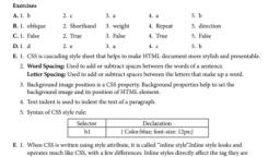


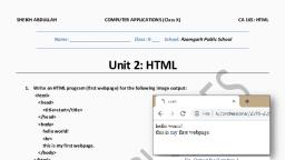


